Advante
Designing a landing page direction that expanded into a fuller website experience for a coaching platform.
Advante is a coaching platform designed to help people gain clarity, discover possibilities, and receive psycho-education in a supportive and judgment-free space. The project started as a landing page UI/UX direction, but the scope evolved as the client clarified the pages needed for launch. The final design included the main website experience and supporting pages for blog content, pricing, team information, programs, events, resources, campaign needs, policies, and pre-launch communication.
The client already had an existing brand direction, so the design work focused on UI/UX structure, content flow, responsive layout, and applying the provided typography and color style consistently across the landing page.
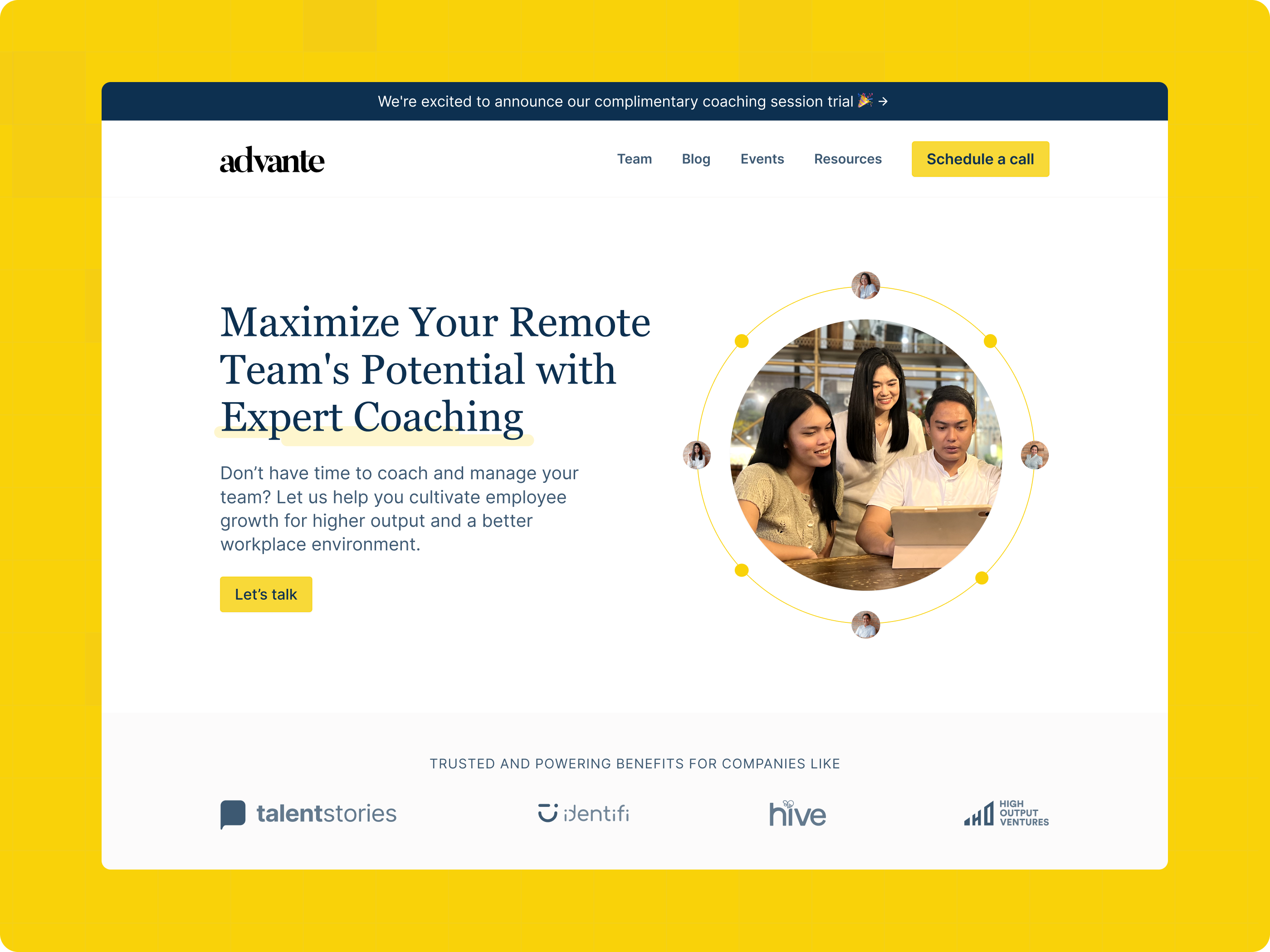
Advante is a coaching service built around clarity, growth, and support.
Advante is a coaching service that helps clients gain clarity, discover possibilities, and work through personal or professional concerns in a supportive, judgment-free space. The platform focuses on coaching services for leadership, career growth, performance, interpersonal skills, mental health, wellbeing, and group coaching.
Advante, formerly known as Valiant
Advante helps clients gain clarity, discover possibilities, and receive psycho-education. It creates a space where users can openly talk about their concerns, goals, and growth areas with guidance and support.
Advante needed a landing page that could explain coaching clearly to first-time visitors.
Because the platform offers different coaching areas, the page needed to organize the information in a way that felt simple, supportive, and easy to understand.
- The service offering needed clearer structure.
- Visitors needed to quickly understand what kind of coaching Advante provides.
- The landing page needed stronger conversion paths for inquiry, booking, sign-up, and subscription interest.
- Supporting pages such as pricing, team, blog, blog single page, and 404 page needed to be planned.
- The visual direction needed to feel professional, friendly, and supportive without looking too corporate or too generic.
Help visitors understand the offer, trust it, and take the right next step.
The goal was to design a clear and flexible website experience that could explain Advante’s coaching services, guide visitors toward inquiry or booking, and support additional content needs such as blog articles, programs, events, campaigns, resources, and policy pages.
Speaking to people looking for personal or professional guidance.
The target audience was defined early so the landing page could speak to the right users and prioritize the right content. Since Advante is a coaching platform, the design needed to feel supportive, trustworthy, and easy to understand for users looking for personal or professional guidance.
Early 20s to Mid-30s
Anywhere in the Philippines (initial launch direction)
No preference
Coaching, career guidance, leadership support, soft skills, mental health and wellbeing, or group coaching
- Coaching and specialization services
- Leadership and soft skills support
- Career coaching
- Subscription-based coaching services
- A clear and supportive way to understand the service before taking action
Guiding visitors toward inquiry, sign-up, booking, or subscription interest.
The landing page needed to support clear visitor actions instead of only presenting information. The experience was planned to help users understand the coaching service first, then guide them toward inquiry, sign-up, booking, or paid plan interest.
Reference points, not a full competitor audit.
Possible coaching and self-development references were reviewed to understand how similar services present their offers online. These references helped guide what the Advante landing page needed to communicate clearly, including service value, trust, pricing, coaching focus, and booking or inquiry actions.
harayacoaching.com
torch.io · betterup.com
Clean, friendly, and heartwarming — the client’s existing visual tone.
Advante already had a preferred brand direction, including the typography and color style to use for the website. The UI/UX task was to apply that existing direction into a landing page that felt clean, friendly, supportive, and professional while still supporting strong content hierarchy and conversion-focused actions.
Keeping the UI aligned with this existing direction shaped the spacing, structure, imagery style, and overall layout so the landing page felt supportive rather than intimidating.
Designing for professionals who want clarity, growth, and balance.
Persona planning helped clarify what the landing page needed to support. The main user direction focused on professionals who want emotional clarity, better habits, productivity support, career growth, and stronger work-life balance.
Maria
“You have the power to move past your struggles and create the life you want.”
Goals
- Understand emotions better
- Develop healthy habits
- Increase productivity
- Overcome procrastination
- Feel more in control
- Create better work/life balance
- Achieve career success
- Practice self-care
- Feel emotionally fulfilled
- Develop confidence in her abilities
Needs
- Supportive environment
- Accessible resources
- Clarity on goals
- Actionable steps
- Understanding of emotions
- Education on healthy habits
- Time management tools
- Accountability
- Confidence-building tools
- Emotional support
Motivations
- Feeling fulfilled
- Feeling in control
- Achieving success
- Feeling proud of accomplishments
- Improving productivity
- Developing positive habits
- Having time for self-care
- Attaining work/life balance
- Understanding emotions
- Overcoming procrastination
Frustrations
- Not having enough time
- Feeling overwhelmed
- Not understanding emotions
- Difficulty staying focused
- Not feeling in control
- Struggling to build healthy habits
- Feeling frustrated by lack of progress
- Difficulty managing stress
- Not having enough resources
- Not being able to practice self-care
Tasks
- Identify goals
- Make a plan
- Set realistic expectations
- Track progress
- Ask for help when needed
- Evaluate emotions
- Take breaks
- Learn new skills
- Practice healthy habits
- Celebrate successes
A 2-week landing page UI/UX process from brief to developer handoff.
The Advante landing page project was completed through a focused 2-week UI/UX process. The work started with understanding the client’s goals, reviewing the product and existing brand direction, and planning the page structure. The next phase focused on sitemap, wireframes, visual alignment, mock-up design for all required pages, prototyping, client feedback, landing page audit, and developer handoff.
What the final website needed to include.
The page scope evolved during the process as the client clarified what they needed for the website. The final design included the main homepage experience and supporting pages needed for launch, content, coaching programs, events, resources, policies, and campaign use.
Mapping the website structure around visitor goals and clear conversion paths.
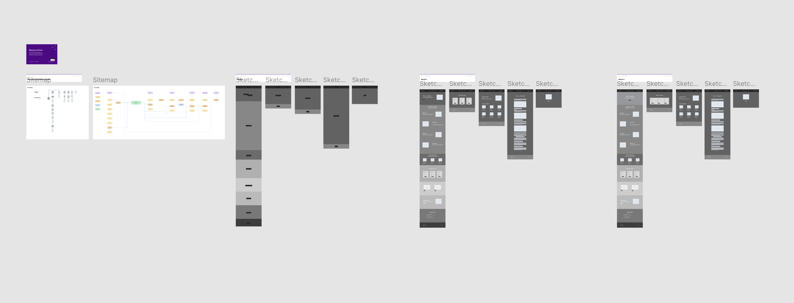
The sitemap helped organize how visitors move through the homepage, supporting pages, and key actions. It also helped keep the main landing page focused while still allowing users to explore pricing, team information, blog content, programs, events, resources, and inquiry actions.
Planning content hierarchy before visual design.
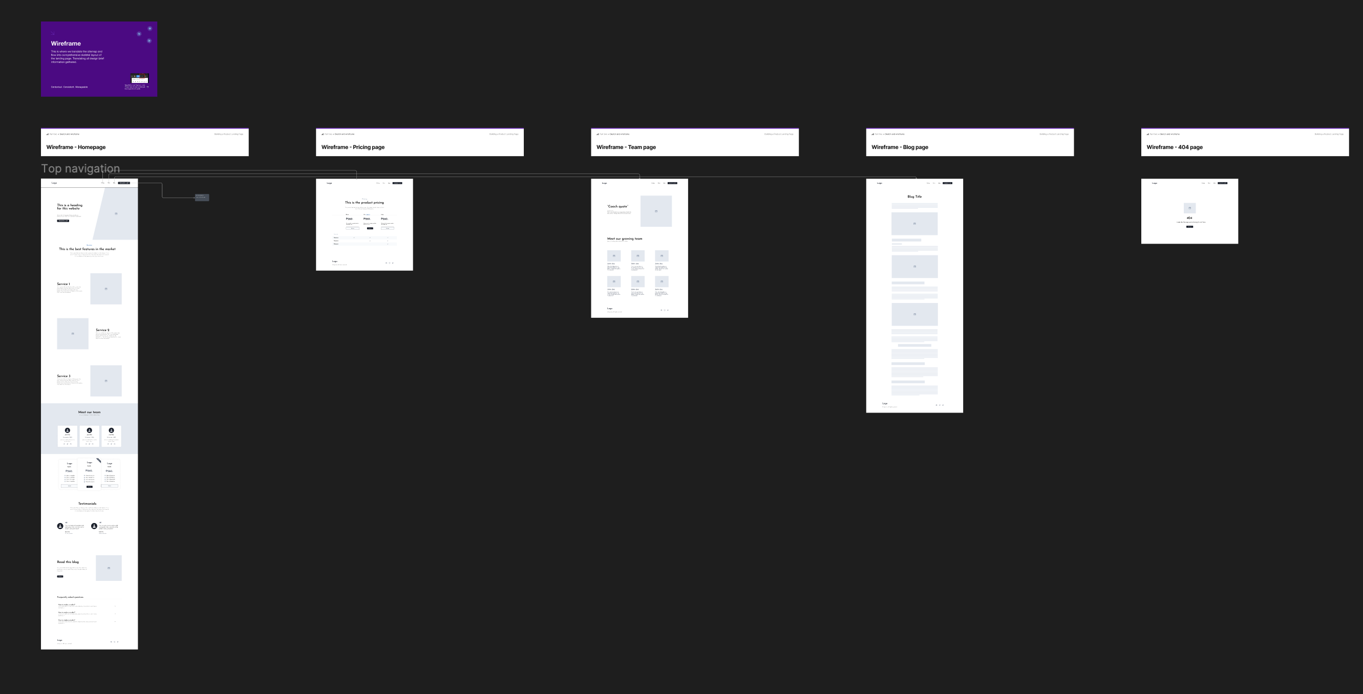
Low-fidelity wireframes were created to plan the structure of the main website pages and supporting pages before moving into high-fidelity UI design. This helped organize the content hierarchy, navigation flow, service information, pricing, team content, blog structure, programs, campaigns, events, resources, and policy pages.
Exploring layout direction and visual references before UI design.
Before moving into the final UI mock-ups, I explored moodboards and layout references to understand how Advante’s existing typography, colors, and visual style could be applied across the website. This helped guide the layout direction, image treatment, spacing, content flow, and overall UI feel while keeping the design aligned with the client’s preferred brand direction.
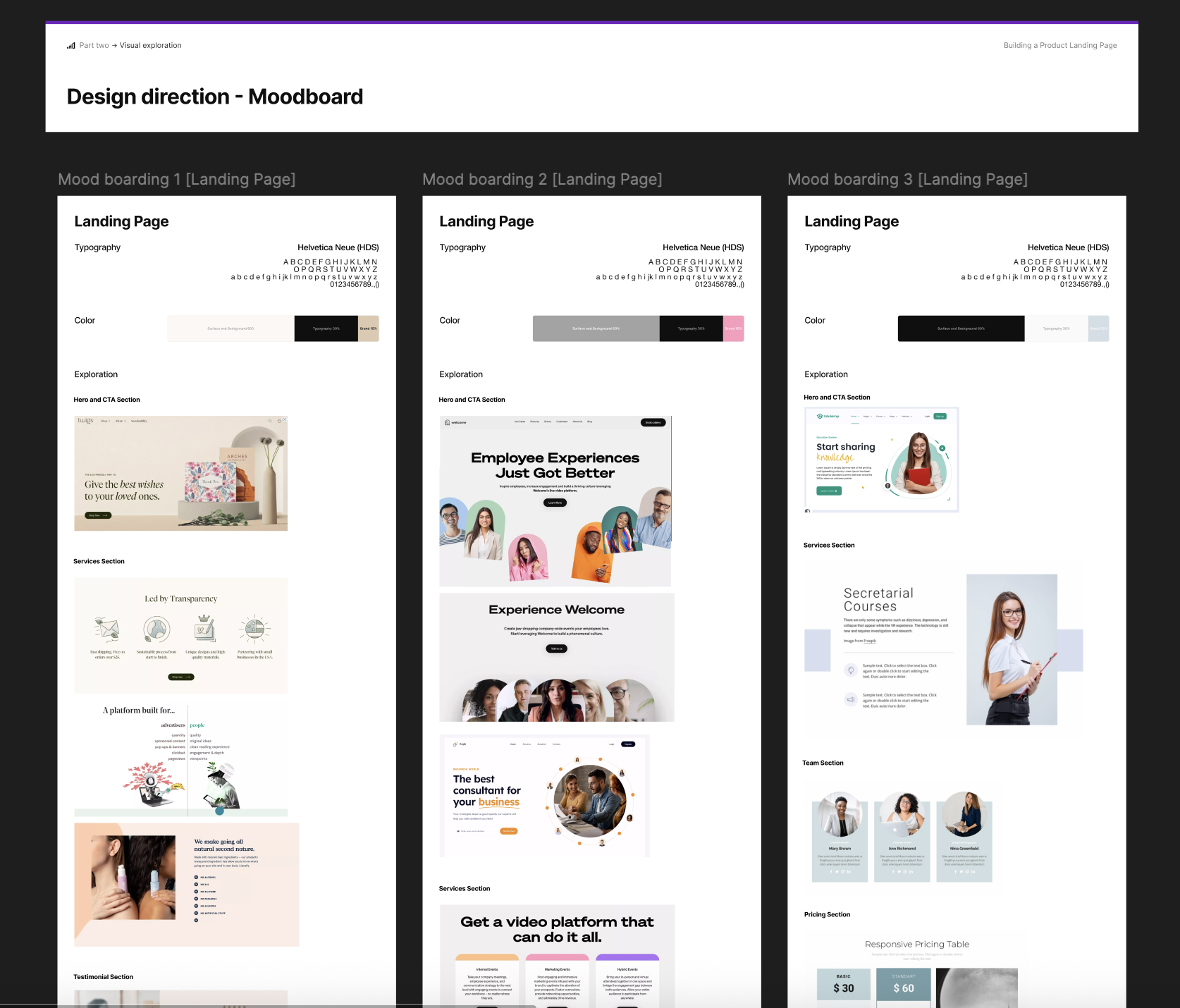
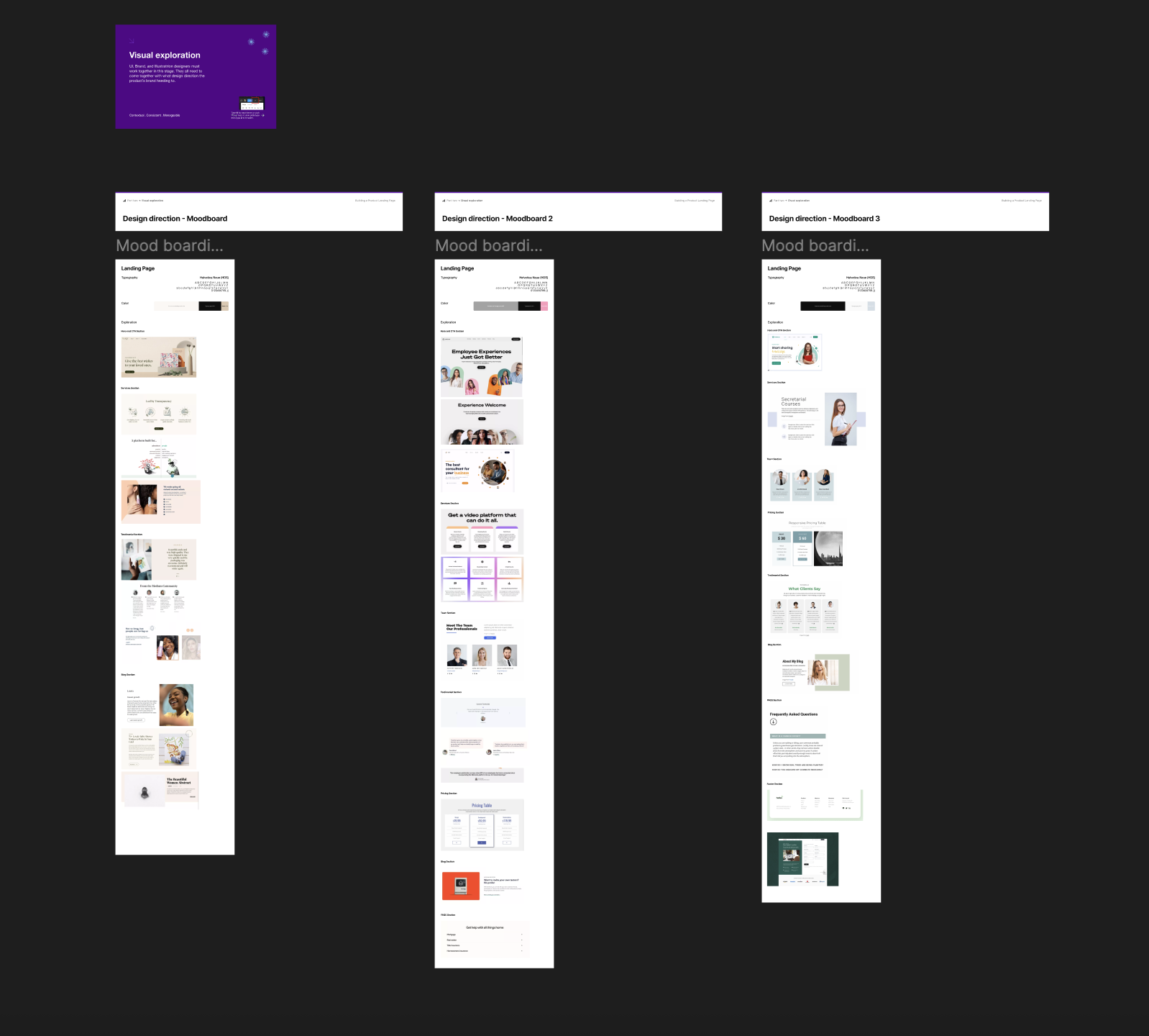
- How the existing typography and color direction could support a clean and professional coaching website
- What layout style would work best for service sections, testimonials, blog content, pricing, and CTA areas
- How imagery and spacing could make the website feel supportive, friendly, and trustworthy
- How the UI could feel warm and approachable without losing structure and clarity
The final website direction across desktop, tablet, and mobile.
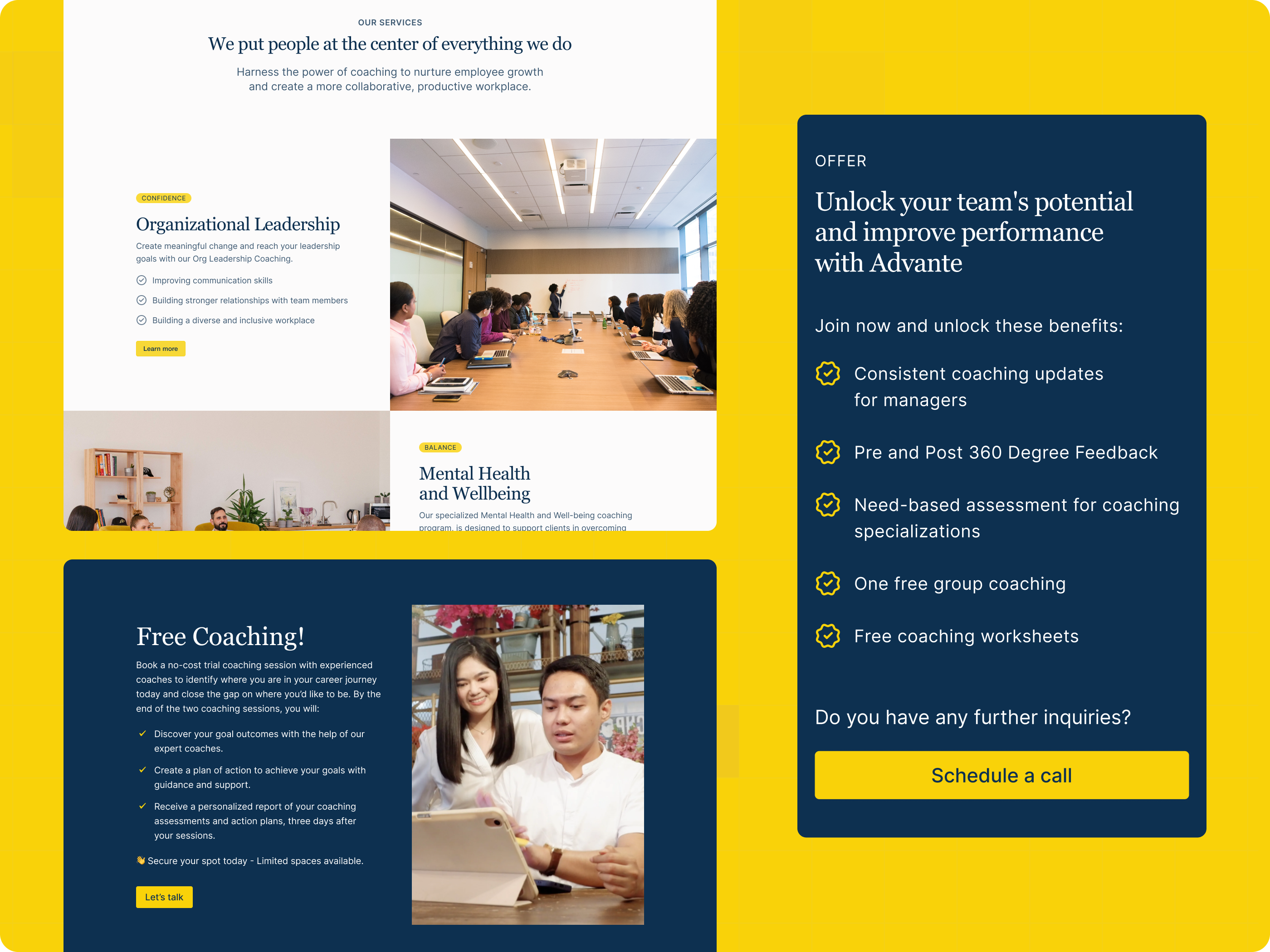
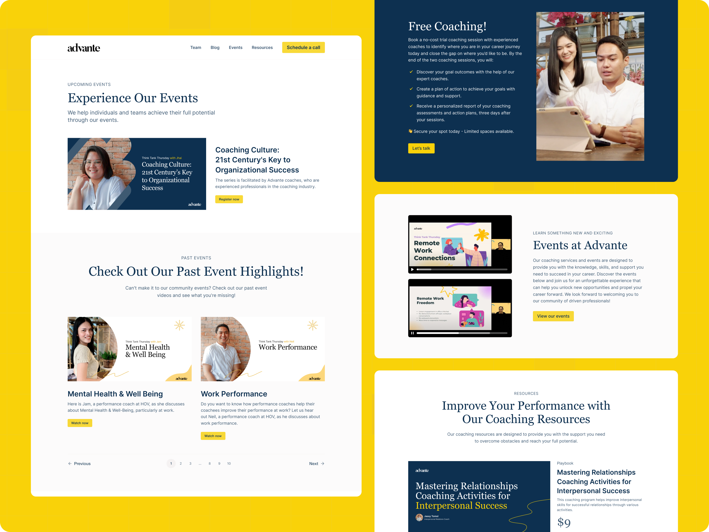
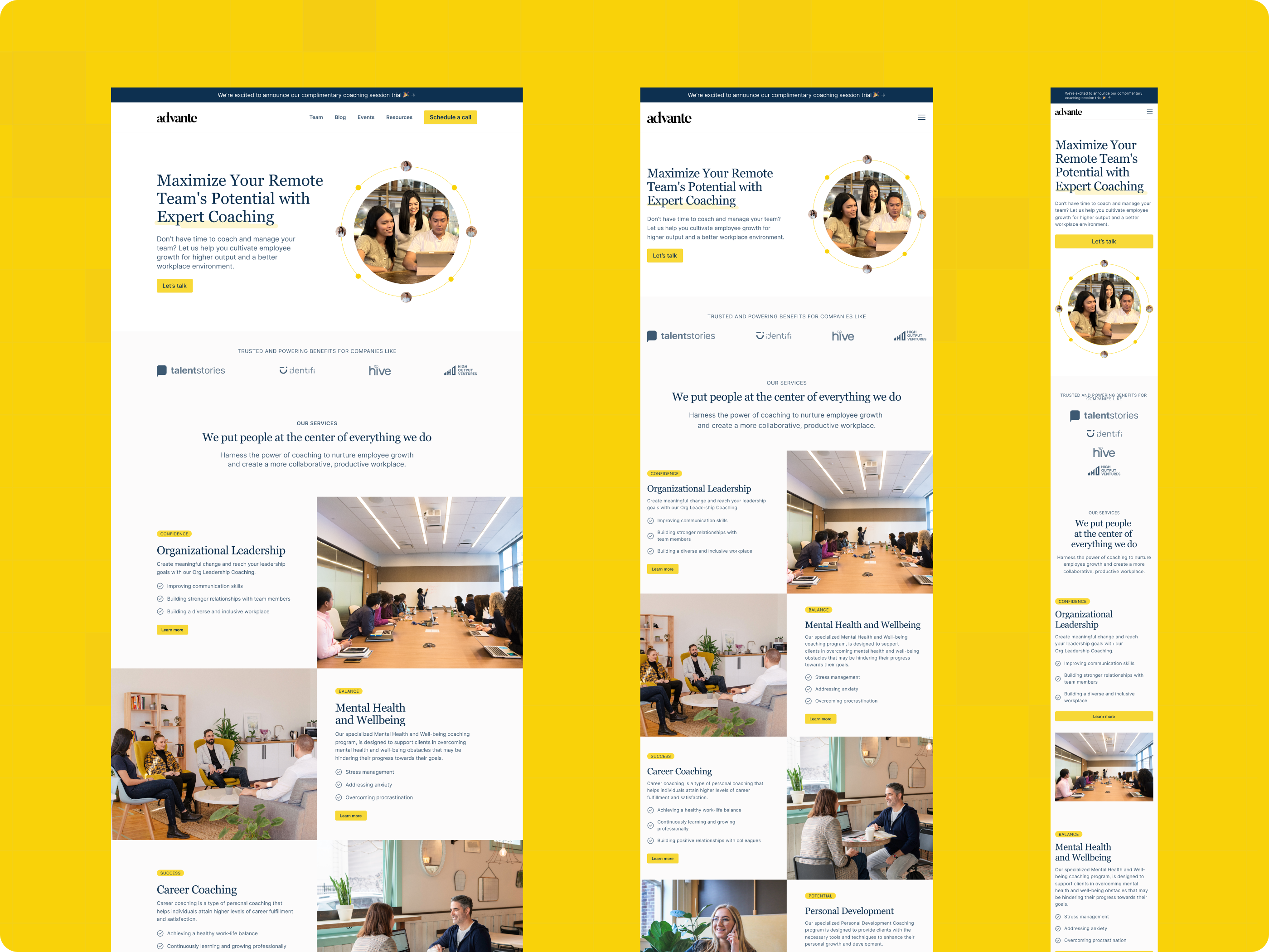
The high-fidelity mock-up phase covered the final website page scope, not only the homepage. The pages were designed to keep the experience consistent across the main landing page, blog, pricing, team, program, campaign, event, resource, and policy-related sections. The homepage direction below shows that consistency across desktop, tablet, and mobile.
Making the design easier to translate into code.
Before handoff, the landing page designs were reviewed for spacing, alignment, responsiveness, navigation states, and button interactions. Redlining and documentation were then prepared to help developers understand layout rules, responsive behavior, component states, and interaction details. A developer sync-up was also done to walk through the screens, notes, and expected behavior so implementation could move more clearly and efficiently.
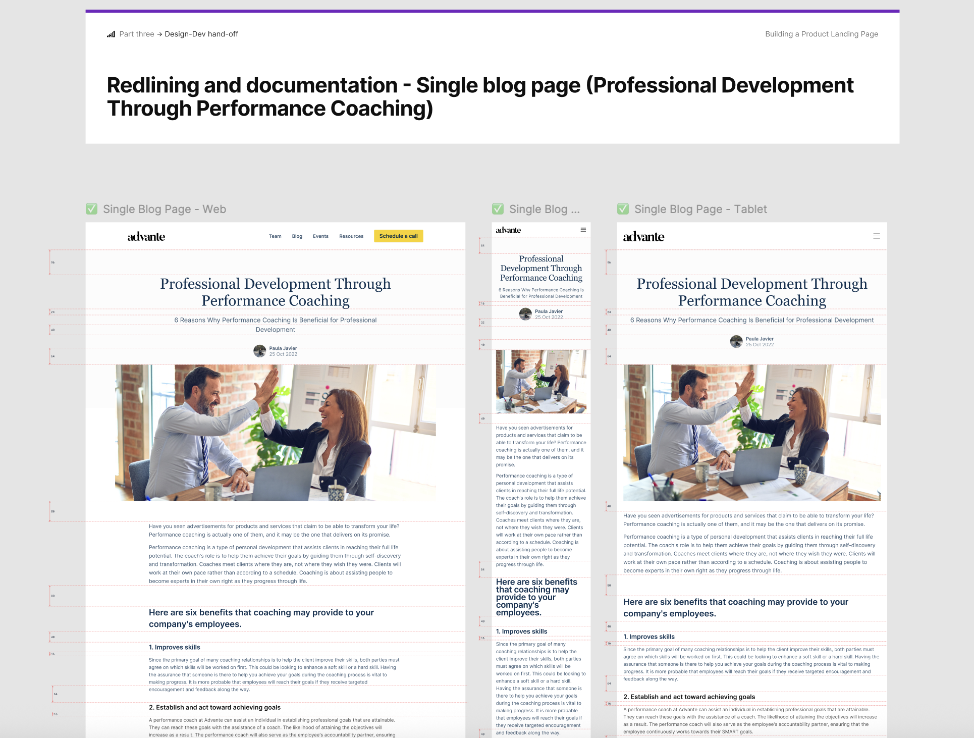
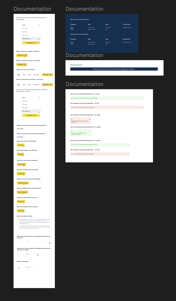
The handoff covered all designed pages across web, tablet, and mobile, not only the homepage or blog pages. I prepared the needed redlining, responsive references, interaction notes, and documentation so the developer had a clear guide for implementing the full website experience.
- Complete redlining for all designed pages
- Web, tablet, and mobile redlining references
- Responsive layout measurements
- Spacing, alignment, and section structure notes
- Navigation and menu behavior documentation
- Button hover, active, and clicked-state references
- CTA interaction notes
- Modal and page behavior references
- Responsive design references for implementation
- Developer handoff notes and walkthrough materials
- Responsive behavior for all designed pages across web, tablet, and mobile
- Header and navigation states across desktop, tablet, and mobile
- Mobile menu open, close, and interaction behavior
- CTA hover, active, and clicked states
- Button behavior across key pages and sections
- Modal behavior and related interaction notes
- Page transition and user flow references where needed
- Layout spacing and alignment rules across breakpoints
- Notes for consistent front-end implementation across all pages
A structured, responsive experience built on a proper UI/UX process.
The final Advante UI/UX design helped turn the coaching platform’s initial landing page direction into a fuller website experience. The final structure included the home page, blog pages, team page, pricing page, program-related pages, campaign and event pages, resources, policy pages, pre-launch page, and error state page, giving the client a more complete website foundation for launch.
Expanded the initial landing page direction into a fuller website page structure
Designed the final page scope based on the client's clarified needs
Organized content for coaching services, programs, events, resources, blog, pricing, team, and policy pages
Applied the client's existing typography, colors, and visual direction consistently across the UI
Prepared responsive page designs and prototype flows for review
Supported development with redlining, notes, responsive references, and handoff documentation