Ballers.ph
The Challenge
Ballers.ph already had an established platform and audience, but the interface lacked consistency across key elements such as typography, color usage, imagery, and icons. Over time, these inconsistencies made the experience feel visually cluttered and harder to navigate, especially for content-heavy sections.
The goal was not to redesign from scratch, but to refine the existing system—preserving the brand’s identity and familiarity while improving clarity, structure, and overall usability.
The Solution
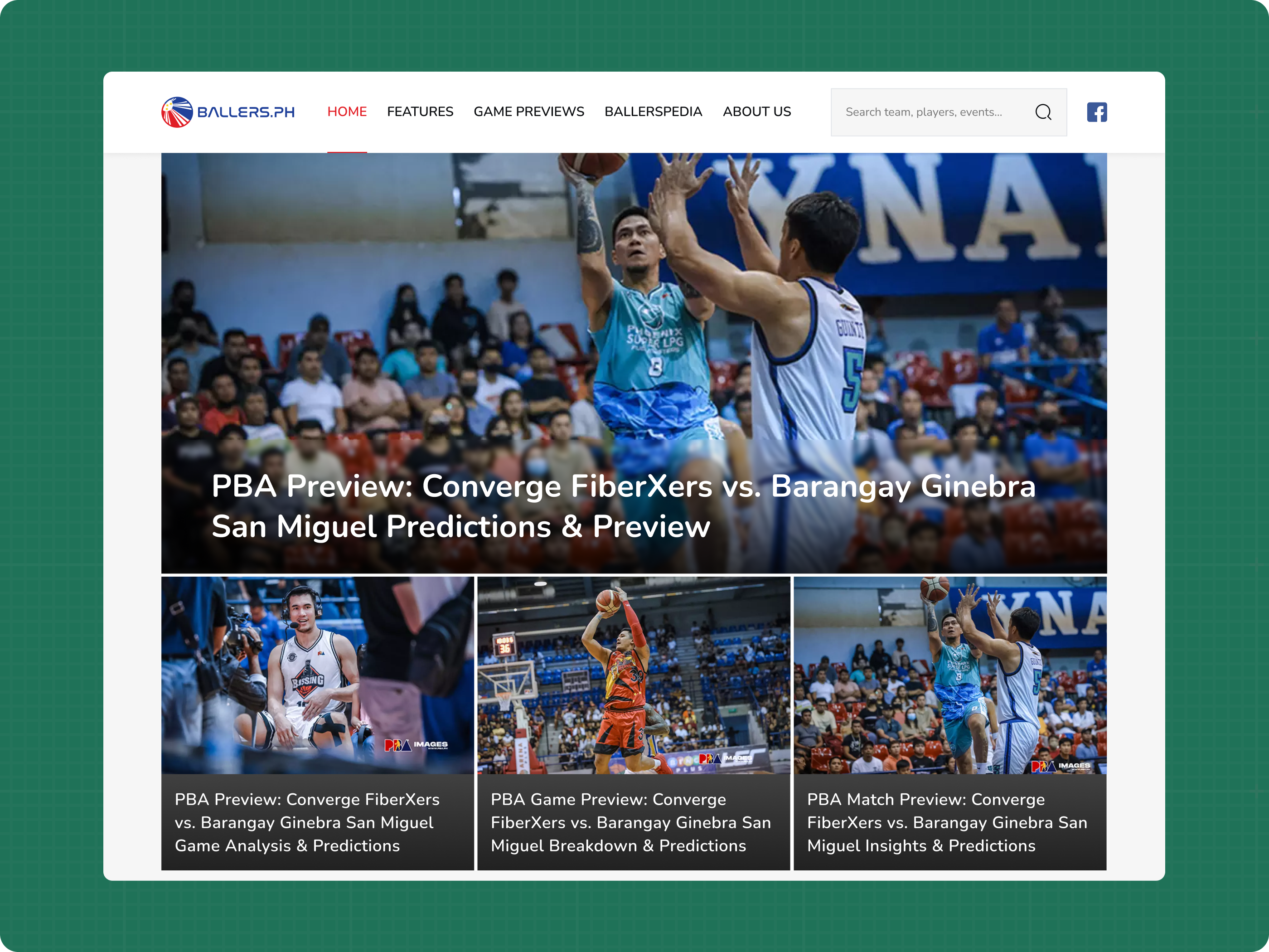
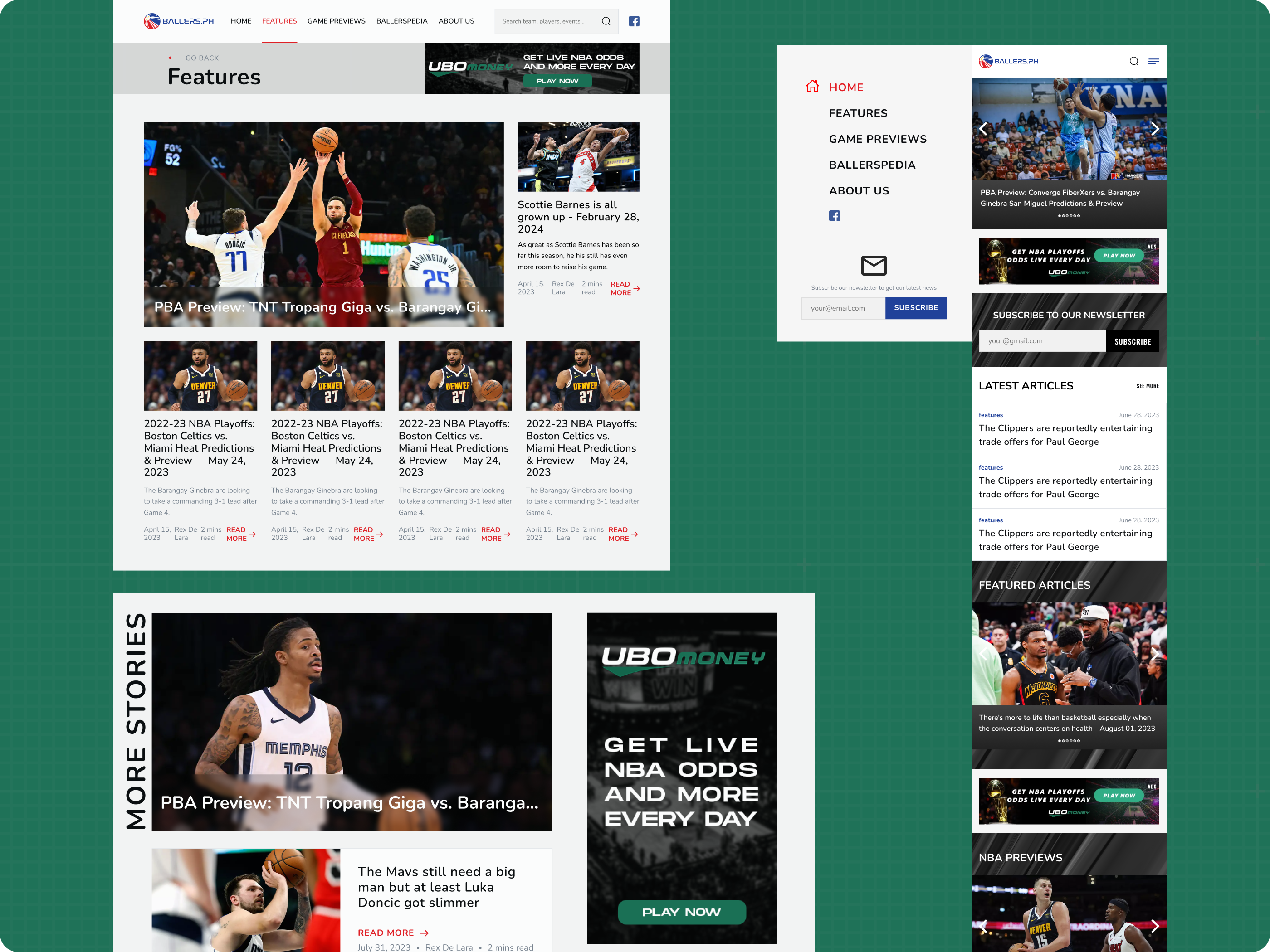
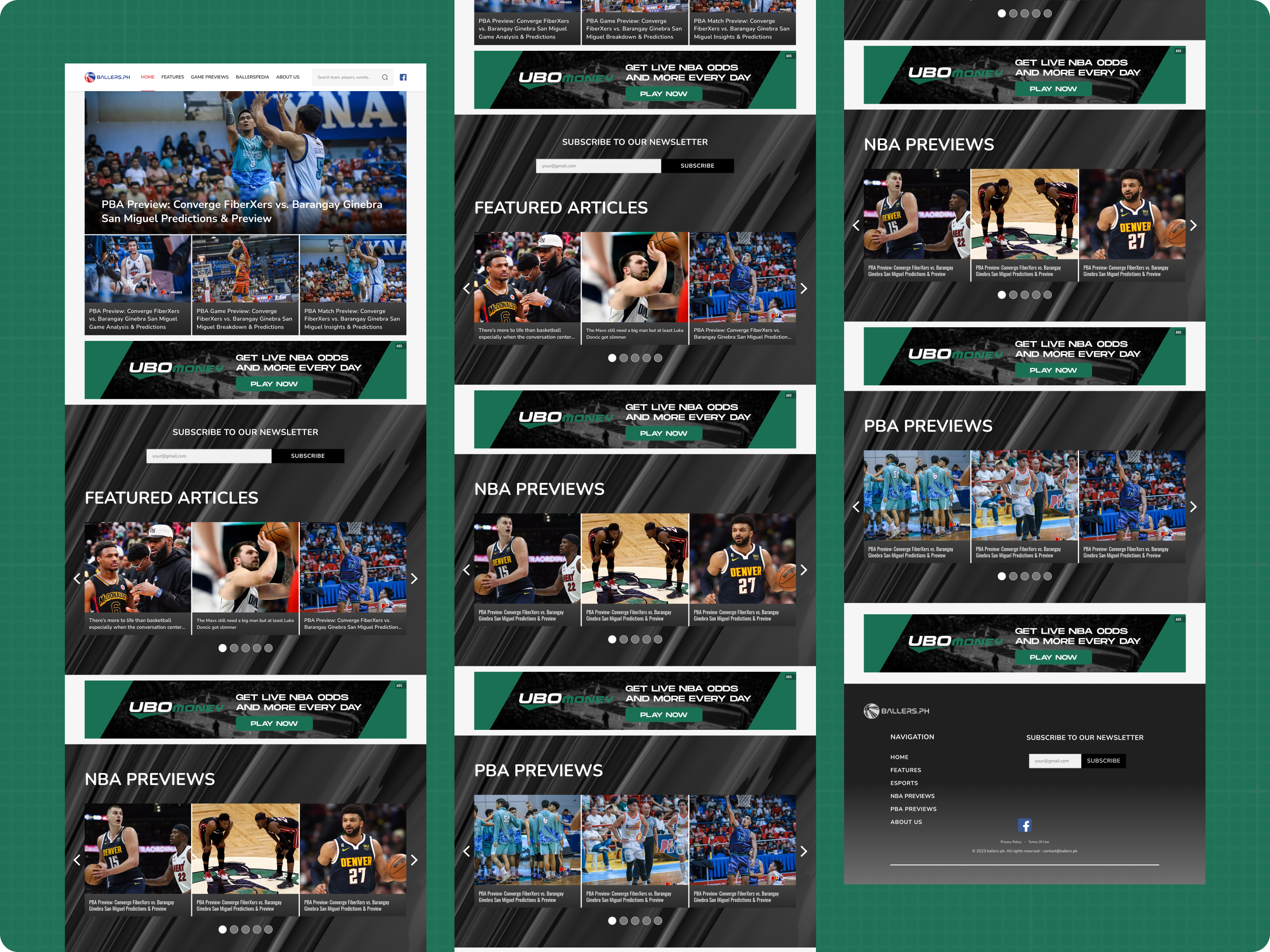
The redesign focused on bringing structure and consistency to an already established visual direction. Instead of changing the brand, the approach refined it—standardizing typography, tightening the color system, and aligning image treatments to create a more cohesive experience across the platform.
Content hierarchy became a key priority. Sections such as featured articles, previews, and categories were reorganized to improve scanning and readability, allowing users to quickly identify important content without feeling overwhelmed.
Visual noise was reduced by simplifying layouts and ensuring that every element—from cards to navigation—follows a consistent pattern. The result is a cleaner, more structured interface that maintains the familiar look and feel of Ballers.ph, while significantly improving how content is consumed and navigated.
The Impact
- Improved visual consistency across typography, colors, and components
- Enhanced content discoverability through clearer hierarchy and layout structure
- Reduced visual clutter, making the platform easier to scan and navigate
- Maintained brand familiarity while elevating overall design quality
- Delivered a refined experience without disrupting existing user behavior