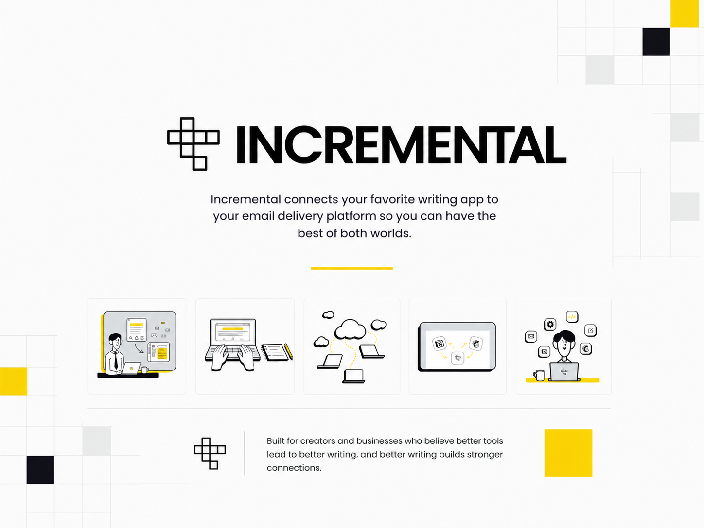
Incremental
A collaborative brand identity project created to build a clean, structured, and scalable visual system for a modern technology-focused brand.
Starting Point
A growing brand needs more than isolated design assets. Without a clear identity system, brand applications can feel inconsistent, less recognizable, and harder to scale across different touchpoints.
For Incremental, the challenge was to create a cohesive branding system that feels clean, modern, and structured while still being flexible enough to work across both digital and physical applications. The identity needed to present the brand in a more organized and intentional way through consistent logo usage, typography, color, and visual direction.
Because this was a collaboration project, another important part of the challenge was making sure the work stayed visually aligned and cohesive even with two designers contributing to the branding process.
The Approach
The solution was to create a cohesive brand identity system for Incremental built across its core brand assets — logo usage, typography, color system, visual direction, merchandise, and social media application.
- Logo usage — defined for consistent and clear application
- Color system — structured to support hierarchy and brand tone
- Typography — clean and readable across all brand formats
- Visual direction — a shared creative language for both designers
- Merchandise — extending the identity into physical applications
- Social media — adapting the system for digital content
Rather than treating each asset separately, the system was designed to work as one connected identity — making the brand feel more complete, more professional, and more scalable across different touchpoints.
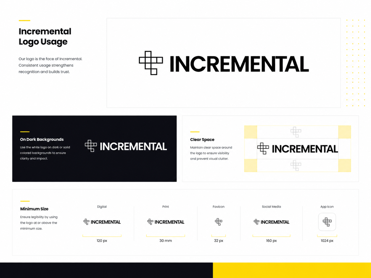
Logo Usage
The logo usage section presents the Incremental mark in a clean and structured way. It shows how the logo can be applied consistently across different brand materials while maintaining clarity, balance, and recognizability.
Defining how the logo is used — including spacing, contrast, and placement — keeps the identity looking intentional across every application, from digital screens to physical brand materials.
- Consistent and recognizable logo application across all brand materials
- A clearly defined mark that holds up in any context or format
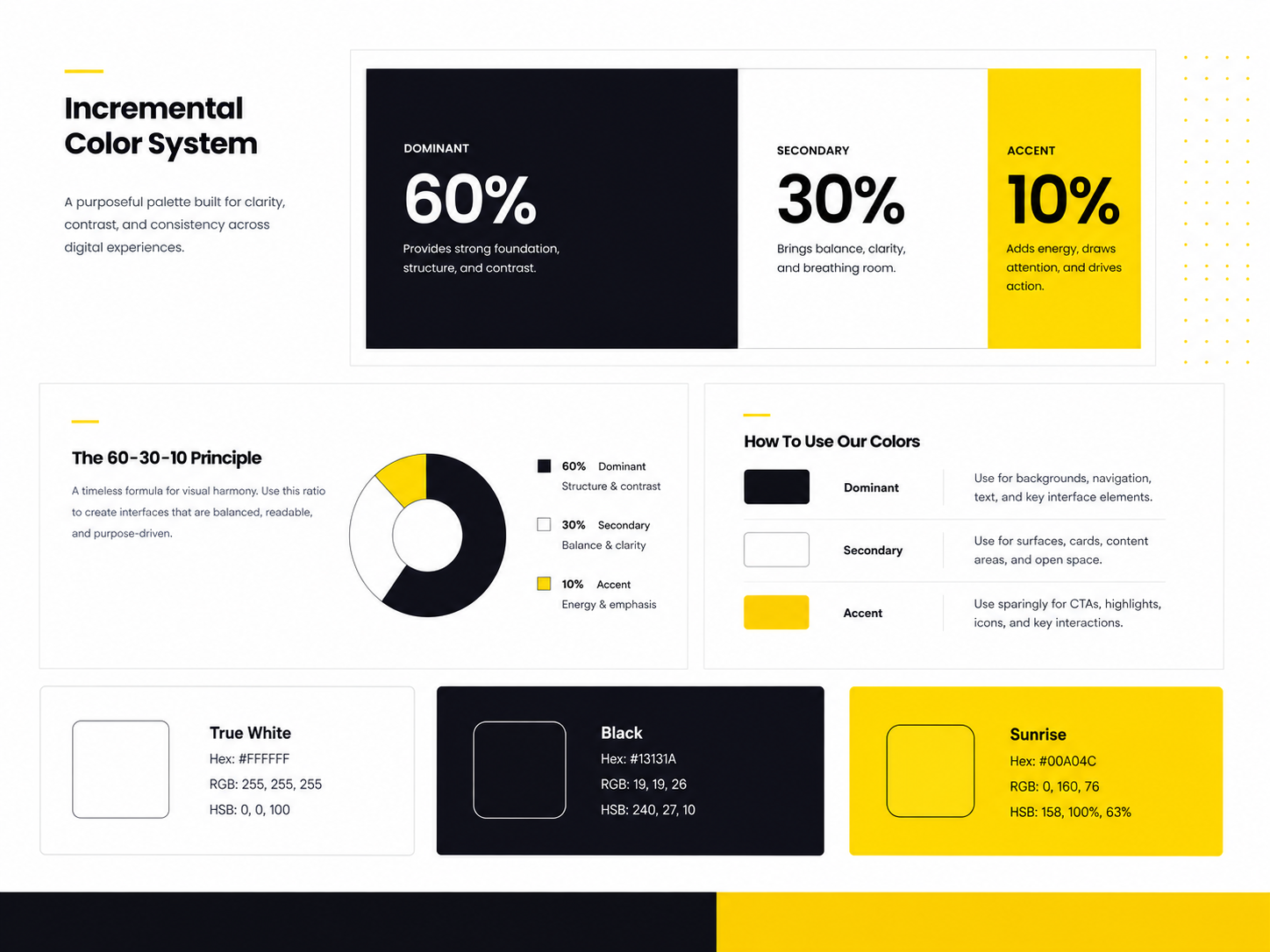
Color & Palette
The color system defines the palette that supports the Incremental identity. The selected colors work together to create hierarchy, contrast, tone, and visual consistency across different brand applications.
A focused, intentional palette prevents the brand from feeling inconsistent when applied across different materials. Each color has a defined role — so the identity reads as one cohesive system rather than a set of unrelated choices.
- A palette that creates clear visual hierarchy across all brand touchpoints
- Consistent mood and brand recognition from one application to the next
- A focused system that stays coherent across digital and physical use
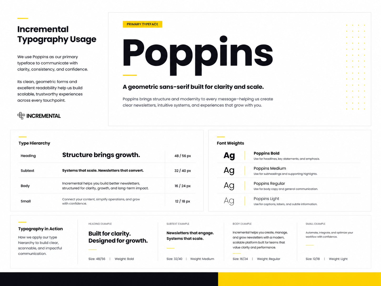
Type System
The typography system shows how type supports the overall identity of Incremental. It creates a clear structure for reading — separating headlines from supporting content and giving the brand a consistent and recognizable voice across different applications.
When type choices are inconsistent, the brand loses authority even when the layout is well-composed. A defined type system ensures Incremental communicates with the same clarity and confidence across every format.
- Clear typographic hierarchy that supports readability and brand structure
- A consistent and professional brand voice across all formats
- Readable, clean layouts from brand presentations to digital content
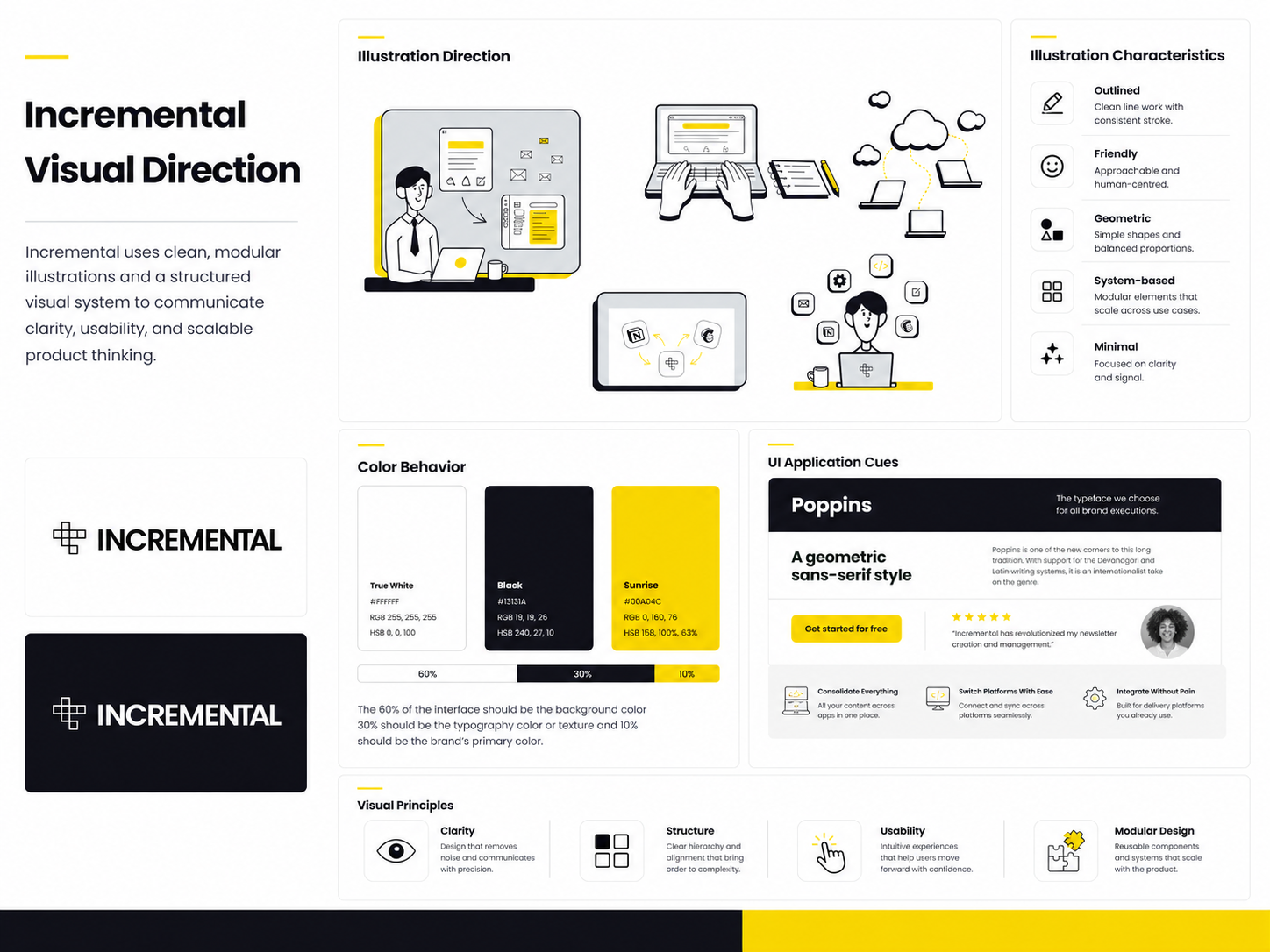
Brand Direction
The visual direction section presents the broader creative language of the brand. It defines the mood, composition, styling, and overall art direction that shapes how Incremental looks and feels across different brand contexts.
For a collaboration project, a shared visual direction is especially important — it keeps both designers working within the same creative framework so the final deliverables feel aligned and unified rather than separate.
- A cohesive visual language that holds the identity together across all assets
- A clear creative direction both designers could work within consistently
- A brand look that feels intentional and polished across every touchpoint
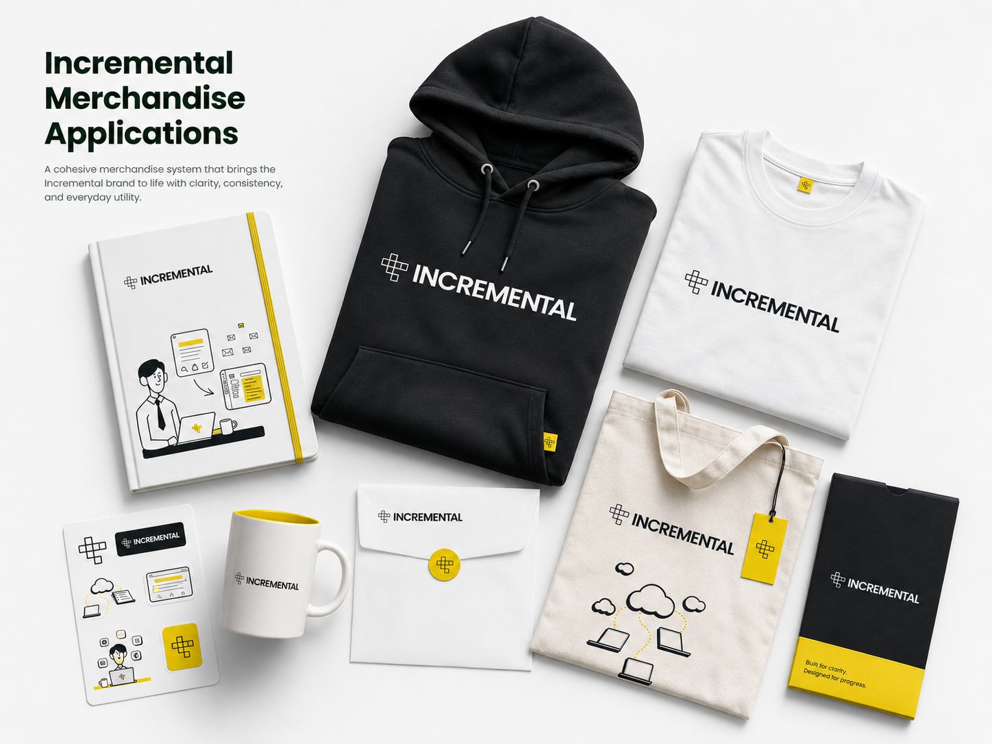
Merch Collection
The merch collection shows how the Incremental identity extends into physical brand applications. It demonstrates that the system is flexible enough to move beyond screens while keeping the branding clean, recognizable, and visually consistent.
Physical applications are a strong measure of any identity system. A brand that translates well onto merchandise has a stronger and more versatile foundation than one built only for digital use.
- Brand identity that remains clear and recognizable on physical surfaces
- A system that extends naturally beyond digital into real-world applications
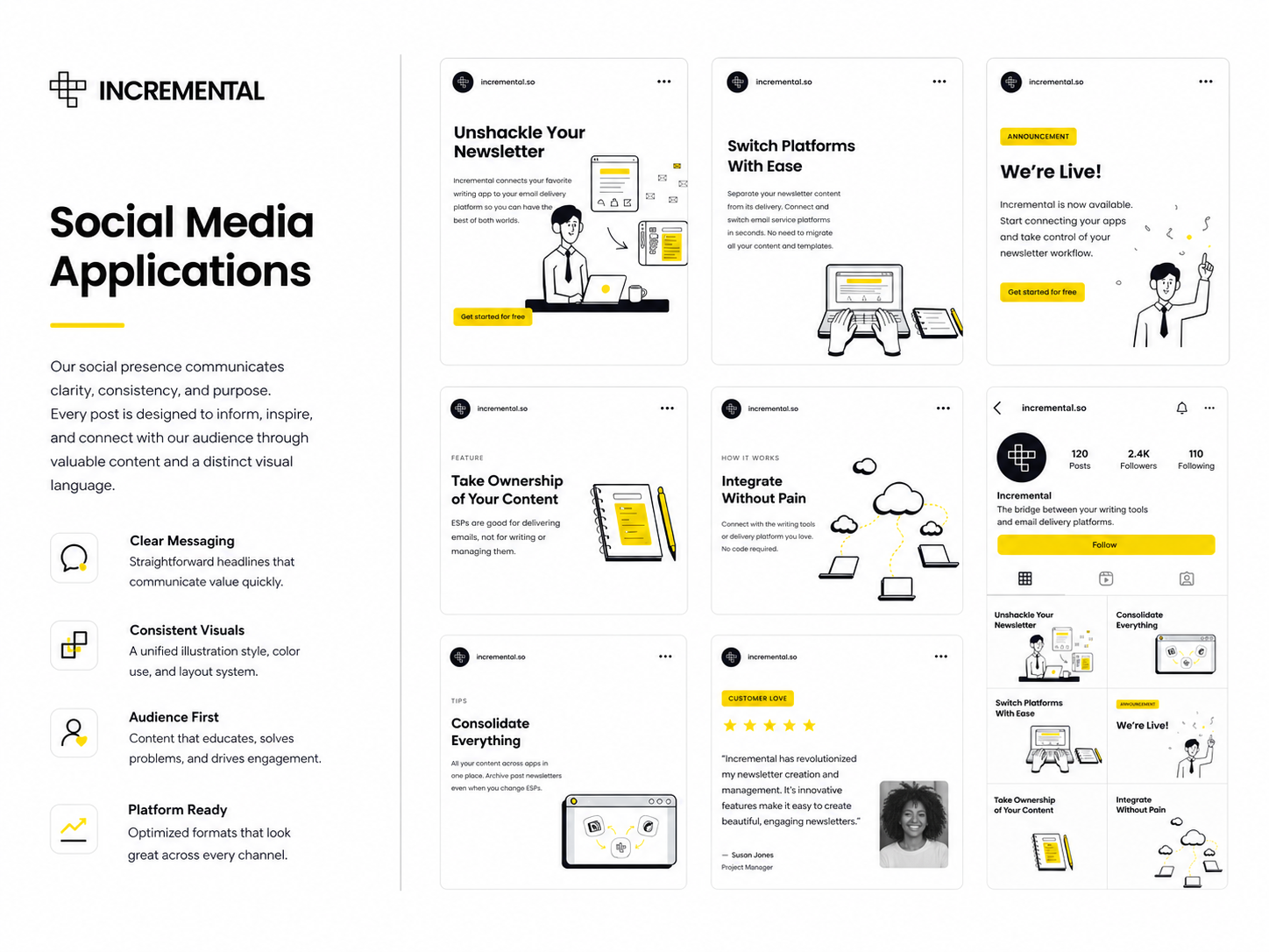
Social Media Mock-up
The social media mock-up shows how the identity works in digital content. It demonstrates how the visual system translates into online brand communication — keeping Incremental consistent, polished, and easy to recognize across platforms.
Social media is where the identity gets tested at scale. Content posted regularly needs to look like it comes from the same brand every time — the mock-up confirms that the system holds up in that context.
- A consistent and polished brand presence across digital platforms
- Visual identity that remains recognizable in fast-moving social feeds
- Digital-ready layouts that scale across content formats
The Impact
Incremental was developed as a collaborative branding project between two designers, resulting in a cohesive identity system built across key brand assets. Through brand overview, logo usage, typography, color system, visual direction, merchandise, and social media application, the project presents a complete and consistent branding solution.
The final result is a structured and polished brand system that strengthens how Incremental is presented across different touchpoints — and reflects a collaborative process where shared direction produced a unified outcome rather than separate design pieces.