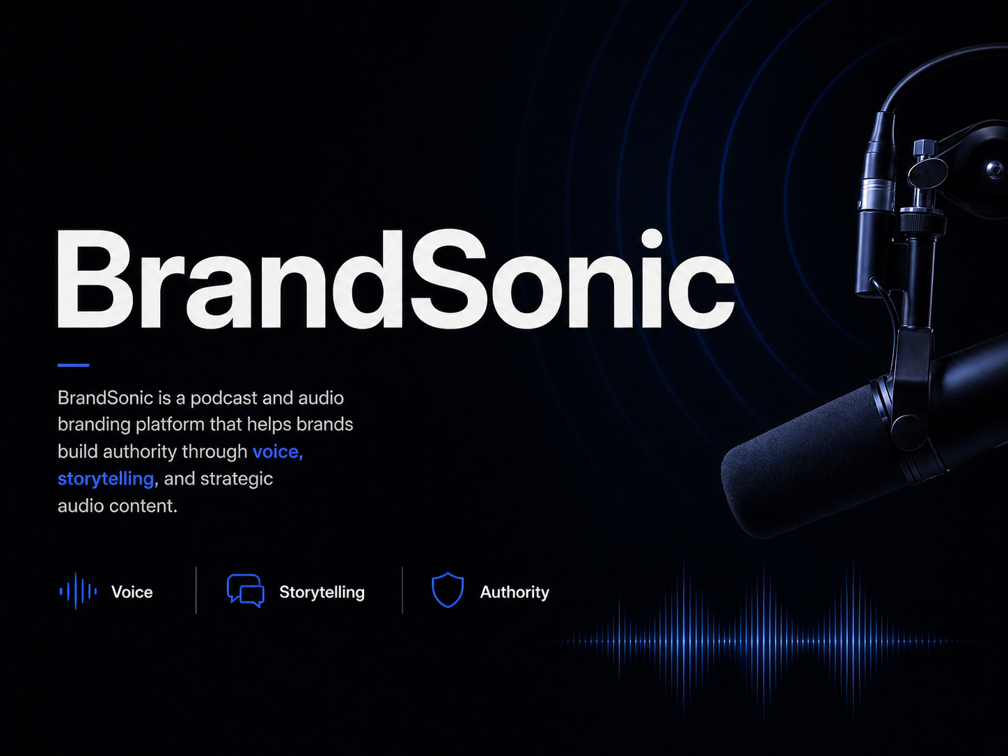
BrandSonic
A modern brand identity for a podcast and audio branding platform built to communicate voice, storytelling, and brand authority with a clean, premium, and consistent visual system.
Starting Point
BrandSonic needed a visual identity that could clearly represent its role in the podcast and audio branding space. The goal was to create a brand system that feels credible, modern, and easy to recognize — while staying flexible enough for digital content, social media, merchandise, and other brand applications.
Podcast and audio service brands can easily look generic when they rely on common audio visuals, inconsistent layouts, or overused microphone and sound wave elements. The challenge was to create an identity that still feels connected to audio and storytelling — but in a cleaner, more premium, and more professional way.
Without a clear identity system, the brand could feel less recognizable and less polished when applied across different platforms.
The Approach
The solution was to build a cohesive brand identity system using a strong dark foundation, a focused blue accent, clean typography, and structured visual direction. This created a more premium and professional look while keeping the brand connected to the podcast and audio space.
- Logo usage — defined for consistent application across materials
- Color system — built around strong contrast and a focused palette
- Typography — structured for hierarchy and brand confidence
- Visual direction — clear, modern, and audio-inspired without being generic
- Merchandise — extending the identity into physical applications
- Social media — adapting the system for digital content
Each part of the system was designed to work together so the brand feels consistent, recognizable, and ready for real-world use.
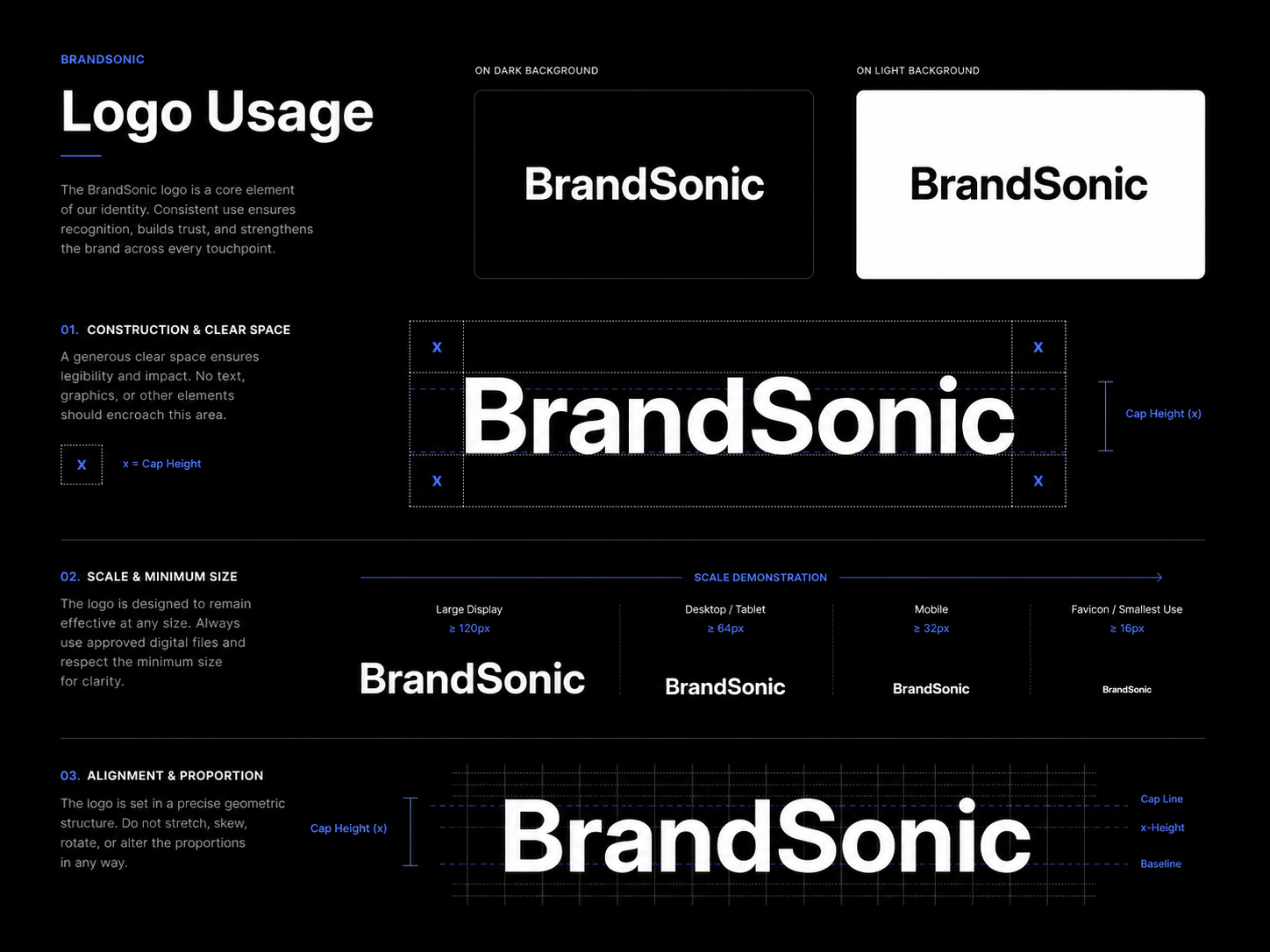
Logo Usage
The logo usage section presents the BrandSonic mark in a clean and consistent way. It shows how the logo can be applied with proper spacing, contrast, and clarity so the identity remains recognizable across different layouts and brand materials.
Keeping the logo application consistent across every touchpoint prevents the brand from fragmenting — it ensures BrandSonic always reads as one recognizable identity regardless of where it appears.
- Clear and consistent logo application across all brand materials
- Recognizable identity that holds up at any size or context
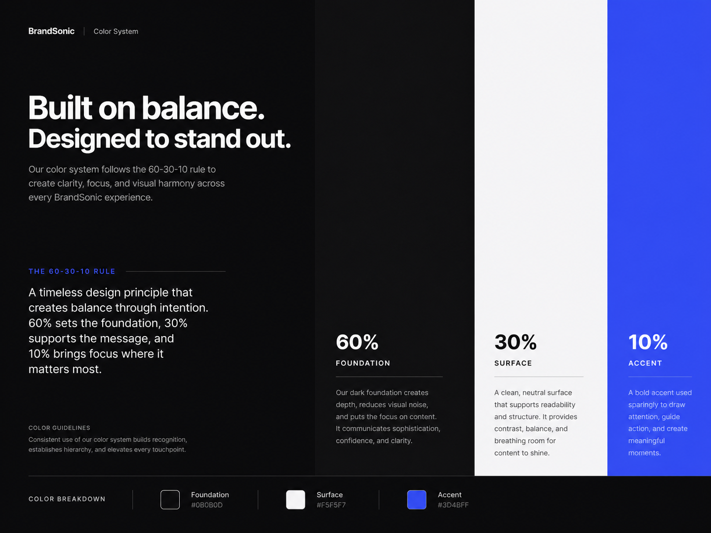
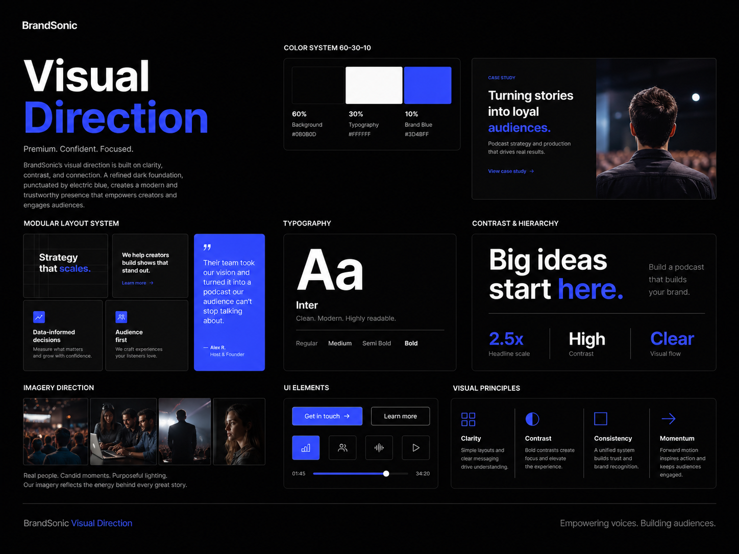
Color & Palette
The color system uses a dark foundation supported by clean neutrals and a blue accent. This creates strong contrast and gives the brand a modern, premium, and digital-first feel.
A limited, focused palette is a deliberate choice — it prevents the brand from looking inconsistent when applied across materials. Every color has a role in creating hierarchy and reinforcing the visual identity.
- Strong contrast that makes the brand feel premium and digital-ready
- Clear visual hierarchy across the entire identity system
- A focused palette that stays consistent across every application
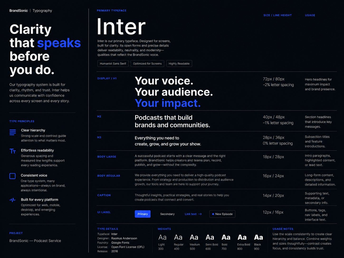
Type System
The typography system supports a clean and confident brand voice. It gives the identity a structured and professional look while keeping the content readable across brand presentations, social media layouts, and other visual applications.
When typography is inconsistent, even well-designed layouts lose their sense of brand authority. A defined type system ensures BrandSonic communicates clearly and consistently no matter the format.
- Clear hierarchy between headline and supporting content
- Confident, professional brand voice across all formats
- Consistent readability from social posts to brand presentations
Look & Feel
The visual direction gives BrandSonic a polished and modern look through strong contrast, clean composition, and subtle audio-inspired energy. The design avoids unnecessary clutter and keeps the brand focused on clarity, storytelling, and professional presentation.
This direction gives the brand a clear visual personality — distinct enough to stand out in the podcast and audio space without relying on overused design tropes.
- A distinctive visual personality that feels premium and purposeful
- Clean compositions that keep focus on the brand message
- A look that scales across digital and physical applications
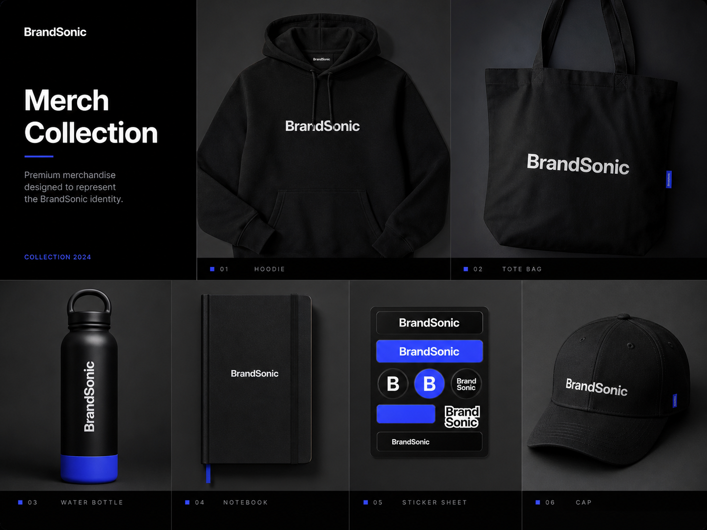
Merch Collection
The merch collection shows how the BrandSonic identity can extend into physical brand applications. The design keeps the branding clean and recognizable while showing how the visual system can work beyond digital screens.
Physical brand applications are a strong test of any identity system. A brand that only works on screens has limitations — one that translates to merchandise, print, and real-world surfaces has a stronger foundation.
- Identity that holds up cleanly on physical surfaces
- Consistent brand presence beyond digital platforms
- A system ready for real-world brand extensions
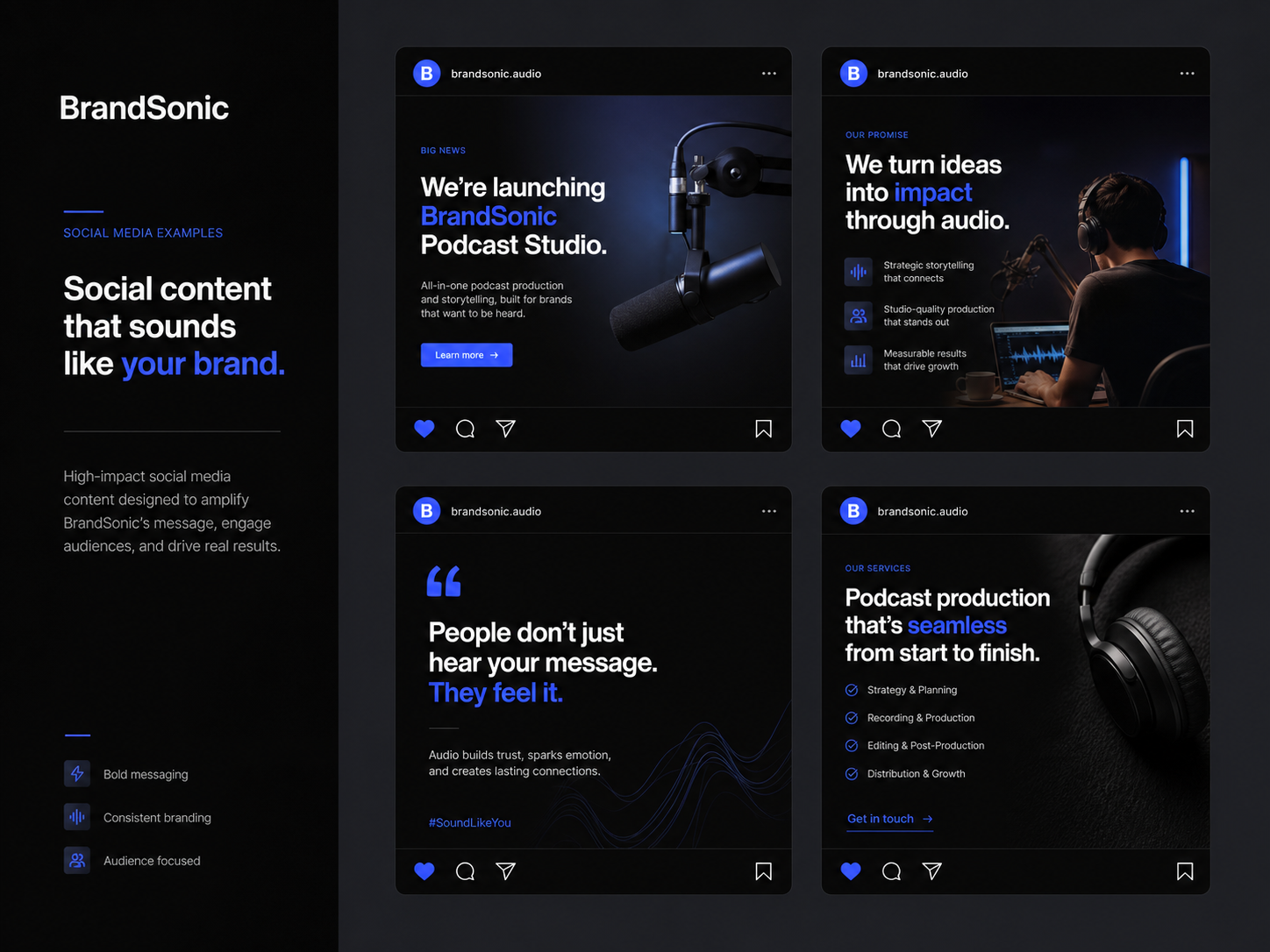
Social Media Mock-up
The social media mock-up shows how the identity can be applied to digital content. The layout keeps the brand consistent, polished, and easy to recognize across online platforms where podcast and audio brands often communicate with their audience.
Social media is where most of the audience interacts with the brand daily. A consistent presence here reinforces recognition and builds credibility over time — it's one of the most important applications of the identity system.
- Consistent and polished presence across social platforms
- Brand identity that remains recognizable in fast-scrolling feeds
- Digital-ready layouts that scale across content formats
The Impact
BrandSonic's identity system was designed to feel clear, professional, and consistent across different brand touchpoints. By creating a visual system around logo usage, typography, color, visual direction, merchandise, and social media application, the brand now has a stronger foundation for presenting itself in the podcast and audio branding space.
The final result is a modern branding system that supports recognition, consistency, and a more premium brand presence — not just a set of design assets, but a complete and scalable visual identity.