Parves Shahid
The Challenge
Parves Shahid is an AI creator who publishes educational content on a regular basis. The content itself was valuable — but the visuals told a different story. Posts were inconsistent in style, structure, and tone. Each piece felt disconnected from the last.
Because of this:
- Users scrolled past without stopping
- Information felt dense and hard to process
- The creator had no recognizable visual identity
What We Set Out to Do
Design a personal brand system that makes AI content easier to understand and gives the creator a consistent, recognizable presence across all formats.
- Make complex AI topics approachable through visual clarity
- Build a consistent identity that works across every content format
- Create reusable templates for carousels, infographics, and banners
- Feel modern and relevant to AI without being generic
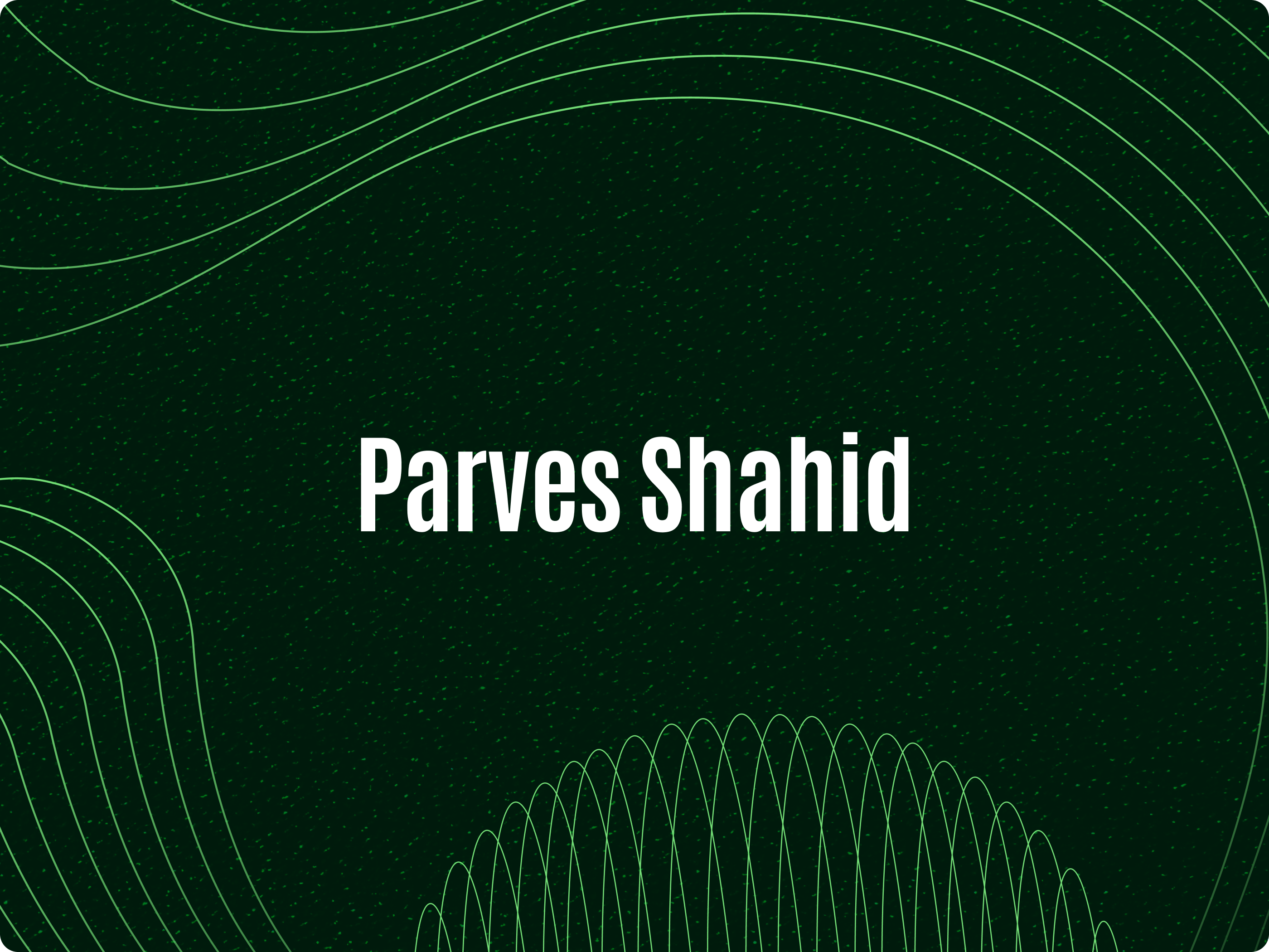
Moodboard & Direction
Before touching any layout, I needed to establish the visual language. The moodboard set the tone for everything that followed.
Three core decisions shaped the direction:
- Dark background — removes visual noise and focuses attention on the content
- Neon green accents — highlights key information and creates contrast without distraction
- Abstract contour lines — represent AI systems, flows, and structured thinking
- Strong visual identity that immediately stands out in crowded feeds
- A clear, reusable foundation for all content formats
Building the System
A brand system only works if every piece follows the same rules. I defined three core elements that make it possible to produce content quickly without losing consistency.
Header font: Antonio. Supporting text: Jura. Bold and readable — chosen for fast scanning. Headers carry the message at a glance while supporting text fills the detail without slowing the reader down.
A tightly limited palette — deep dark background, neon green accents, and white text. Fewer colors means faster recognition. Every piece immediately reads as "Parves Shahid."
Reusable visual patterns — contour lines, glow effects, and geometric shapes — defined once and applied consistently. No random design choices. Every element has a purpose and a place.
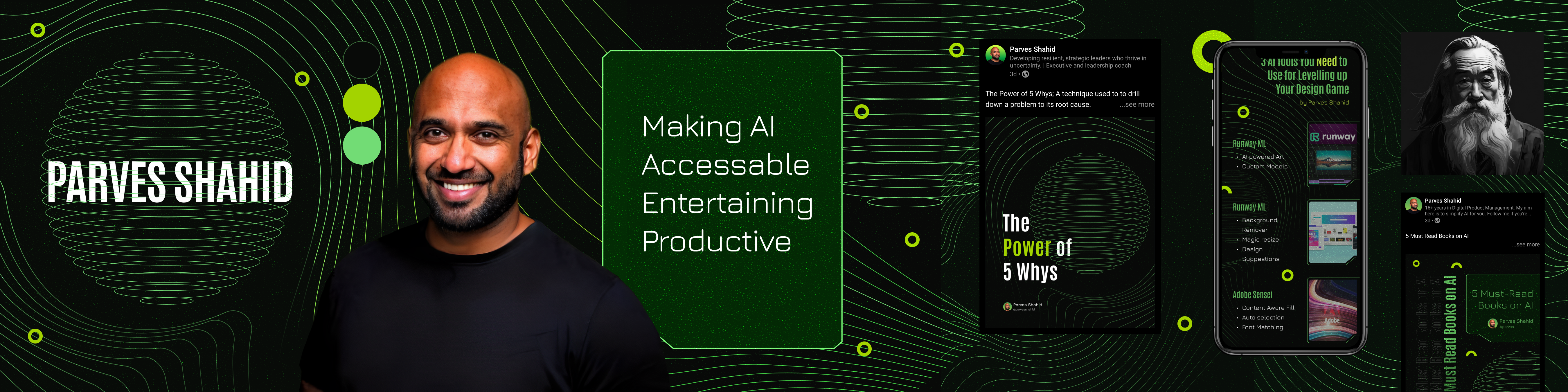
LinkedIn Profile & Cover
The LinkedIn profile is the first thing someone sees before deciding whether to follow or engage. It had to make a strong, immediate impression — one that communicates expertise and consistency at a glance.
The brand system was applied directly to the profile and cover banner, ensuring that the visual identity carries through from the very first touchpoint.
- Strong first impression that communicates credibility
- Cohesive identity between profile visuals and published content
- Immediately recognizable as an AI creator with a defined brand
Carousel Design
AI topics can feel overwhelming when presented as walls of text. The carousel format breaks content into digestible slides — but only if the structure is clear and the hierarchy is intentional.
Each slide was designed with a clear visual hierarchy: one main idea per slide, supported by brief text and guided by the brand's visual system. Layouts are consistent enough to feel familiar, but varied enough to stay engaging.
- Complex AI ideas become easier to follow slide by slide
- Higher engagement — structured content invites interaction
- More shareable because each slide works as a standalone visual
Structured for Retention
Users don't just want to consume AI content — they want to save it and come back to it. Infographics and cheatsheets serve that need, but only when the information is laid out clearly enough to be useful at a glance.
Each infographic was built with deliberate spacing, clear section breaks, and a visual hierarchy that guides the eye naturally from top to bottom. Nothing competes for attention — everything has its place.
- Faster understanding — key points surface immediately
- Better retention — structured layout aids memory
- High save rate — users keep well-designed cheatsheets
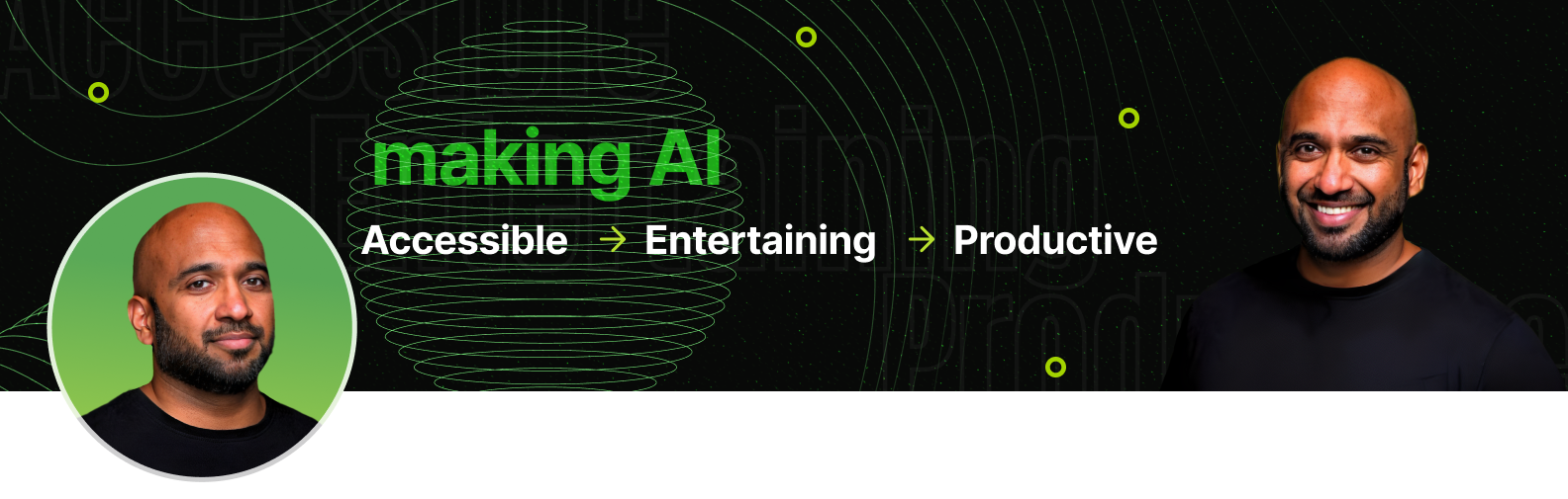
Banner & Visual Identity
Many creators invest in content but neglect the surrounding visual environment. A profile banner without a clear brand system signals inconsistency before the audience even reads a single post.
The same design system applied to the banner creates a unified visual environment — one that reinforces the brand every time someone visits the profile, not just when they engage with a specific post.
- Instant brand recognition across the full profile
- Professional appearance that builds trust before the content is even read
The Impact
The result is a cohesive and scalable personal brand system — built to work across every format Parves Shahid publishes. The carousel breaks down AI topics into structured, shareable slides. The infographics give followers something worth saving. The banner and profile create a consistent first impression. And because everything follows the same visual rules, each piece reinforces the others.
Not just a set of nice-looking visuals — a system that can scale as the creator's content grows.