Gaurav Singh
The Challenge
Gaurav Singh shares structured insights about entrepreneurship, leadership, and decision-making. The ideas are strong — but without a clear visual system, the content risks losing clarity and memorability.
From the visuals:
- Ideas are educational but need stronger visual framing
- Multi-step content can feel overwhelming without structure
- Posts lack a consistent visual identity across formats
Because of this:
- Users may not fully absorb the content
- Key insights get lost in long explanations
- The brand is not instantly recognizable
What We Set Out to Do
Design a personal brand system that simplifies complex ideas and makes them easier to understand, follow, and remember.
- Turn structured thinking into structured visuals
- Make educational content easier to scan
- Build a consistent visual identity across all formats
- Improve clarity without losing depth
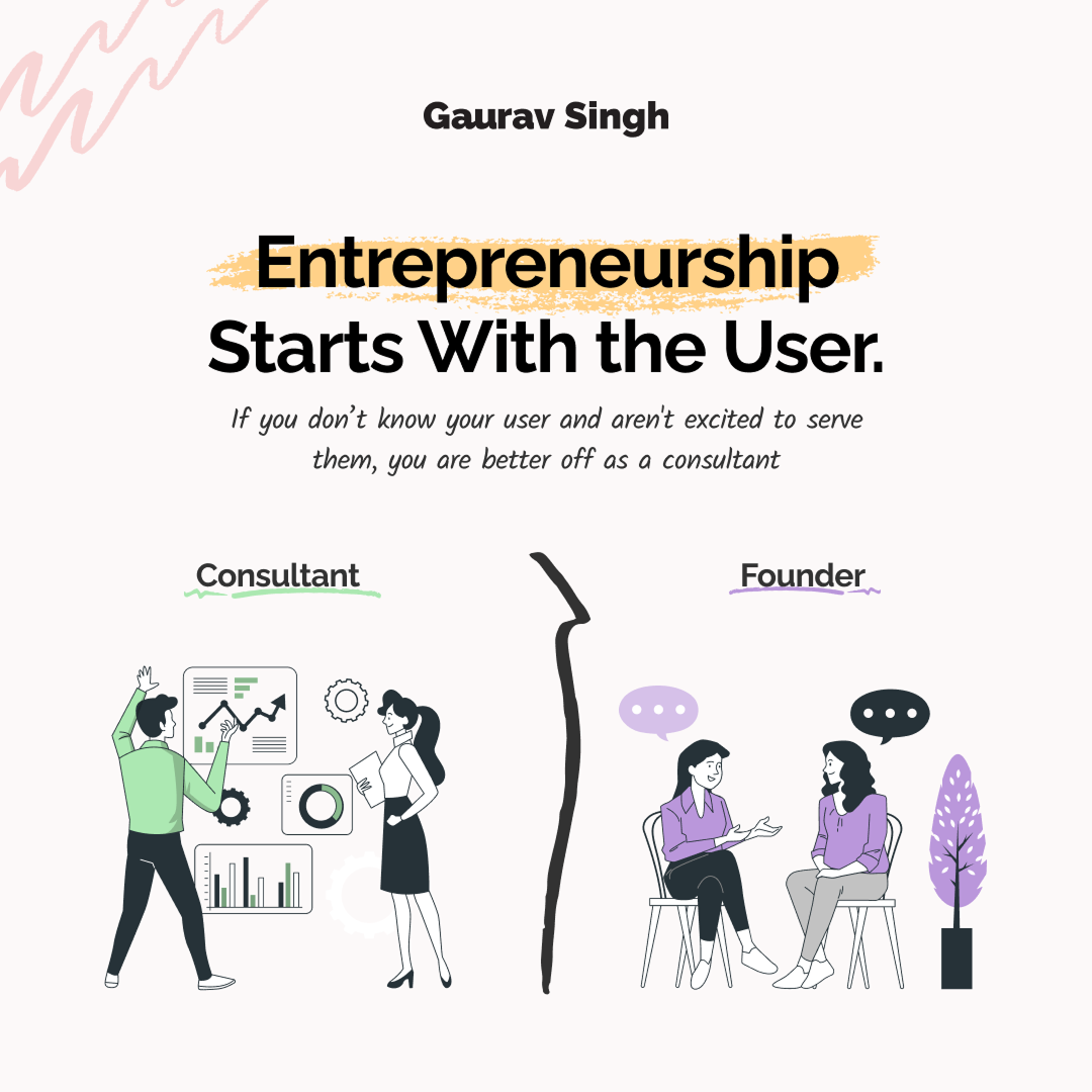
Moodboard & Direction
Before designing layouts, the focus was to define a visual language that supports structured thinking.
Four decisions shaped the direction:
- Light background → improves readability for educational content
- Soft accent colors → highlight key ideas without overwhelming
- Hand-drawn strokes and arrows → guide attention and create flow
- Illustration style → supports storytelling and simplifies concepts
Why: Educational content needs clarity more than decoration. The visuals must guide understanding, not compete with it.
- Content feels approachable and easy to follow
- Users can process information faster
- Visual system supports learning instead of distracting
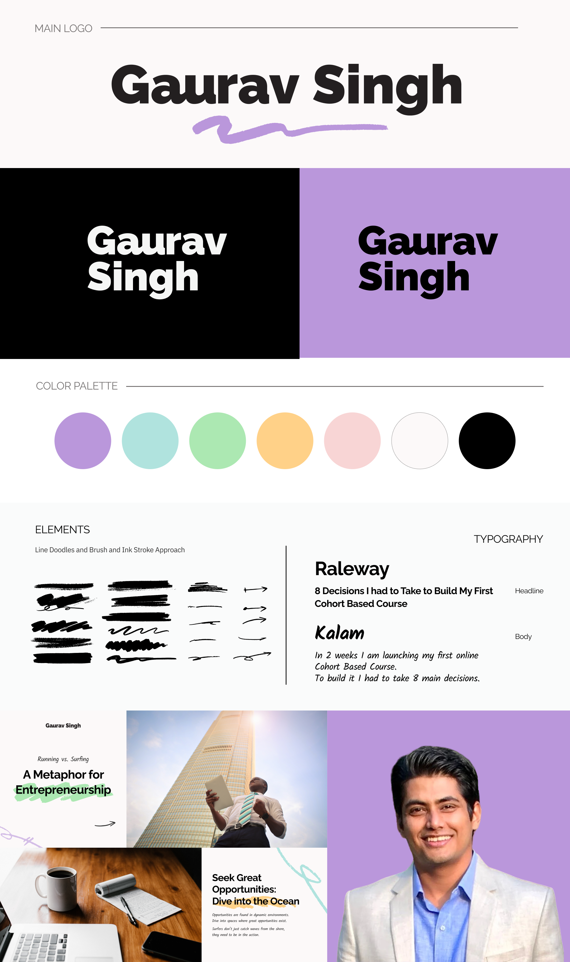
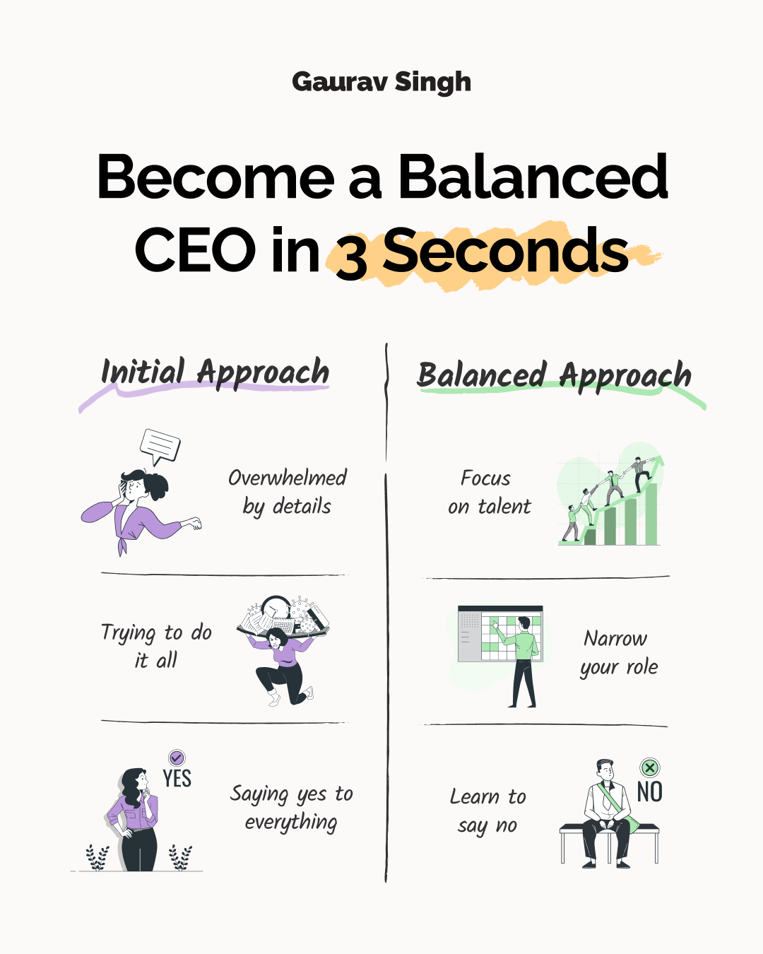
Building the System
Every element is built to serve one purpose — making structured ideas easier to absorb. When the system is consistent, even complex content feels clear.
Header font: Raleway. Supporting text: Kalam. Raleway provides clean, modern structure for headlines and hierarchy. Kalam adds a handwritten quality that makes supporting text feel warm and personal. Purely rigid typography would feel too cold for storytelling content — this balance keeps it human.
A soft neutral base keeps focus on the content. Pastel accents — purple, green, yellow, teal — categorize ideas and highlight key points. When everything looks the same, educational content becomes overwhelming. Color creates the separation users need to scan and retain.
Hand-drawn arrows direct attention across sections. Brush strokes highlight key words. Dividers and layout blocks organize multi-step content. Without visual guidance, even well-structured content can still feel confusing — these elements make the reading path obvious.
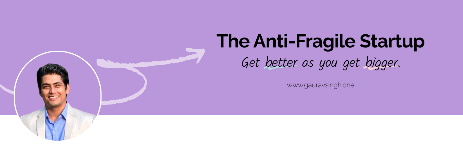
LinkedIn Profile & Cover
The profile is the first touchpoint of the brand. Before a user reads any post or follows any content, the profile layout tells them what to expect.
Design applied:
- Clear headline positioning that communicates expertise immediately
- Balanced layout between text and visuals
- Consistent use of brand colors and elements throughout
- Strong first impression that builds credibility
- Immediate understanding of expertise and content focus
- Cohesive brand presence from the very first visit
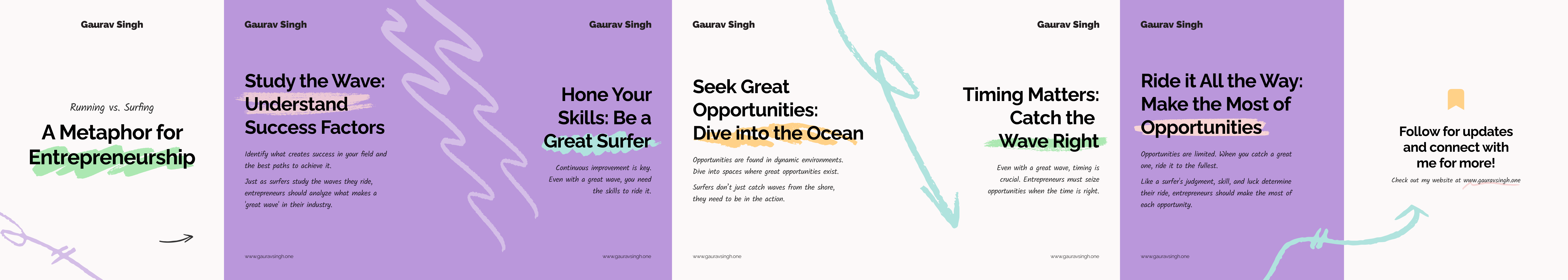
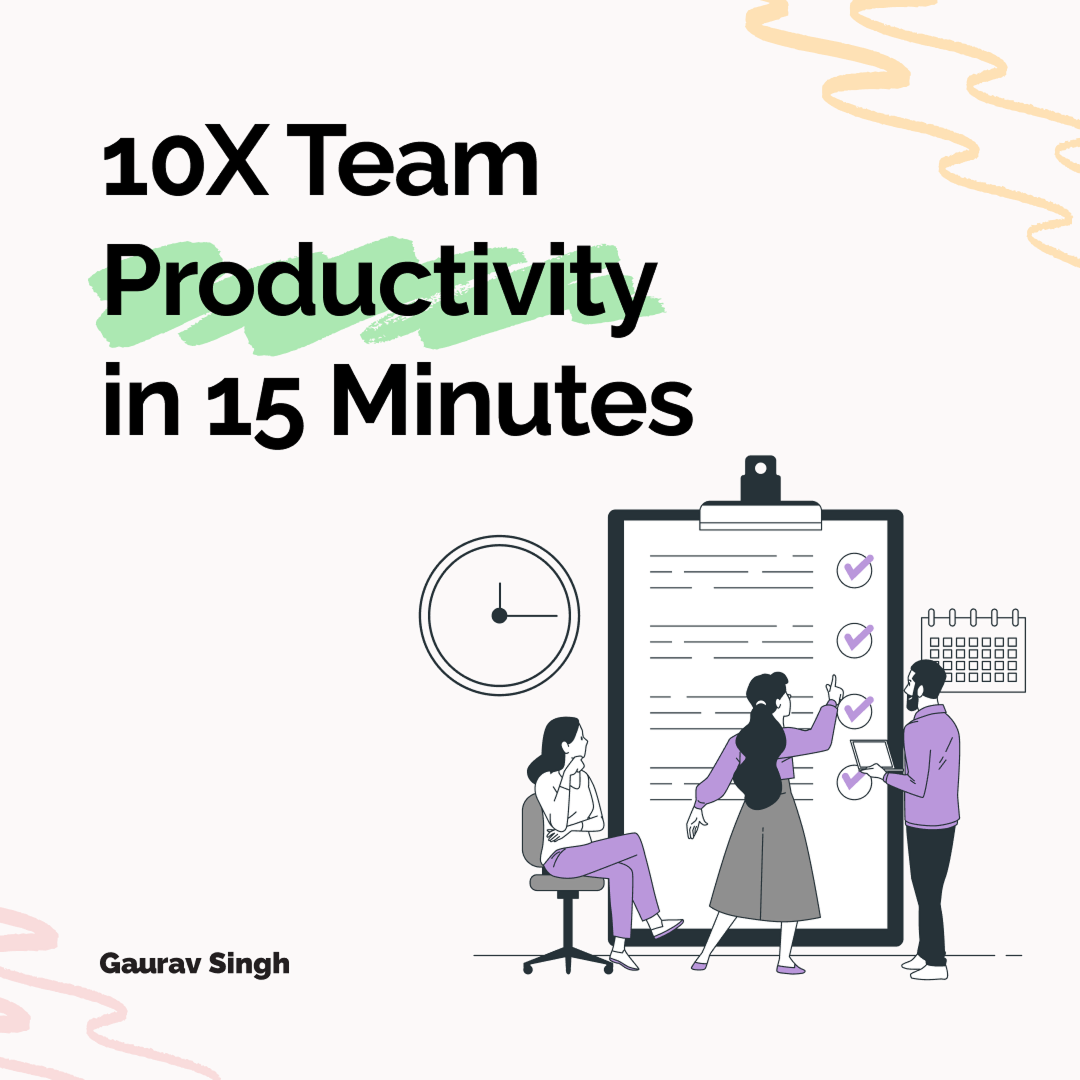
Carousel Design
Multi-slide educational content can feel heavy and hard to follow when ideas compete with each other across slides.
Design decision:
- One idea per slide — nothing competes for attention
- Clear headline with short supporting text per frame
- Visual flow using arrows and highlights to guide reading
- Easier to consume step-by-step without losing context
- Higher engagement — focused slides invite swiping
- More shareable content — each slide works independently
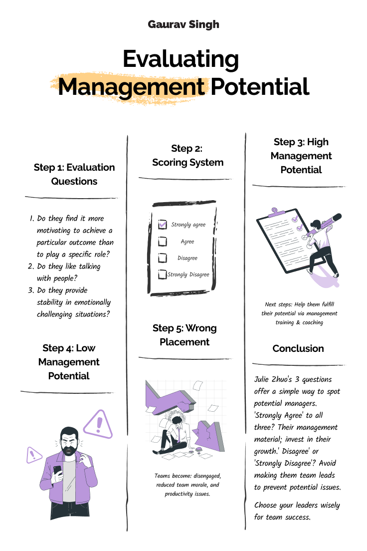
Structured for Retention
Complex frameworks and multi-step ideas are hard to retain when information isn't visually organized. Infographics make the structure of an idea visible.
Design decision:
- Structured layout with clear sections for each idea
- Visual grouping of related concepts
- Icons and illustrations to reinforce each point
- Faster understanding — structure makes the content readable at a glance
- Better memory retention — grouped information sticks
- Users are more likely to save and return to the content
The Impact
The result is a cohesive and scalable personal brand system designed for clarity and learning. Complex ideas become easier to understand. Content is structured and visually guided. The brand identity remains consistent across every format — carousel, infographic, banner, and profile.
Not just a visual upgrade — but a system that improves how content is consumed, understood, and remembered.