Ravi Kumar Sapata
The Challenge
Ravi Kumar Sapata shares strong, opinion-driven insights. The content is bold by nature — but without a distinct visual system, it risks being overlooked in fast-scrolling environments.
From the visuals:
- Key statements did not stand out immediately
- Layouts lacked a strong focal point
- Content blended into the feed instead of capturing attention
Because of this:
- Users scroll past before engaging
- Strong ideas lose their impact
- The personal brand is not instantly recognizable
What We Set Out to Do
The goal was to visually amplify Ravi's voice — so bold ideas land immediately, not after the user has already scrolled past.
- Make bold ideas visually immediate
- Create a strong and recognizable identity
- Introduce a high-impact visual system
- Ensure consistency across all content formats
Moodboard & Direction
The direction focused on contrast, emphasis, and energy.
Three decisions shaped the visual approach:
- Dark background → creates depth and removes distractions
- High-contrast accent color → highlights key words and ideas
- Expressive elements → add energy and personality to the layout
Why: Thought-leadership content competes for attention — it needs to stand out instantly.
- Content becomes visually striking
- Users notice key ideas immediately
- Stronger presence in crowded feeds
Building the System
Every element is built to give Ravi's content immediate visual authority — so the ideas hit before the user has a chance to scroll away.
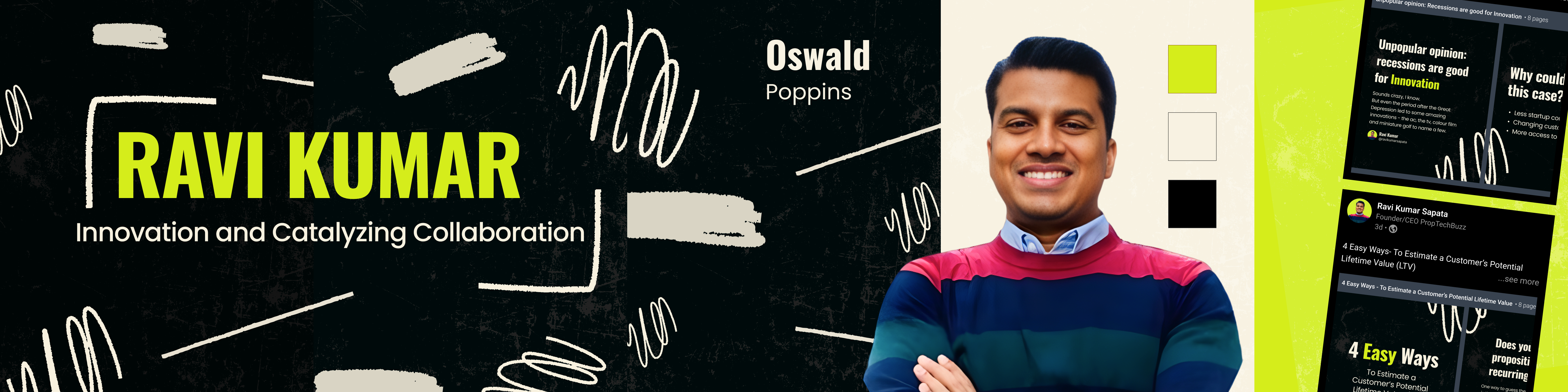
Header font: Oswald. Supporting text: Poppins. Oswald drives bold, high-impact headlines — the kind that stop a scroll. Poppins handles supporting text with clarity and calm. Without strong typography, bold ideas lose authority.
A dark base keeps focus entirely on the content. A bright accent color guides the eye to the most important words. Contrast is essential for visibility — users are directed to key messages before anything else.
Dynamic shapes, highlight strokes, and structured layout blocks — used to reinforce personality. Clean layouts alone wouldn't match Ravi's tone. The design needed energy. Content feels expressive and the visual identity becomes distinct.
LinkedIn Profile & Cover
The profile is the first impression. Before anyone reads a post, they see the banner and the profile layout — it either builds credibility or loses the user.
Design applied:
- Strong typography to communicate authority
- High-contrast visuals that match the content's energy
- Consistent system that extends the brand across the full profile
- Immediate recognition as a bold, opinionated voice
- Strong personal brand presence from the first glance
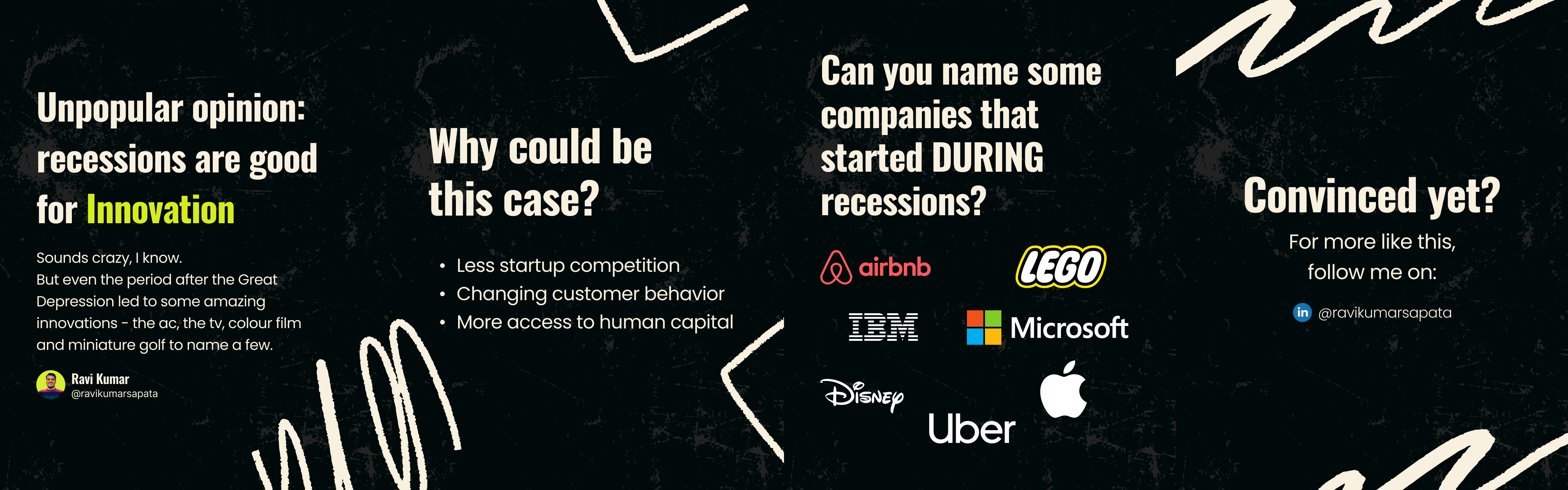
Carousel Design
Long-form opinions are difficult to consume quickly. When every slide competes for attention, the argument gets lost.
Design decision:
- One key idea per slide
- Strong headline per frame to anchor the argument
- Minimal supporting text — enough context, nothing extra
- Easier to follow arguments slide by slide
- Higher engagement — focused slides invite interaction
- More shareable content that stands alone per frame
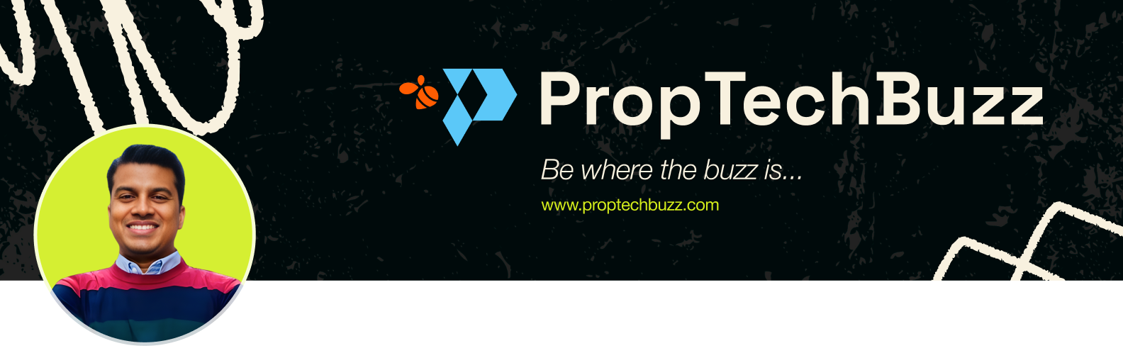
Banner System
Banners are the visual environment surrounding the content. Without a clear system, the profile looks inconsistent even when individual posts are well-designed.
The same visual system applied here ensures the brand identity carries through at every level — not only within posts, but across the entire profile experience.
- Cleaner, more cohesive profile presentation
- Instant brand recognition across all touchpoints
- Professional environment that reinforces credibility
The Impact
The result is a bold and cohesive personal brand system — built around Ravi's voice, not just around aesthetics. Content stands out instantly. Key ideas are immediately visible. The visual identity is strong and consistent across every format.
Not just visually striking — but aligned with how the content is meant to be experienced.