Grace Ling
The Challenge
Grace Ling is an illustration designer with a strong and recognizable visual identity. Her work is expressive, polished, and consistent — making her brand memorable and distinct.
With that strong foundation, this project focuses on exploration: how can her personal brand evolve by introducing a new visual direction?
What We Set Out to Do
Instead of changing her identity, the goal was to expand it.
- Explore a new branding approach that contrasts her illustration style
- Introduce a more structured and layout-driven visual system
- Create a flexible direction she can use for different types of content
- Maintain her identity while opening room for experimentation
This approach allows her brand to grow without losing what already works.
Moodboard & Direction
The direction focused on contrast and versatility.
Three key decisions shaped the approach:
- Shift from illustration-led visuals → to layout and typography-driven design
- Use structured compositions → to create a more editorial feel
- Apply controlled spacing and hierarchy → to guide content more clearly
This creates a complementary direction — expressive (existing style) alongside structured (new exploration).
- Expands her creative range
- Makes the brand adaptable across different formats
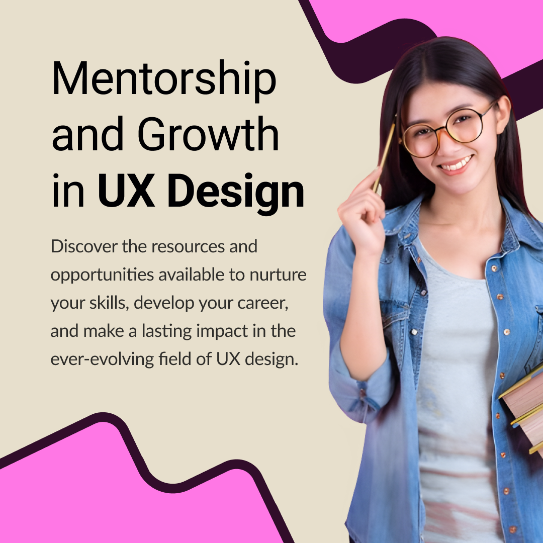
Building the System
This system is designed as an additional layer for her branding.
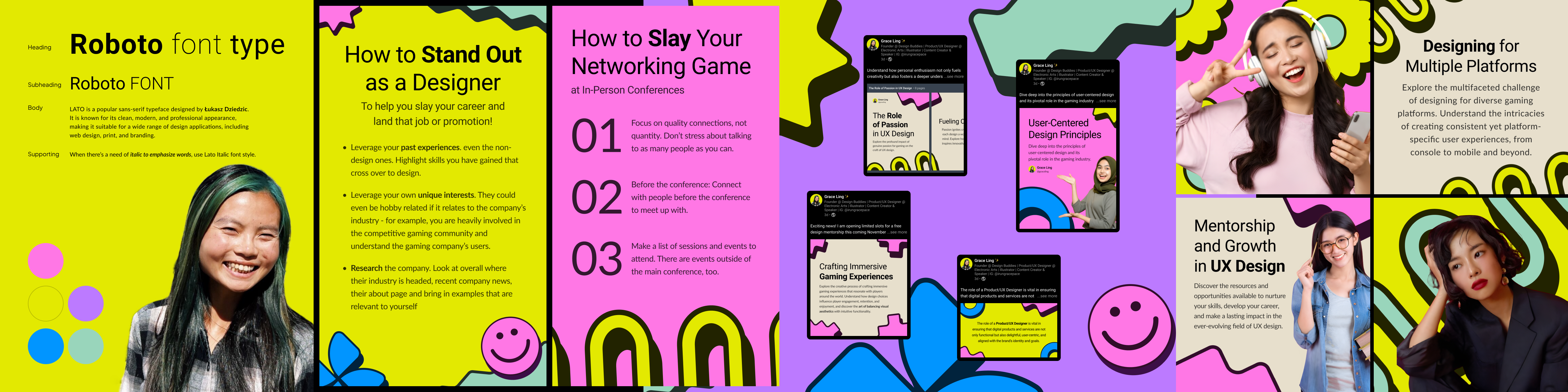
Header font: Roboto. Supporting text: Lato. Typography becomes the core visual driver — Roboto for clean, structured headlines; Lato for readable, balanced body text. Shifts focus from visual illustration to content clarity.
Simplified and intentional — neutral base for clarity with accent colors used selectively for emphasis. Highlights key information while maintaining a clean and modern feel.
Clean layout containers, consistent spacing system, and minimal visual accents. No decorative elements — everything serves a structural purpose, making layouts easy to scale across content types.
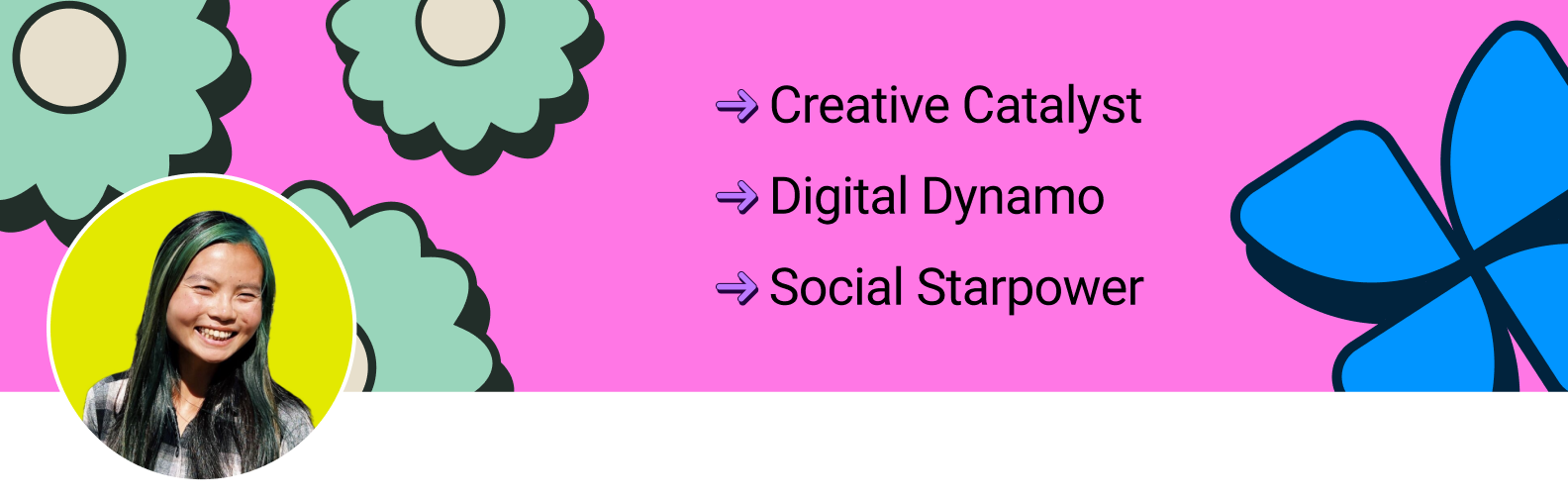
LinkedIn Profile & Cover
The profile and cover introduce this new direction at the first touchpoint.
- Typography-driven layout
- Structured composition
- Clear information hierarchy
- Presents a more versatile side of her personal brand
- Strengthens professional positioning
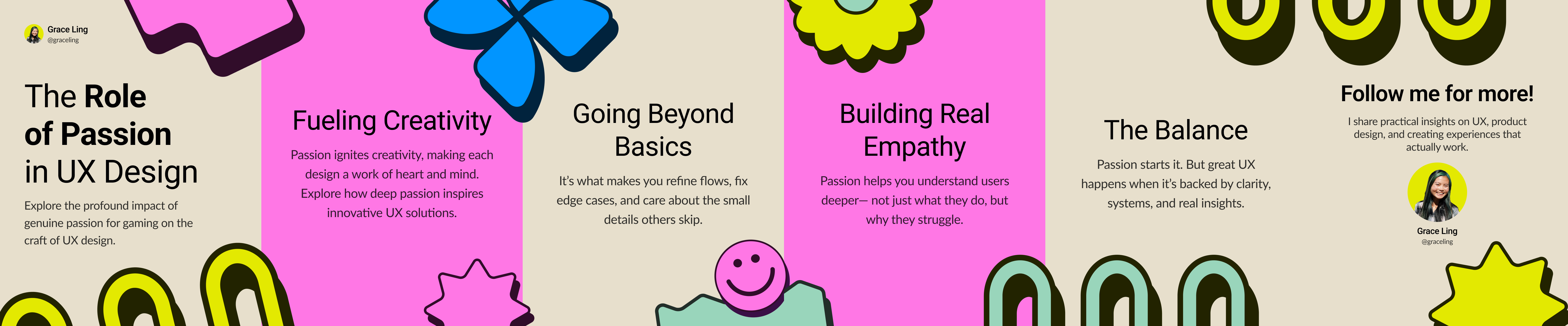
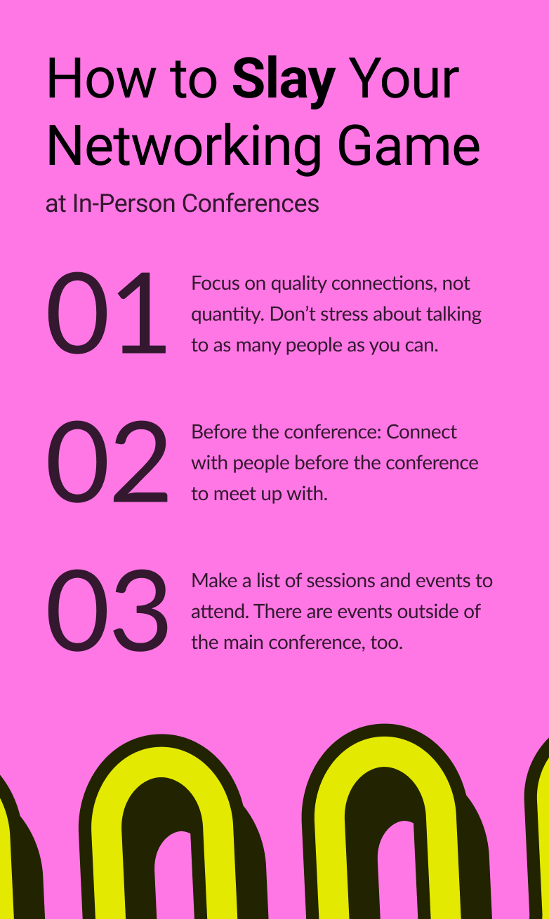
Carousel Design
This format explores how structured layouts can support storytelling.
- One idea per slide
- Clear hierarchy between headline and details
- Consistent layout system
- Easier to follow content
- Better balance between clarity and creativity
Banner & Visual Identity
Multiple banner variations showcase the flexibility of this direction.
- Consistent layout and typography across all variations
- Structured composition that translates across formats
- Demonstrates range without breaking the system
- Cleaner presentation across screen sizes
- Reinforces the structured direction of the brand
The Impact
The result is a flexible extension of Grace Ling's personal brand.
This is not a shift away from her identity — but an expansion of it. A system that allows both expression and structure to coexist.