Incremental
Incremental is a newsletter platform landing page redesign focused on improving product clarity, content hierarchy, and conversion flow for users who want to connect their writing app to their email delivery platform.
Incremental already had an existing landing page. The work focused on reviewing and improving that experience — sharpening the product message, layout, and visual hierarchy — rather than building a new design from scratch.
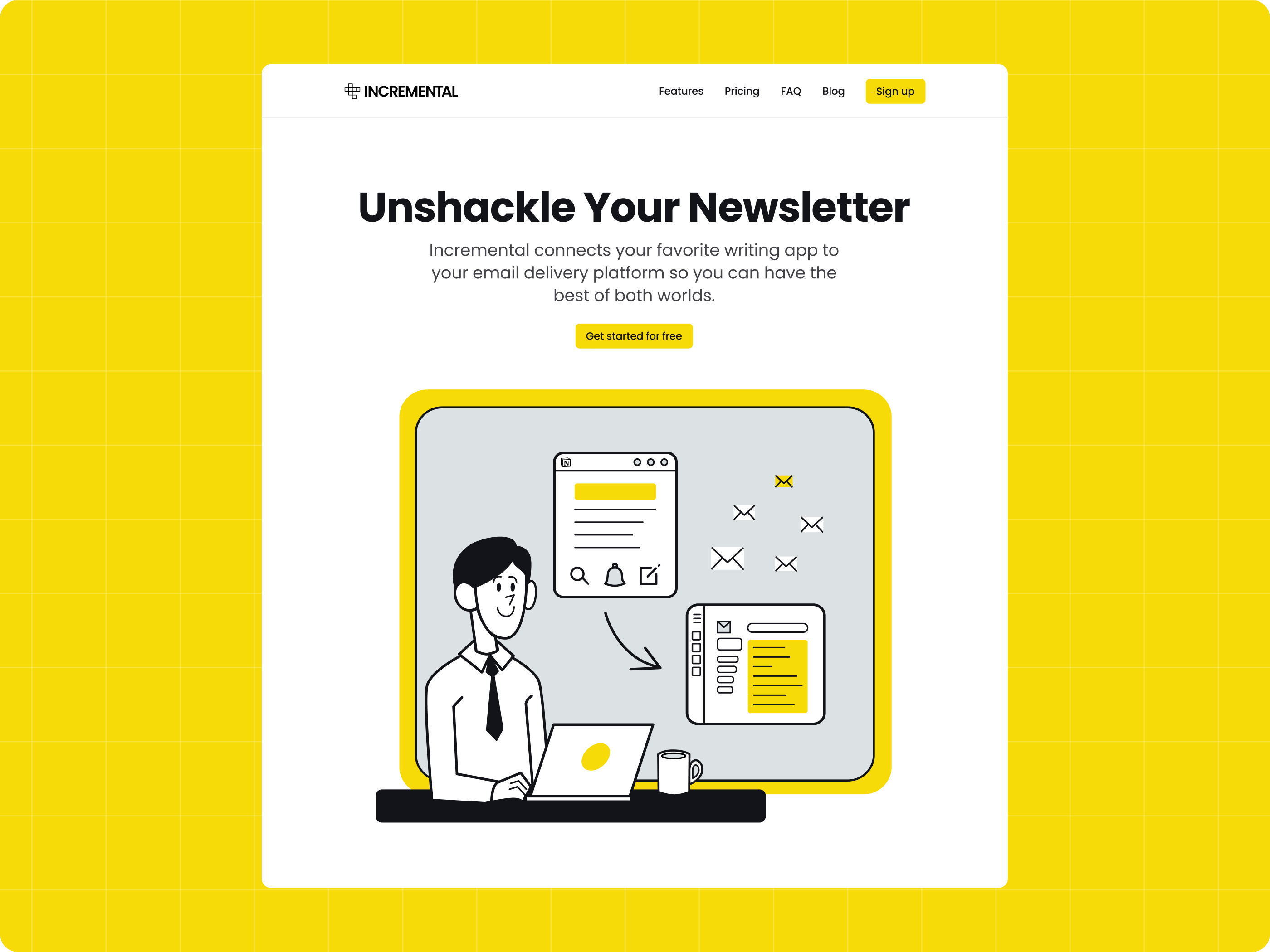
Helping users connect their writing workflow with email delivery.
Incremental connects a user’s favorite writing app to their email delivery platform so they can save the best of both worlds. The product supports newsletter creators by helping them write content in Notion, sync content to their email service provider, manage newsletter content, and avoid manual formatting or migration issues.
The existing landing page needed clearer hierarchy and stronger product storytelling.
The original landing page already communicated the product idea, but the structure needed improvement. Some sections felt too plain, the visual hierarchy was not strong enough, and the product benefits needed to be easier to scan. The redesign focused on improving clarity, layout flow, trust-building sections, pricing presentation, and the main call-to-action.
- Product message needed to be clearer at first glance
- Key benefits needed better visual hierarchy
- Sections needed stronger spacing and flow
- Pricing and FAQ needed to feel easier to compare
- CTA areas needed to stand out more
- The page needed a more polished and engaging visual direction
Understanding what the client wanted to improve.
The project started with a discovery call to understand the client’s goals, existing landing page, product value, and areas that needed improvement. Since the website already existed, the design process focused on improving the experience instead of rebuilding the direction from scratch.
- Reviewed the existing landing page
- Discussed what the client wanted to improve
- Clarified the product value and target message
- Identified important landing page sections
- Aligned on improving content hierarchy, layout, and CTA clarity
Exploring a visual direction that could support the improved landing page.
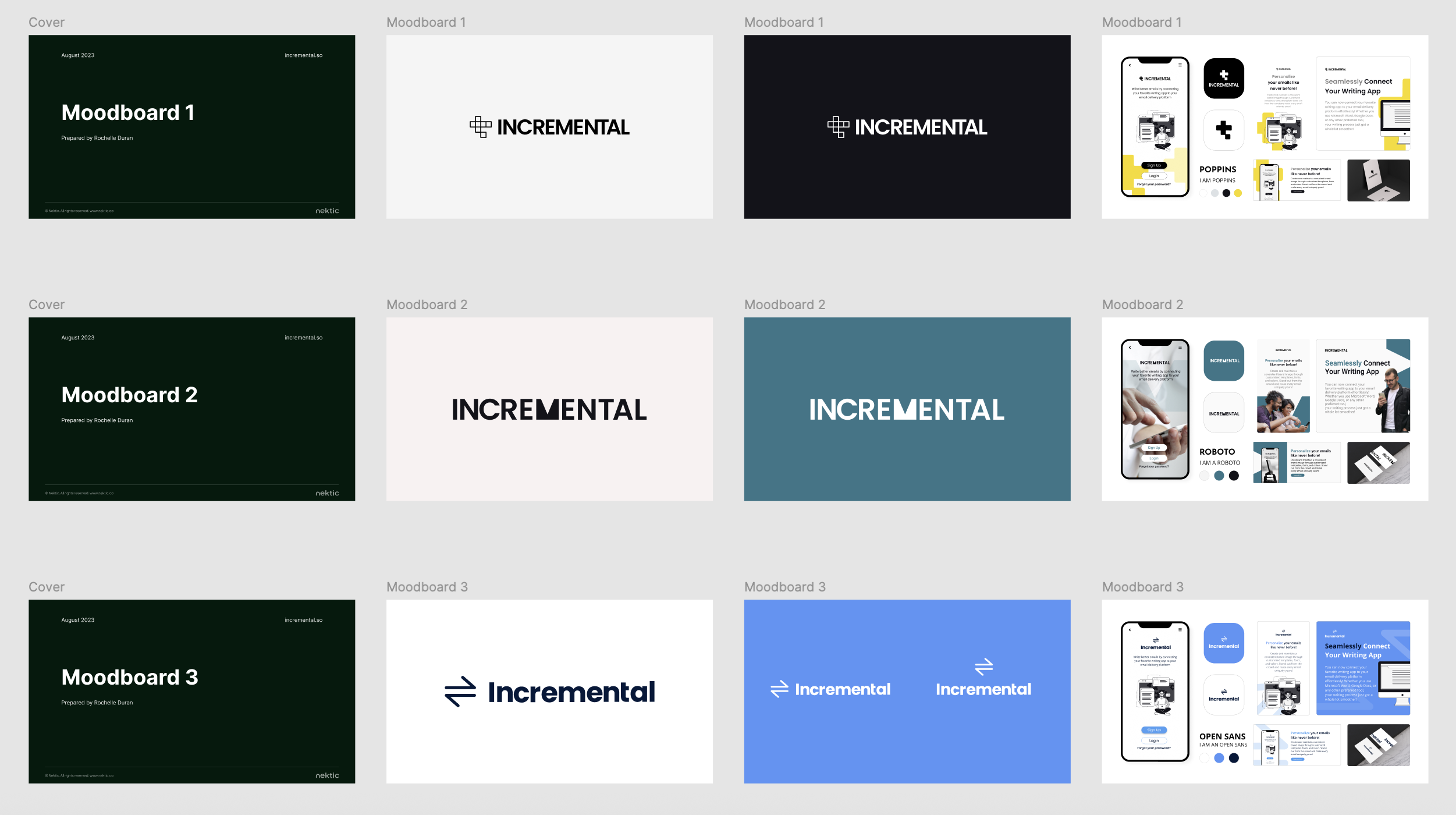
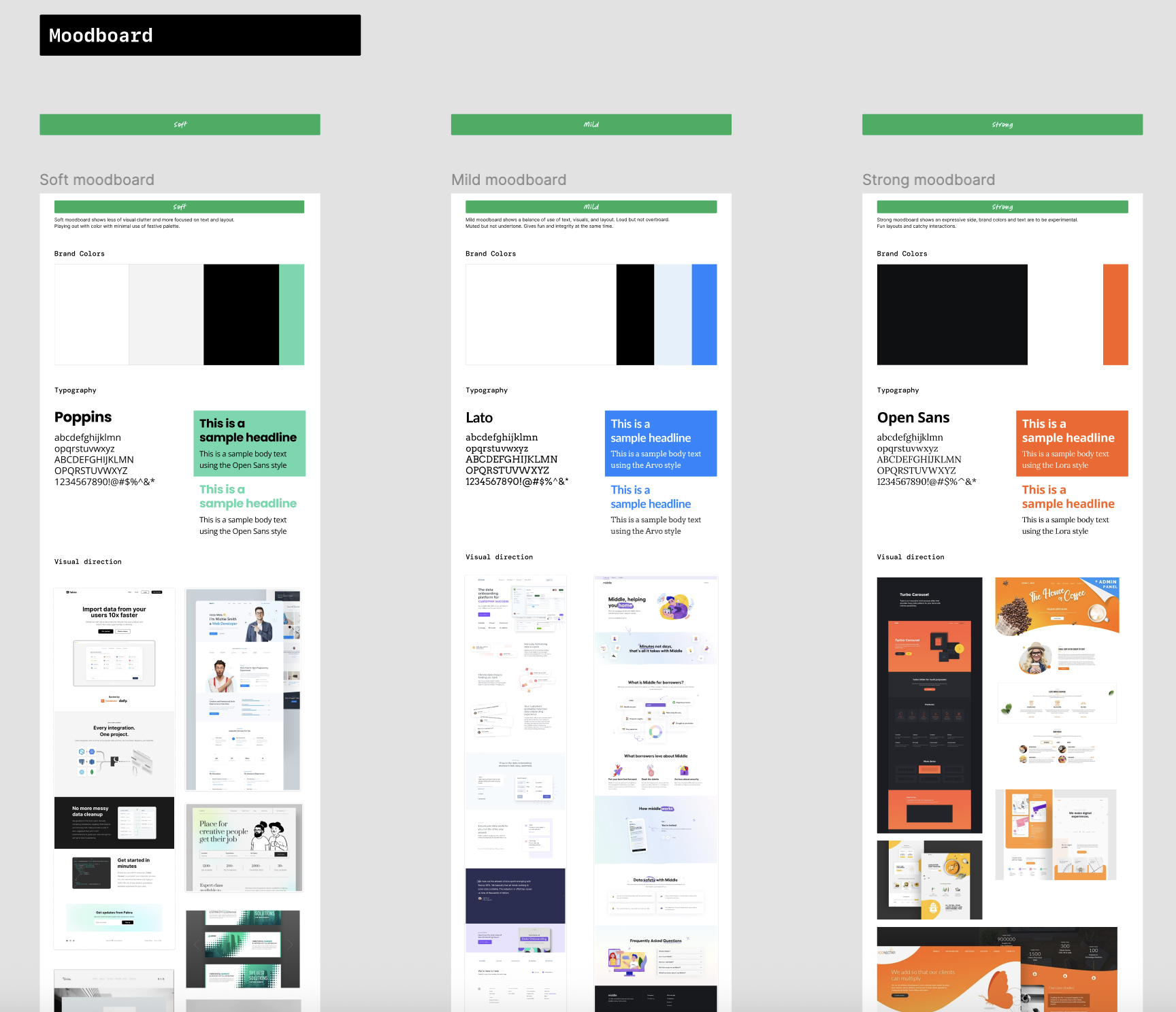
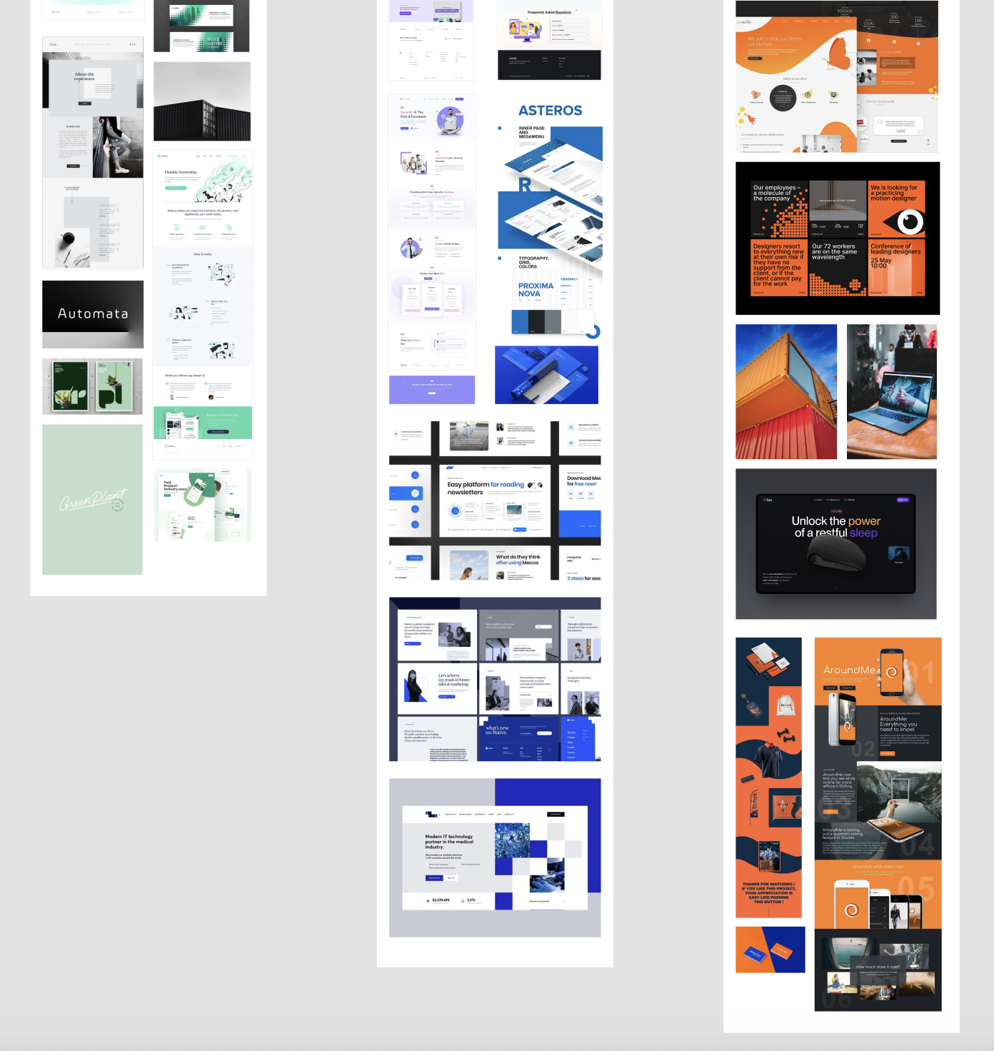
Alongside the UI/UX redesign, I also helped explore Incremental’s brand design direction. Since the timeline was short, the brand exploration had to be completed quickly and clearly before the final UI design started. The goal was to align on a visual approach that could make the landing page feel more polished, recognizable, and easier to remember.
The client preferred the first moodboard direction because it used a darker and cleaner visual style, a strong black and white foundation, illustration-heavy visuals, and the brand color as a highlight. This helped guide the final landing page direction and made the design feel more intentional and visually distinct.
Final visual choices that shaped the landing page direction.
After the brand exploration, the final visual direction was defined through color, typography, illustration, and photography choices. These decisions helped the landing page feel clean, focused, and more memorable while supporting the product’s main message and calls to action.
The final color direction uses a clean black, white, and sunrise yellow palette. The yellow works as the highlight color to make key actions, illustrations, and important UI elements stand out.
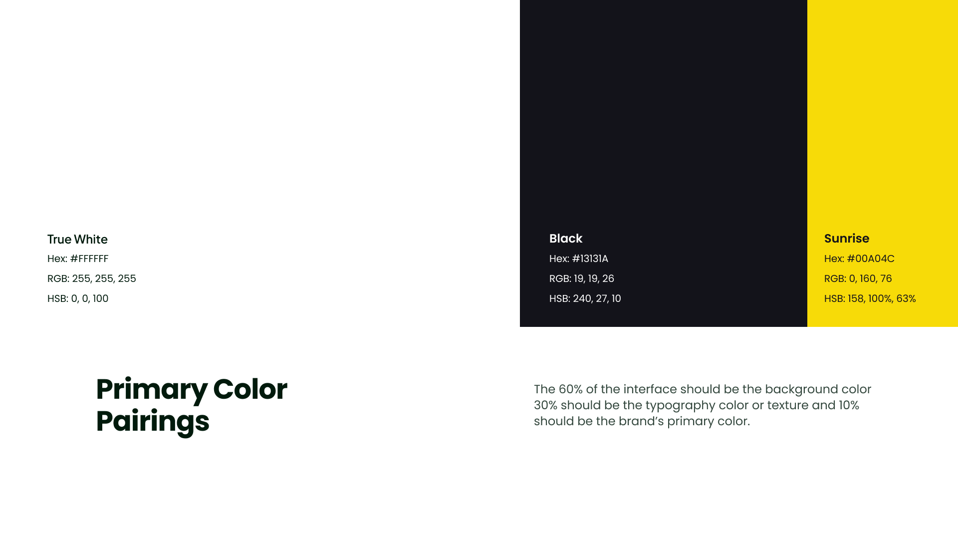
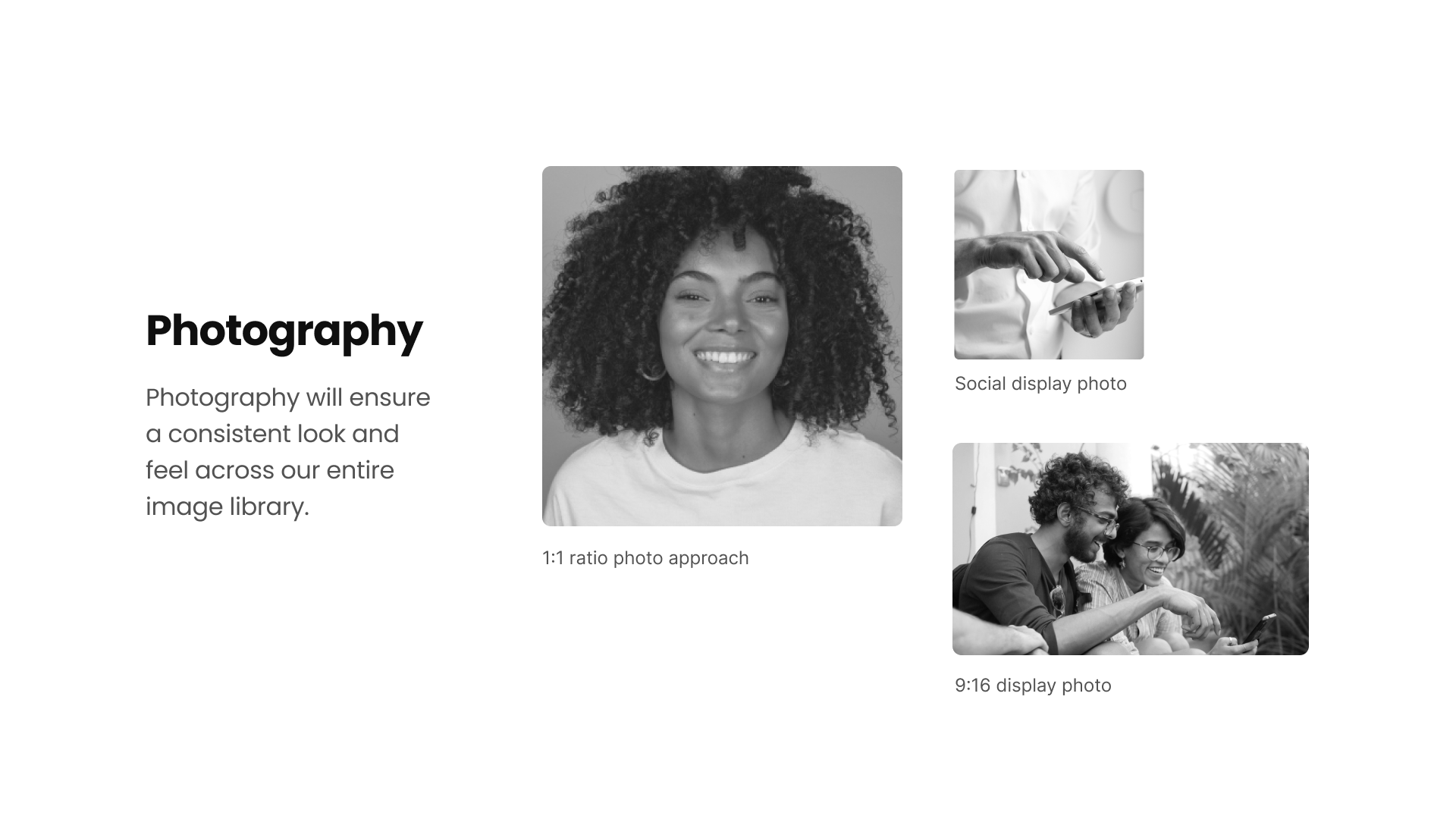
Poppins was used as the main typeface because it feels geometric, clean, readable, and flexible for a modern landing page experience.
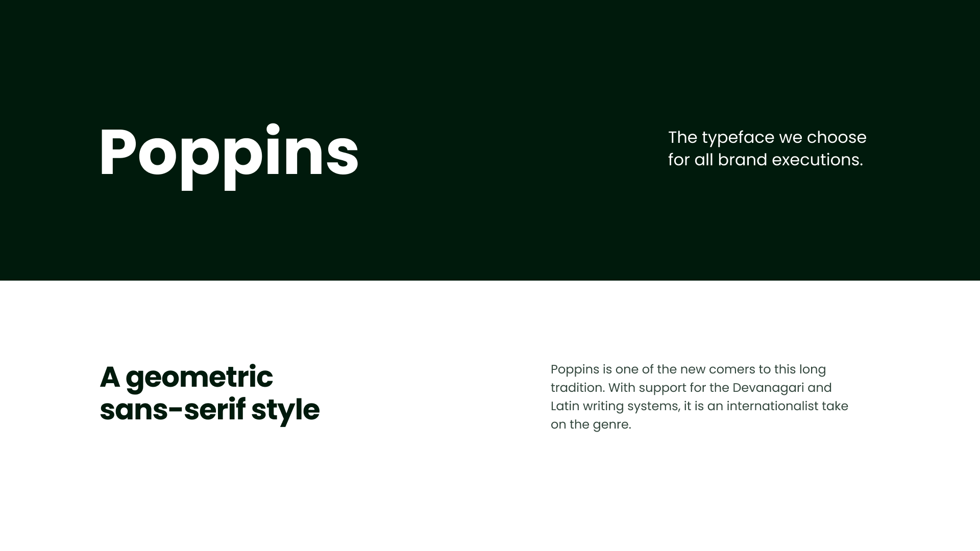
The illustration direction became a key part of the landing page. The style uses black-and-white drawing or illustration with yellow highlights to make important moments pop and explain product benefits in a friendly way.
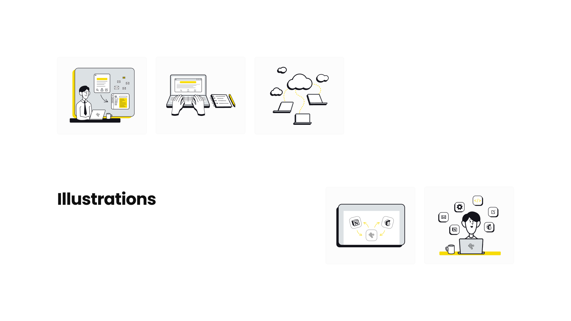
The photography direction supports a consistent black-and-white image style, helping the brand feel clean and focused without creating too much visual noise.
A focused 1-week process from discovery to developer handoff.
Because Incremental already had an existing landing page, the project moved through a focused 5-day process: reviewing the current site, planning the improved structure, exploring the visual direction, designing and refining the mock-up with the client, and preparing the design for developer handoff.
Studying similar product websites to improve the page structure.

Competitor and reference websites were reviewed to understand how similar tools present features, pricing, testimonials, CTA sections, and product explanations. This helped identify useful patterns that could improve Incremental’s landing page without copying another product’s design.
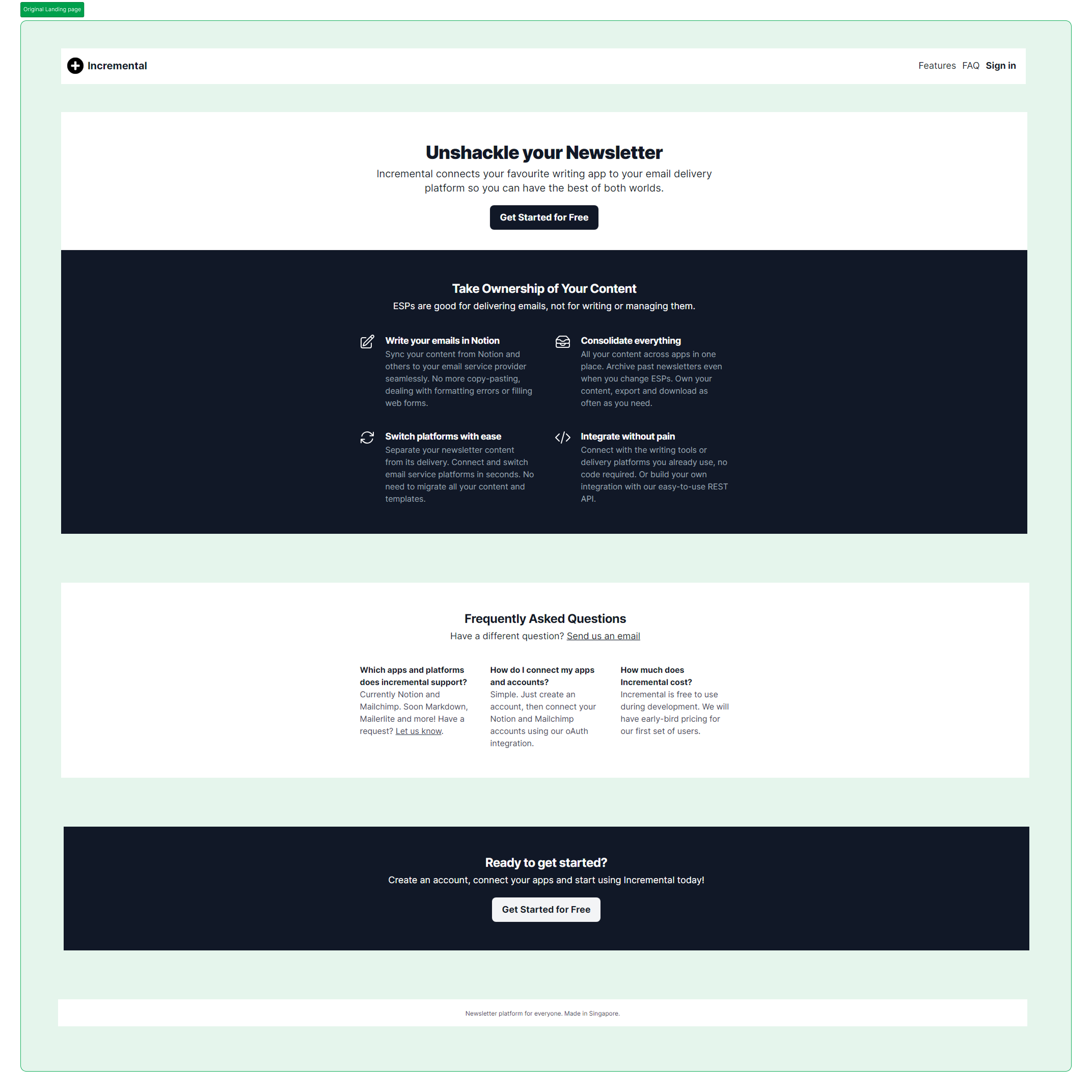
Reviewing the existing design before improving the experience.
Before redesigning the page, the existing Incremental landing page was reviewed to understand its current structure, content, and gaps. This helped identify what needed to be retained, improved, or restructured in the new design.
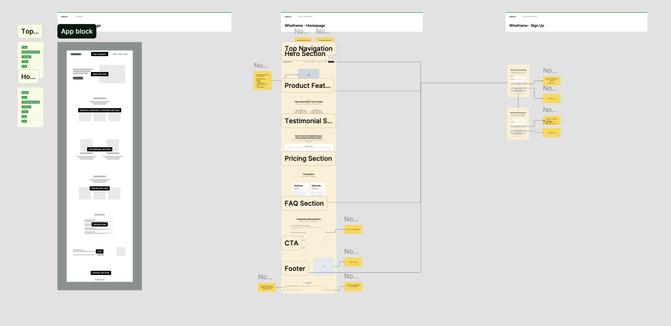
Planning the improved landing page flow before visual design.
The sitemap and wireframe stage helped organize the updated landing page structure. This included planning how users move from the hero message to features, testimonials, pricing, FAQ, final CTA, and footer. The goal was to create a clearer flow that made the product easier to understand and easier to act on.
Exploring a cleaner and more engaging landing page direction.
Moodboarding helped explore how the improved landing page could feel more polished, modern, and product-focused. The visual direction focused on keeping the experience simple and readable while making the product benefits, illustrations, pricing, and CTA areas more engaging.
Improving the landing page with clearer sections and stronger visual hierarchy.
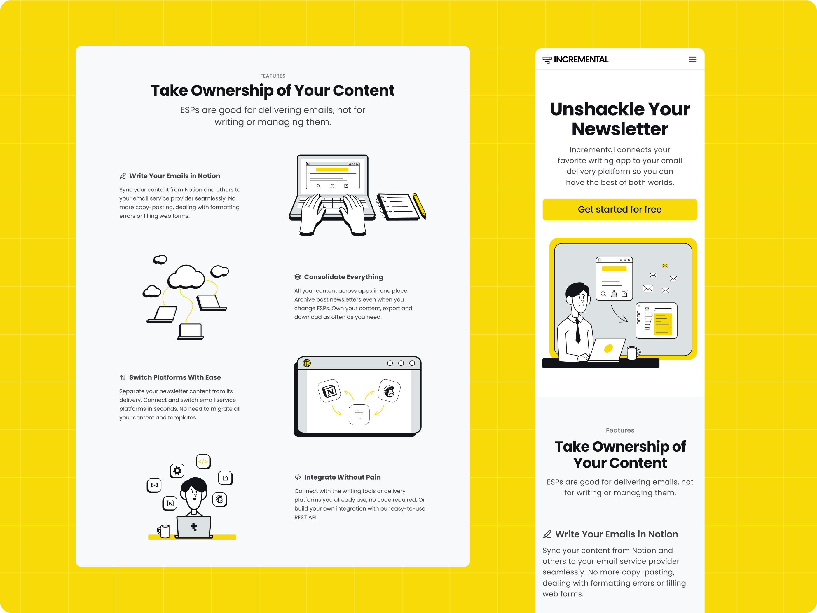
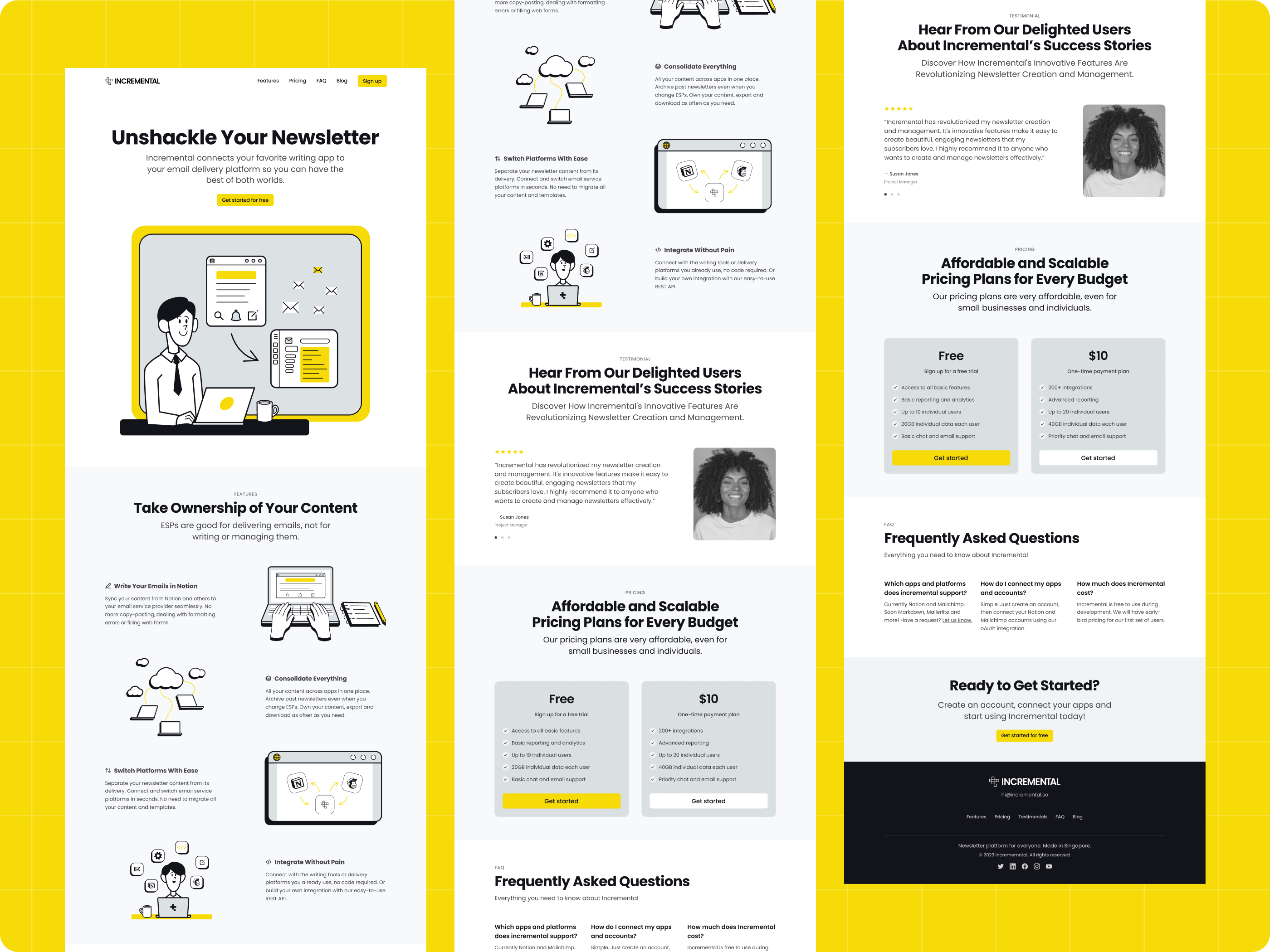
The final mock-up improved the existing landing page by creating a stronger hero section, clearer feature explanations, better section spacing, more engaging illustrations, improved testimonial presentation, clearer pricing cards, a more organized FAQ section, and a stronger final CTA.
Refining the landing page based on client feedback.
During the design phase, the mock-up was reviewed with the client and adjusted based on feedback. The refinement focused on improving readability, spacing, section flow, visual consistency, CTA clarity, and overall polish before preparing the design for development.
Preparing the improved design for implementation.
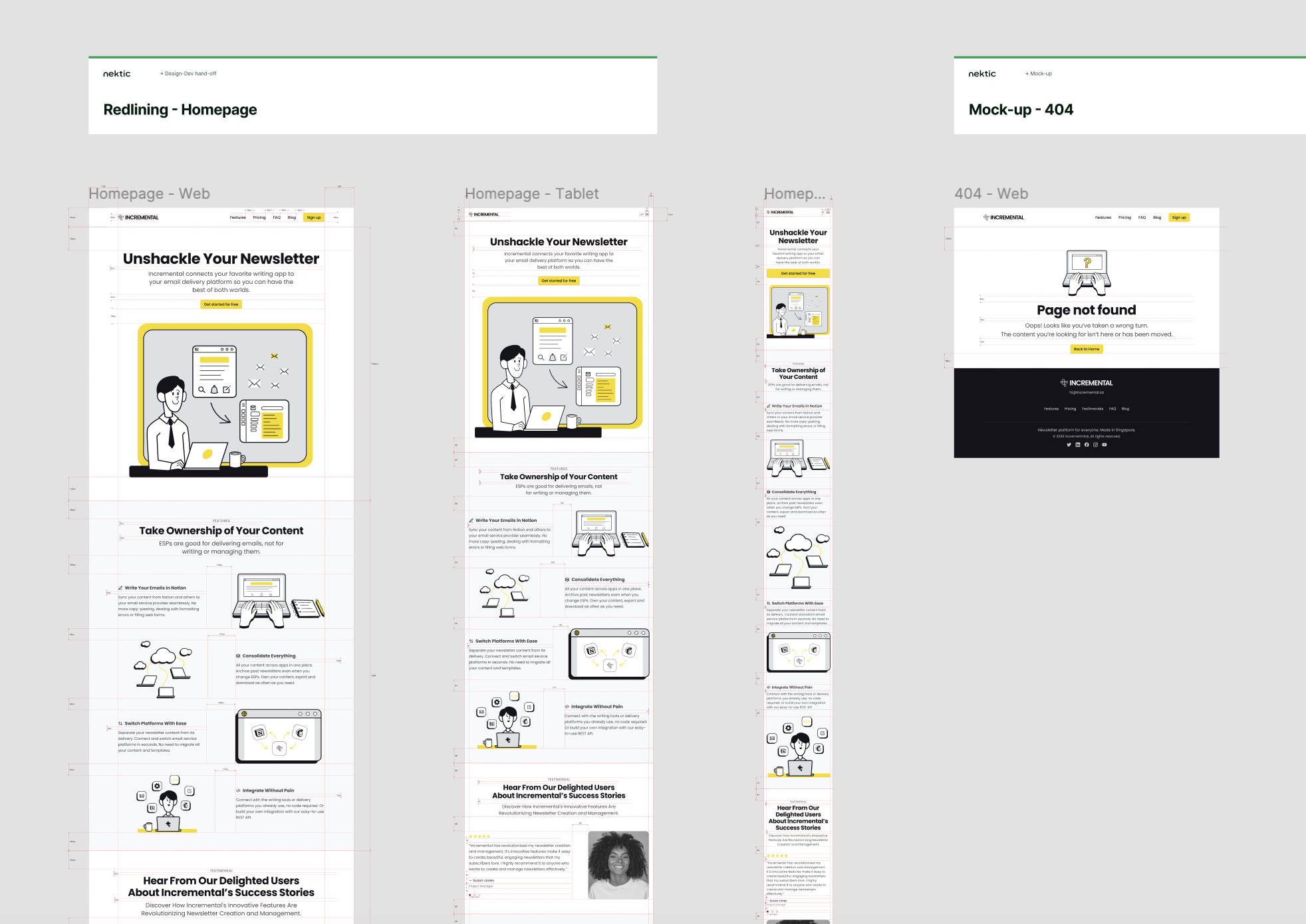
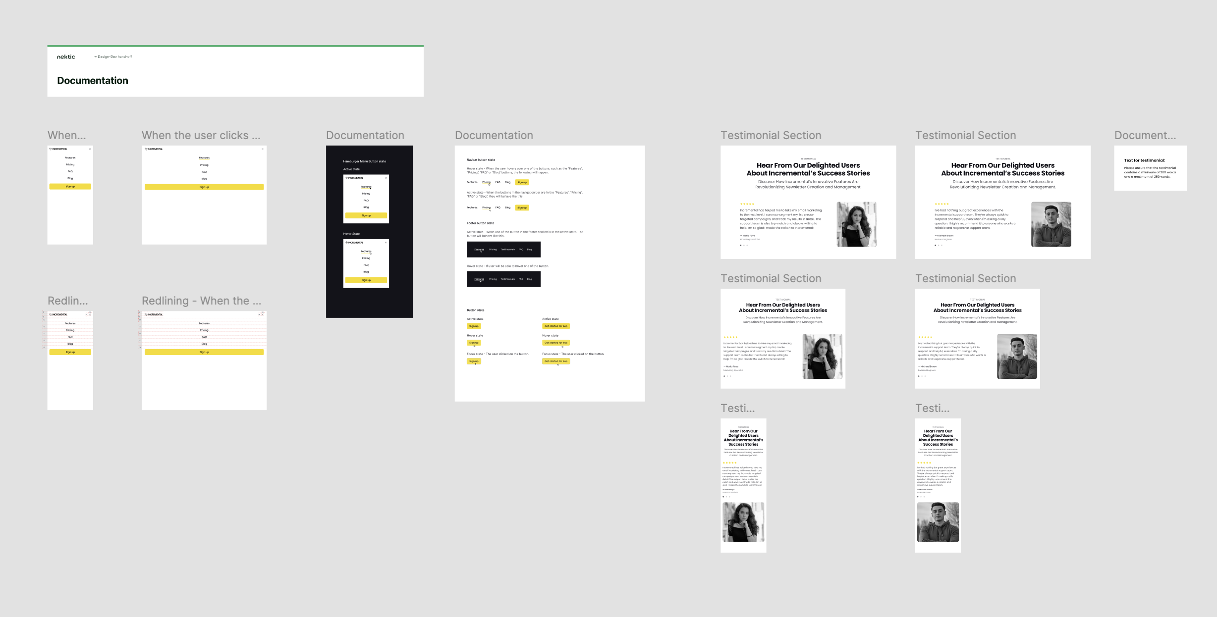
After the final review, the design was prepared for developer handoff. The handoff included the final landing page design, layout references, spacing notes, section structure, CTA behavior, and responsive design guidance needed for implementation.
- Final landing page mock-up
- Section structure and layout notes
- Spacing and alignment references
- CTA behavior notes
- Responsive layout guidance
- Developer handoff support
A clearer and more polished landing page for Incremental.
The final Incremental landing page redesign made the product easier to understand and more visually engaging. The improved structure helped communicate the product benefits, explain the workflow, present pricing more clearly, and guide users toward getting started.
The client was satisfied with the final direction because the black-and-white, illustration-heavy approach with yellow highlights made the landing page feel more polished, distinct, and easier to understand.
Improved the existing landing page instead of rebuilding from scratch
Helped explore a fast, focused brand direction alongside the UI/UX redesign
Strengthened product messaging and content hierarchy
Made the feature sections easier to scan
Improved pricing, FAQ, and CTA presentation
Created a more polished, black-and-white, illustration-heavy visual direction with yellow highlights
Prepared the design for development handoff