Kim Frances Santillana
The Challenge
Kim Frances creates valuable, informative content, but the visual presentation made it harder to absorb quickly.
From the visuals:
- Content relied heavily on text without strong hierarchy
- Layouts felt inconsistent across posts
- Important points didn't stand out immediately
Because of this:
- Users needed more time to process each post
- Key insights were easily overlooked
- Engagement dropped despite strong content
What We Set Out to Do
The goal was not to redesign the content — but to redesign how it is consumed.
- Make content easier to scan
- Introduce clear visual hierarchy
- Build a consistent system across all outputs
- Maintain a clean and professional identity
Moodboard & Direction
The direction focused on clarity and structure.
Three design decisions shaped the approach:
- Clean layout → removes unnecessary noise
- Controlled spacing → separates ideas clearly
- Minimal color usage → highlights only what matters
Why: Users don't read everything — they scan first.
- Faster comprehension
- Improved readability
- Better engagement
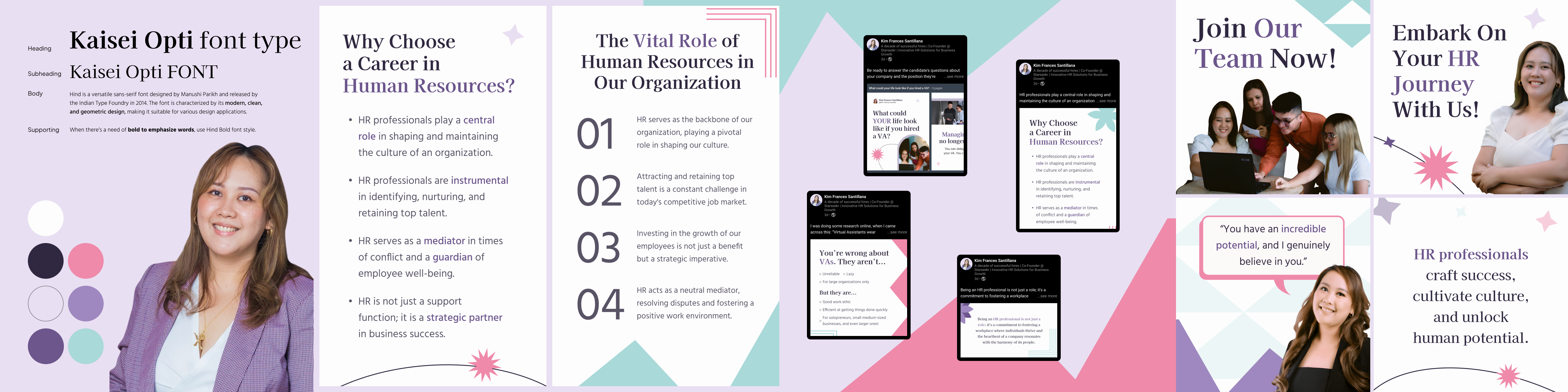
Building the System
Every element is defined with a purpose — to make the content easier to read, recognize, and scale.
Header font: Kaisei Opti. Supporting text: Hind. Kaisei Opti creates emphasis and authority in headlines. Hind keeps body text readable and balanced. Without strong hierarchy, all text competes equally — and nothing stands out.
Color is used as a guide, not decoration. A neutral base keeps the layout clean. An accent color draws attention to key words selectively. Too much color creates noise — this keeps focus where it belongs.
Consistent spacing, layout containers, and alignment rules applied across every format. Random layouts reduce consistency — a defined system makes every piece predictable and easy to scale.

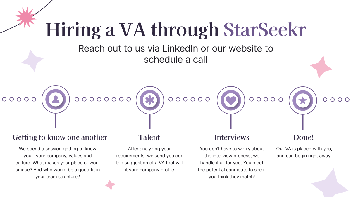
LinkedIn Profile & Cover
The profile is the first impression. Before a user reads a single post, they see the profile — it sets the expectation for everything else.
The design system was applied directly here:
- Strong headline hierarchy
- Clean and structured layout
- Consistent visual system
- Immediate clarity at first glance
- Professional and credible presentation
- Strong, recognizable brand identity
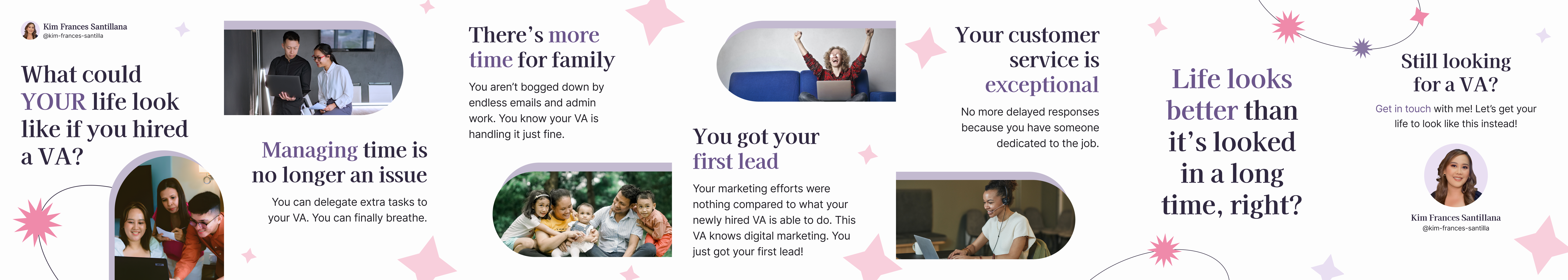
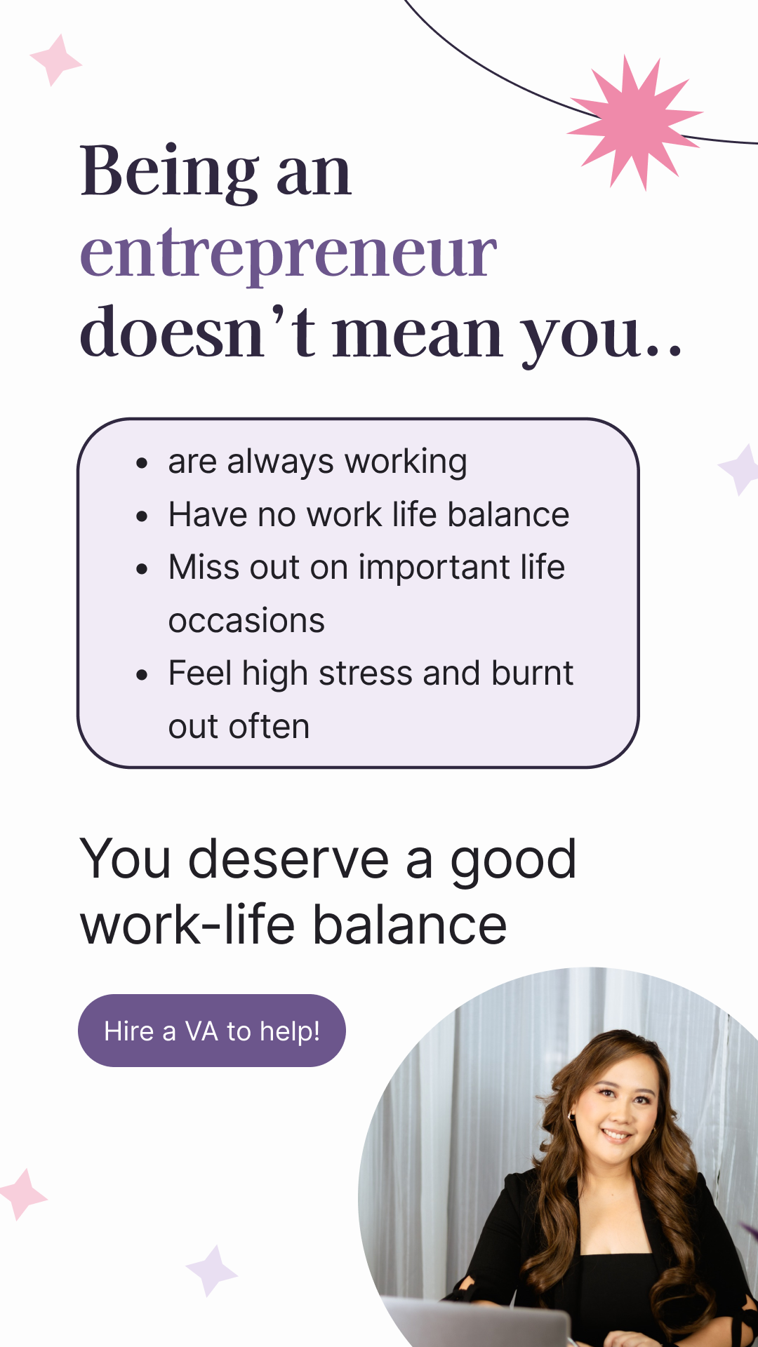
Carousel Design
Long text reduces engagement. The carousel breaks content into structured, easy-to-follow slides — but only if each slide is intentionally designed.
Design decision:
- One idea per slide
- Clear headline with supporting text
- Consistent layout system throughout
- Easier to follow from slide to slide
- Higher engagement per post
- Better content retention

The Impact
The result is a structured and scalable personal brand system.
Not just better visuals — but a better content experience.