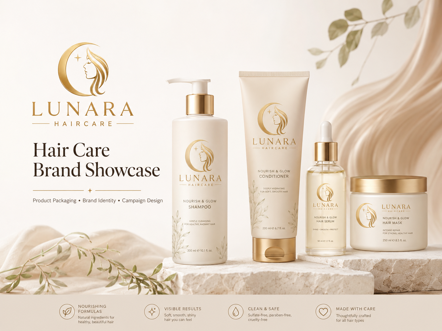
Lunara Haircare
An AI-assisted branding project for a premium hair care brand, created to explore a soft, elegant, and trustworthy visual identity for modern self-care.
The Challenge
Many hair care brands either feel too clinical, too generic, or too luxurious in a way that can feel distant from everyday users. For Lunara Haircare, the challenge was to create a brand identity that feels premium and elegant while still remaining warm, gentle, and approachable.
The brand needed to communicate softness, nourishment, healthy shine, and calm self-care without making the design feel crowded or overly decorative. It also needed a visual system that could stay consistent across multiple touchpoints — from product packaging and brand presentation to merchandise.
Because Lunara is positioned as a modern hair care brand, the identity needed to balance beauty, trust, and simplicity — polished enough for a premium product, but still calm and personal enough for everyday self-care.
The Approach
The solution was to build a cohesive brand identity system rooted in the Lunara concept — a name drawn from "luna" (moon) and "aura" (glow and presence) — that communicates softness, nourishment, and quiet confidence across all brand materials.
- Brand overview — setting the tone for the full identity system
- Logo and brand identity — grounded in clarity, balance, and recognizability
- Color system — warm neutrals, muted cream, champagne, and subtle gold
- Typography and visual direction — refined, modern, and beauty-focused
- Merch collection — extending the identity into physical applications
- Product packaging — minimal, polished, and self-care focused
AI was used to support faster creative exploration and help test how the identity could work across different brand materials. The final direction, design decisions, and presentation were refined by the designer to make sure the output felt realistic, intentional, and aligned with the Lunara Haircare concept.
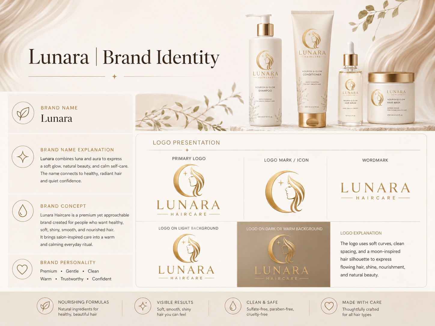
Logo & Brand Identity
The logo and brand identity section presents the Lunara Haircare mark and core identity elements in a clear and polished way. It shows how the logo supports the brand's premium yet approachable tone while maintaining clarity, balance, and recognizability across all brand materials.
The identity stays connected to the meaning behind Lunara — combining the calm feeling of "luna" with the glow and confidence represented by "aura." The result is a mark that feels elegant and personal without becoming distant or overly decorative.
- A clear, balanced logo that communicates softness and premium care
- Consistent identity that holds up across packaging, merchandise, and brand presentations
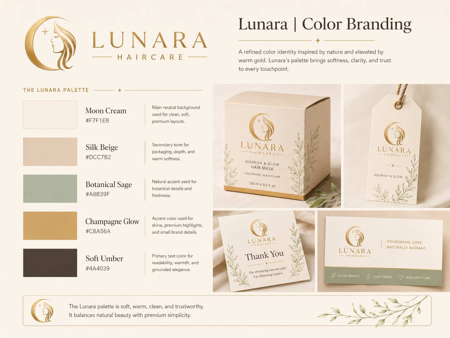
Color & Palette
The color system defines the palette that shapes the entire Lunara Haircare identity. Soft neutrals, warm beige, muted cream, champagne, soft brown, and subtle gold accents work together to communicate softness, nourishment, warmth, and healthy shine.
The palette makes the brand feel premium without feeling cold or distant. Each tone supports the calm, self-care-focused mood that Lunara is built around — giving the identity a cohesive and recognizable visual foundation across every application.
- A warm, refined palette that communicates nourishment and gentle confidence
- Consistent color language that carries through packaging, merch, and presentation
- A premium feel that remains approachable and easy to connect with
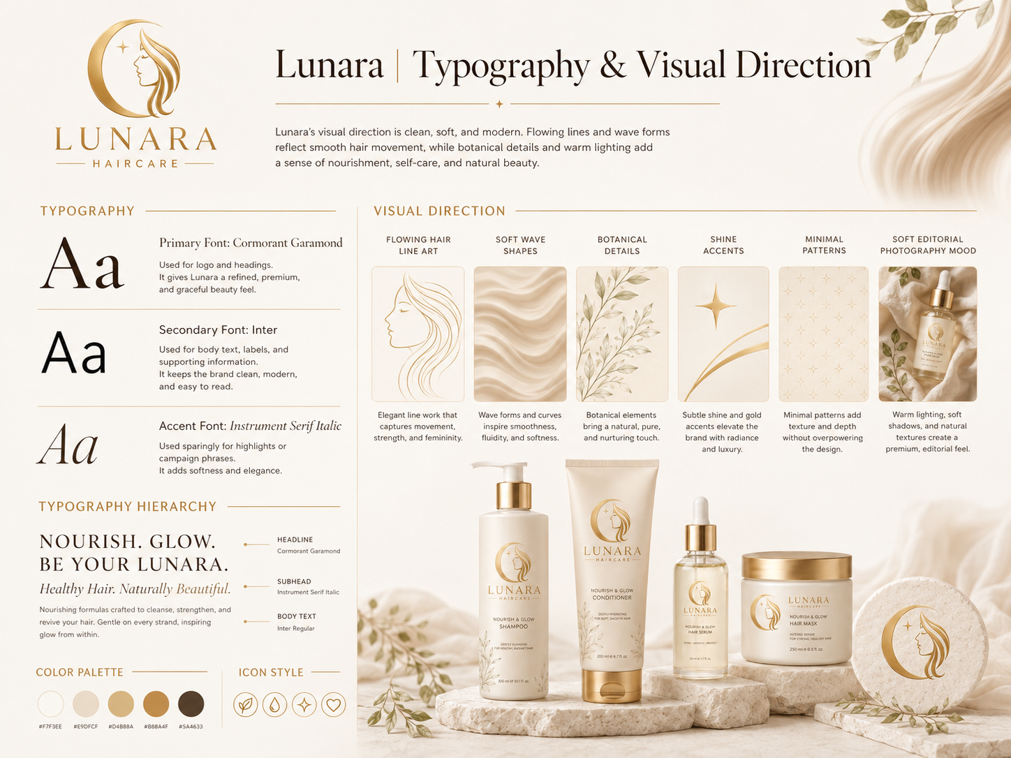
Type & Visual Direction
The typography and visual direction section shows how type and styling work together to shape the overall identity of Lunara Haircare. The type system leans toward a refined, modern beauty tone — clear enough to stay readable across brand materials, polished enough to support a premium hair care brand.
The broader visual direction communicates calm self-care, softness, and quiet confidence. Spacious layouts, clean compositions, and an elegant overall mood ensure that the brand never feels crowded or overly decorative — just soft, considered, and intentional.
- A refined type system that gives the brand a clear, premium beauty voice
- A visual direction that feels calm, spacious, and consistently on-brand
- Typography and styling that work together across all brand touchpoints
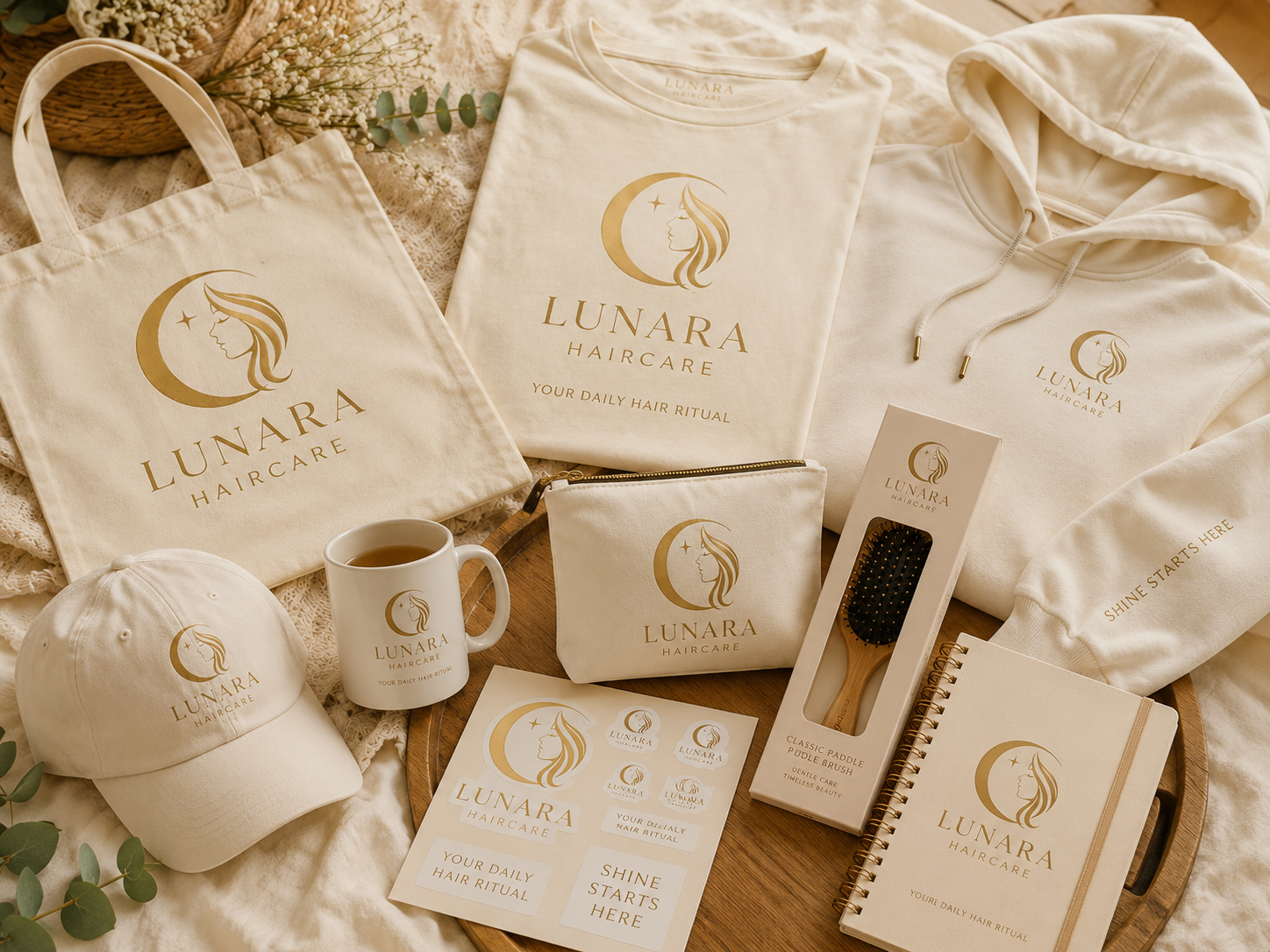
Merch Collection
The merch collection shows how the Lunara Haircare identity extends into physical brand applications. The branding remains recognizable and polished when applied to merchandise — staying visually consistent while showing how the identity can support lifestyle-based brand touchpoints beyond product packaging.
A brand identity that only works on product labels has limited range. Extending Lunara into merchandise demonstrates that the visual system is strong enough to hold up in real-world surfaces while staying clearly connected to the beauty and self-care space.
- A brand identity that translates cleanly to physical surfaces and merchandise
- Consistent brand presence that extends the identity beyond digital applications
- A polished lifestyle feel that stays aligned with Lunara's self-care positioning
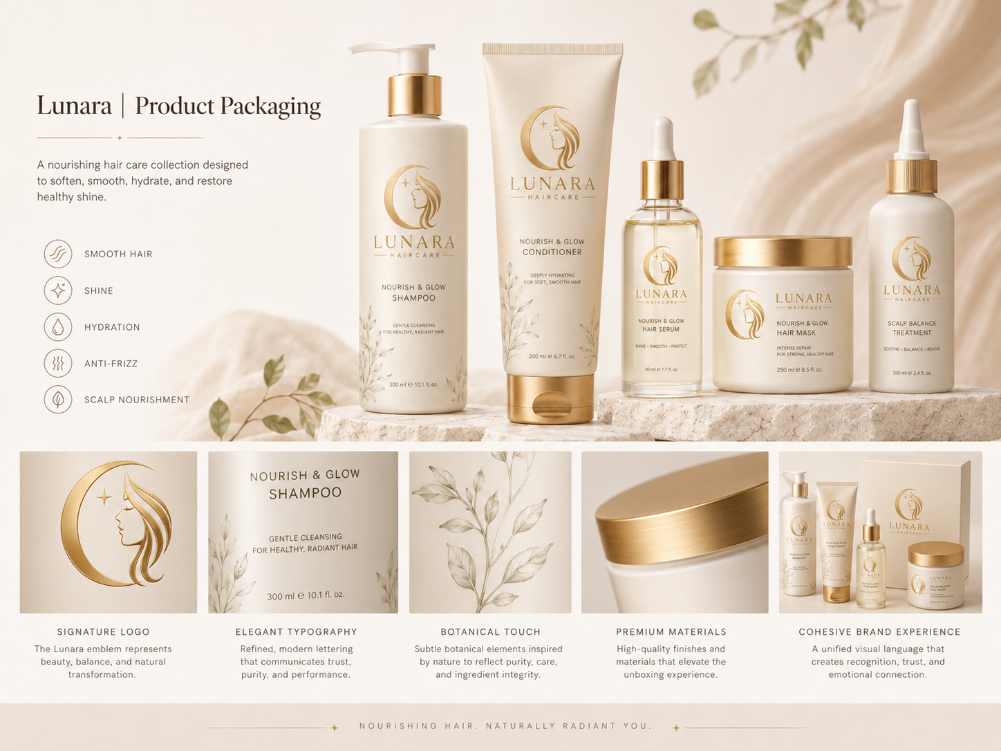
Product Packaging
The product packaging section shows how the Lunara Haircare identity is applied to real product touchpoints. The packaging is kept minimal, polished, and spacious — clean labels, soft visual details, and a presentation that feels elevated without becoming overly complicated.
The packaging directly supports Lunara's brand positioning as a premium yet approachable hair care line. It should feel like something a modern self-care user would keep on their shelf — soft, trustworthy, and easy to connect with at first glance.
- Minimal, elegant packaging that communicates premium care without intimidation
- A product presentation that feels personal, soft, and visually cohesive
- Packaging that holds the brand identity clearly at every product touchpoint
Final Result
Lunara Haircare was developed as an AI-assisted branding project, resulting in a cohesive identity system built across key brand assets. Through brand overview, logo and brand identity, color branding, typography and visual direction, merchandise, and product packaging, the project presents a complete and consistent branding solution.
The final identity gives Lunara a clearer and more unified brand presence across all touchpoints. Instead of feeling like separate design pieces, the logo, color palette, typography, packaging, and merchandise work together as one complete system — soft, premium, trustworthy, and ready for a portfolio branding case study. AI supported the creative exploration process, but the final brand direction, design decisions, and presentation were refined by the designer to make sure the output felt intentional and polished.