Mariam Khawar
The Challenge
Mariam Khawar creates educational and insight-driven content, but the presentation made it harder for users to quickly understand and retain the information.
From the visuals:
- Multiple ideas were presented within a single layout without clear separation
- Content felt dense due to limited spacing and grouping
- Key points did not stand out immediately from supporting information
Because of this:
- Users needed more effort to process the content
- Important insights were easily missed
- Content felt heavier than intended despite its value
What We Set Out to Do
The goal was to simplify how information is delivered without removing depth.
- Make content easier to scan and understand
- Introduce clear visual separation between ideas
- Build a structured system for educational content
- Maintain a clean and approachable visual identity
Moodboard & Direction
The direction focused on clarity and readability.
Three design decisions shaped the approach:
- Minimal layouts → reduce visual noise and distractions
- Controlled spacing → clearly separate sections of information
- Balanced contrast → ensure readability without overwhelming the user
Why: Educational content requires clarity more than decoration.
- Users can process information faster
- Content feels lighter and easier to read
Building the System
Every element is built to support clarity — making educational content easier to absorb, follow, and remember.
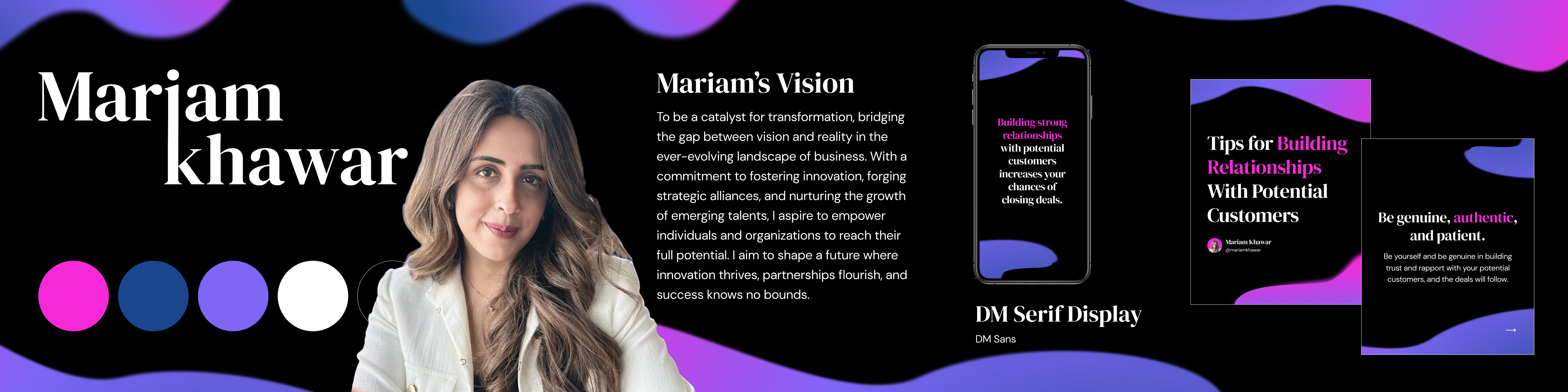
Header font: DM Serif Display. Supporting text: DM Sans. DM Serif Display creates strong visual emphasis in headlines. DM Sans keeps body text clean and readable. Educational content needs a clear distinction between key ideas and explanations — these two fonts create that balance.
Color is used to support readability and focus. A soft contrast palette reduces visual fatigue. Selective highlights draw attention to important information. Too much contrast or color can make educational content harder to process — this keeps it approachable.
Section containers, consistent spacing, and structured layout blocks applied throughout. Grouping information improves clarity and reduces cognitive load — every element has a defined role in making the content easier to scan and understand.
LinkedIn Profile & Cover
The profile serves as the primary introduction to the brand. Before a user reads any content, the profile sets the tone for everything that follows.
Design applied:
- Clear headline hierarchy
- Balanced and structured layout
- Consistent visual system
- Strong and immediate first impression
- Clear communication of personal brand identity
Carousel Design
Educational content can feel overwhelming when presented all at once. The carousel breaks it into focused, digestible slides.
Design decision:
- Break content into multiple slides
- Focus on one idea per frame
- Maintain consistent layout structure throughout
- Easier to follow information slide by slide
- Better engagement with educational content
- Improved clarity per idea
Structured for Retention
Dense information is difficult to retain when it isn't organized. Infographics give information a clear visual structure that makes it easier to absorb and remember.
Design decision:
- Section-based layout to separate related ideas
- Clear grouping of information
- Strong visual hierarchy to guide reading order
- Faster understanding of the content
- Improved retention of key information
- More valuable content that users return to
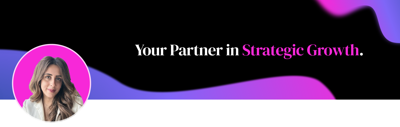
Banner System
The banner is the visual environment that surrounds the content. Without a consistent system, it creates a disconnect between the profile and the posts.
The same design system applied here ensures brand identity is present at every touchpoint — not just within individual posts.
- Cleaner and more cohesive profile layout
- Better overall viewing experience
The Impact
The result is a structured and accessible personal brand system.
Not just visually simplified — but optimized for learning and retention.