Nour
An AI-assisted branding project for a premium candle and home fragrance brand, created to explore a warm, intimate, and elegant visual identity that captures the quiet ritual of light and scent.
The Challenge
The home fragrance and candle market is saturated with brands that either lean too minimalist and sterile, or too ornate and overwhelming. For Nour, the challenge was to create a brand identity that feels genuinely premium — warm, intimate, and considered — without slipping into either extreme.
The brand's name, Nour, means “light” in Arabic — a quiet, deeply meaningful word that needed to shape every design decision. The identity had to communicate the sensory experience of candlelight: its warmth, its stillness, and the personal ritual it creates.
The visual system also needed to work across multiple brand surfaces — from product packaging and merchandise to logo usage and typography — while remaining cohesive, scalable, and rooted in the same quiet confidence the name carries.
The Approach
The solution was to build a full brand identity system around the meaning of Nour — using warmth, restraint, and elegance as the guiding principles across every touchpoint. The identity draws from the golden glow of candlelight, the calm of an intimate space, and the ritual nature of home fragrance.
- Brand overview — setting the tone and visual direction for the full identity
- Logo and brand identity — grounded in clarity, warmth, and refined simplicity
- Color system — deep neutrals, warm amber, soft cream, and muted gold
- Typography — understated, modern, and intimate in character
- Visual direction — quiet, candlelit, and intentionally unhurried
- Merch collection — extending the identity into lifestyle touchpoints
- Product packaging — minimal, elegant, and true to the brand's ritual feel
AI was used to support creative exploration and test how the identity could hold across different surfaces. The final design decisions, brand direction, and presentation were refined by the designer to make sure the output felt intentional and true to the Nour concept.
Brand Overview
The brand overview establishes the full mood and direction of the Nour identity — a premium candle and home fragrance brand built around the Arabic concept of light. It presents the visual tone, emotional positioning, and core design language that carries through every brand touchpoint.
Nour is not just a product brand — it's a sensory experience. The overview anchors that experience in a visual system that feels warm without being loud, and premium without being cold. Every design decision flows from the same quiet, considered place the name represents.
- A clear brand foundation that communicates warmth, intimacy, and quiet luxury
- A visual tone that stays consistent across every application in the system
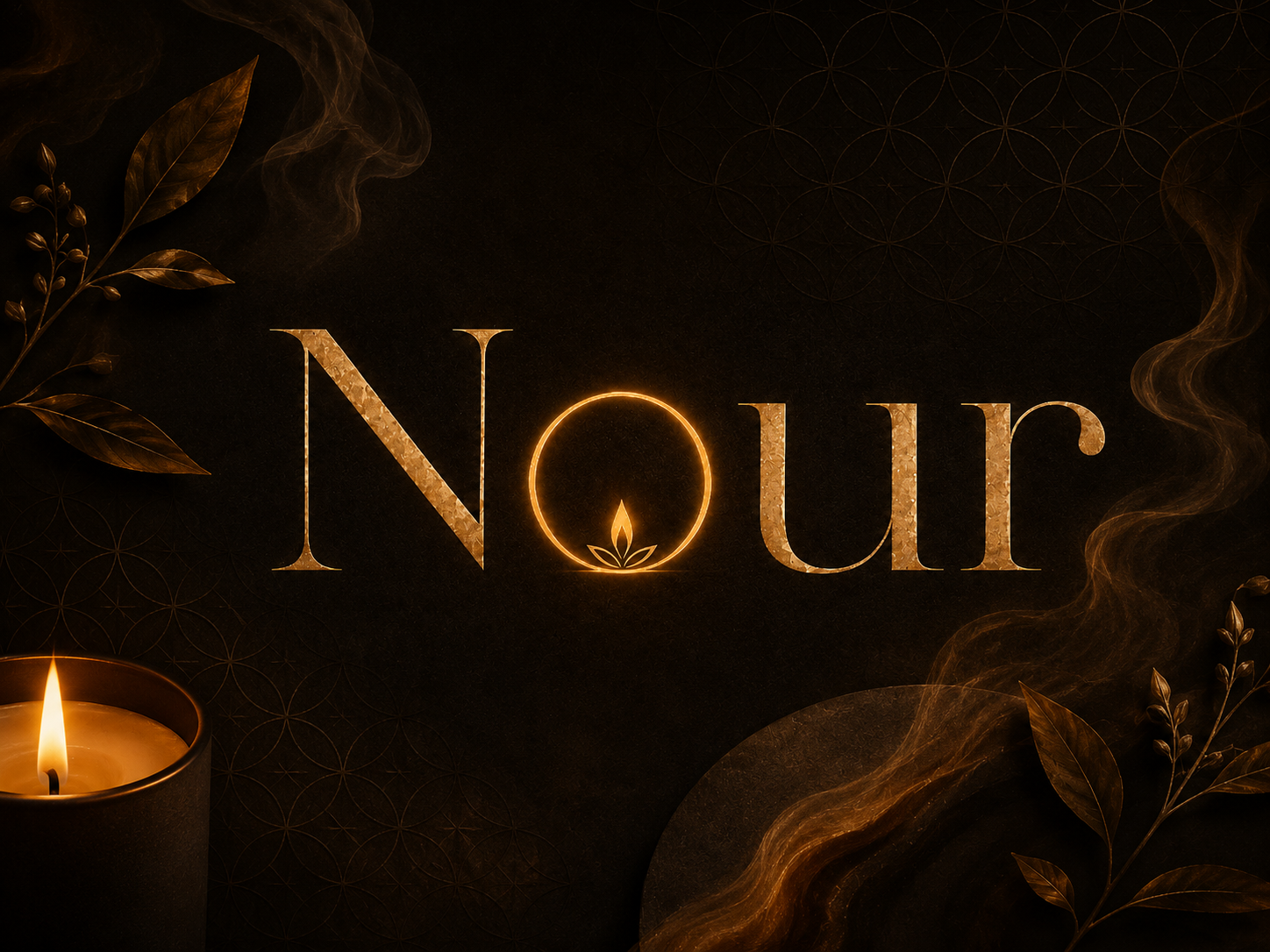
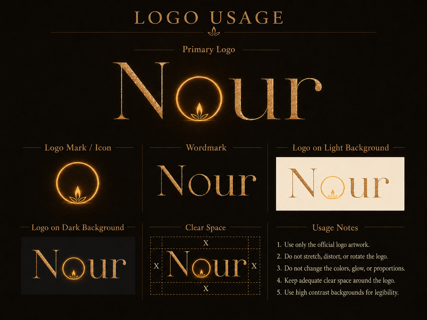
Logo & Brand Identity
The logo and brand identity section presents the Nour mark and core identity elements in a clear, refined way. It shows how the logo supports the brand's premium yet intimate tone — balancing elegance and warmth while maintaining recognizability across all applications.
The identity stays true to the meaning behind Nour — light as something quiet, personal, and present. The mark avoids excess. It lets the name carry its weight without ornamentation, resulting in a logo that feels confident, warm, and distinctly its own.
- A refined logo that communicates warmth and quiet confidence
- Consistent identity that holds across packaging, merchandise, and brand materials

Color & Palette
The color system defines the palette that shapes the entire Nour identity. Deep, grounded neutrals, warm amber, soft cream, muted beige, and restrained gold accents work together to communicate candlelight, intimacy, and quiet luxury.
The palette makes Nour feel premium without feeling cold. Each tone reflects the sensory world the brand lives in — the warmth of a lit candle, the calm of a still room, the soft glow that changes the atmosphere of a space. Together, they give the identity a visual temperature that is immediately recognizable.
- A warm, grounded palette that communicates intimacy and premium restraint
- Consistent color language that holds through packaging, merch, and brand materials
- A visual temperature that feels immediately at home in the lifestyle and fragrance space
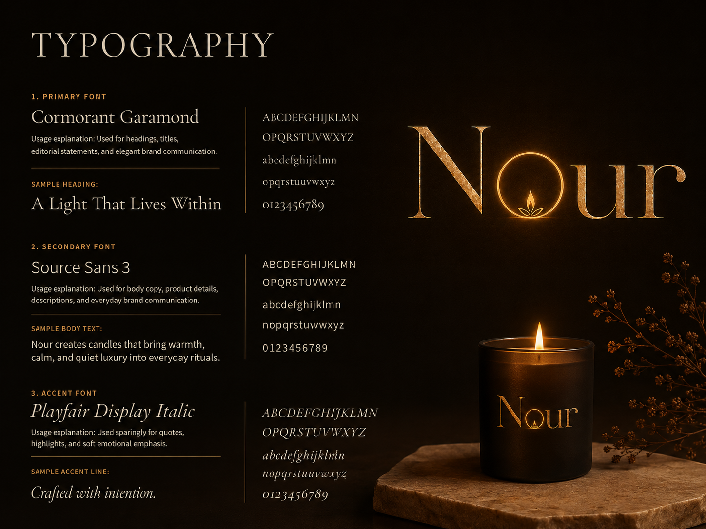
Typography
The typography system shapes how Nour communicates across brand materials. The type choices lean toward understated elegance — refined enough to signal premium quality, intimate enough to feel personal and unhurried rather than corporate or distant.
Type is used with restraint throughout the identity. Generous spacing, careful hierarchy, and a consistent voice across all materials make the brand feel considered at every scale — from product labels to brand presentations and merchandise.
- A type system that gives Nour a calm, premium voice without overstatement
- Clear typographic hierarchy that carries through every brand surface
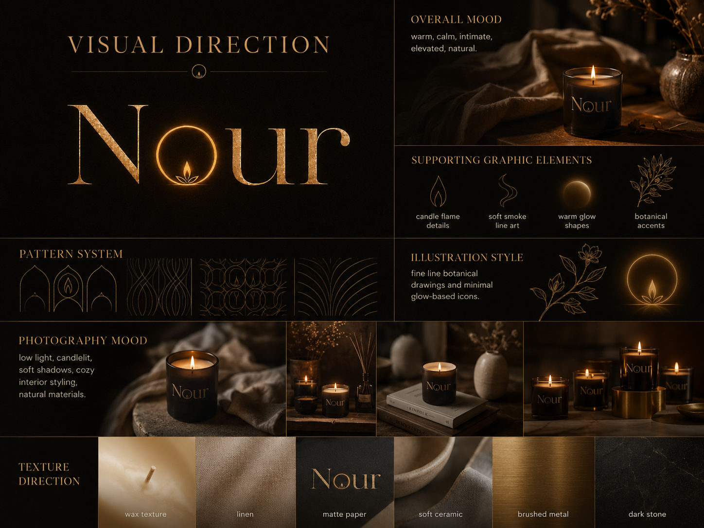
Visual Direction
The visual direction section brings together the mood, composition, and overall aesthetic language that defines how Nour looks and feels. The direction is quiet, candlelit, and intentionally unhurried — designed to communicate the sensory experience of the brand before a product is ever opened.
Layouts are spacious and clean. Composition avoids clutter. The overall mood stays warm and intimate — close enough to feel personal, elevated enough to signal quality. The visual direction ensures that every touchpoint in the Nour system feels like it belongs to the same calm, considered world.
- A visual language that communicates the ritual feel of candlelight and home fragrance
- Consistent mood and composition that holds across every application in the system
- An aesthetic direction that feels premium, warm, and deeply aligned with the brand's name
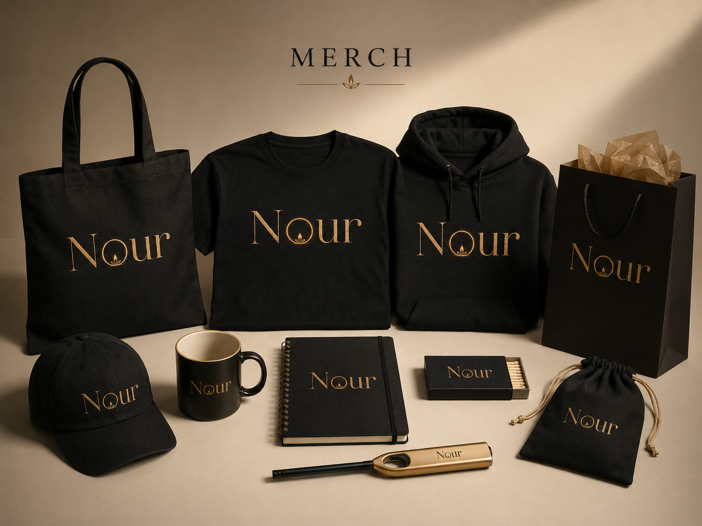
Merch Collection
The merch collection shows how the Nour identity extends into physical lifestyle applications. The brand stays warm and recognizable when applied to merchandise — proving that the visual system is strong enough to move beyond packaging and into the everyday objects that live alongside the product.
For a brand like Nour — built around the ritual of home and self — merchandise is not an afterthought. It extends the brand into the spaces and surfaces that matter to the people it is designed for. The merch collection demonstrates that the identity is versatile enough to work in those real-world contexts while staying clearly Nour.
- A brand identity that translates cleanly onto physical surfaces and lifestyle objects
- Consistent brand presence that extends the system beyond digital and product applications
- A warm, lifestyle-aligned feel that stays true to Nour's intimate positioning
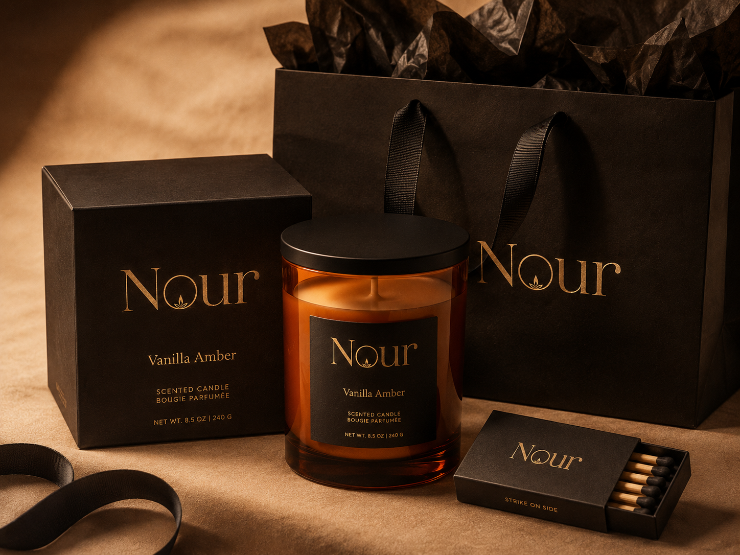
Product Packaging
The product packaging section shows how the Nour identity is applied to its most important touchpoint — the product itself. Packaging is kept minimal and spacious: clean labels, warm visual details, and a presentation that feels elevated without becoming busy or over-designed.
The packaging directly supports Nour's position as a premium home fragrance brand. It should feel like something a person would choose to leave out — quiet enough to belong in a calm space, beautiful enough to be noticed. The design communicates quality at first glance and stays true to the ritual the brand is built around.
- Minimal, warm packaging that communicates premium quality without noise
- A product presentation that feels personal, intimate, and visually cohesive
- Packaging that holds the brand identity clearly at every product touchpoint
Final Result
Nour was developed as an AI-assisted branding project, resulting in a cohesive identity system built across seven brand touchpoints — brand overview, logo and brand identity, color system, typography, visual direction, merch collection, and product packaging.
The final identity gives Nour a unified and intentional brand presence. Instead of disconnected design pieces, the logo, color palette, typography, visual direction, packaging, and merchandise work together as one complete system — warm, intimate, and premium in character. AI supported the creative exploration process, but the final brand direction, design decisions, and presentation were refined by the designer to make sure the output felt genuine and aligned with everything the name Nour represents.