Parin Mehta
The Challenge
Parin Mehta shares structured and insight-driven content, but the visual presentation didn't fully support how the information is meant to be understood.
From the visuals:
- Content appeared dense due to lack of clear separation
- Multiple ideas were presented without strong visual hierarchy
- Layouts did not clearly guide the reader from one point to the next
Because of this:
- Users needed more effort to follow the flow of ideas
- Important insights were not immediately visible
- The structured thinking behind the content was not reflected visually
What We Set Out to Do
The goal was to translate structured thinking into structured visuals.
- Make content easier to scan and follow
- Introduce a clear hierarchy between ideas
- Build a system that reflects logical thinking
- Maintain consistency across all formats
Moodboard & Direction
The direction focused on clarity, structure, and readability.
Three design decisions shaped the approach:
- Grid-based layouts → organize content into logical sections
- Controlled color usage → avoid overwhelming the viewer
- Clear spacing → separate ideas and reduce visual clutter
Why: Parin's content is analytical — the design must support logical flow.
- Users can follow content more easily
- Information becomes clearer and more digestible
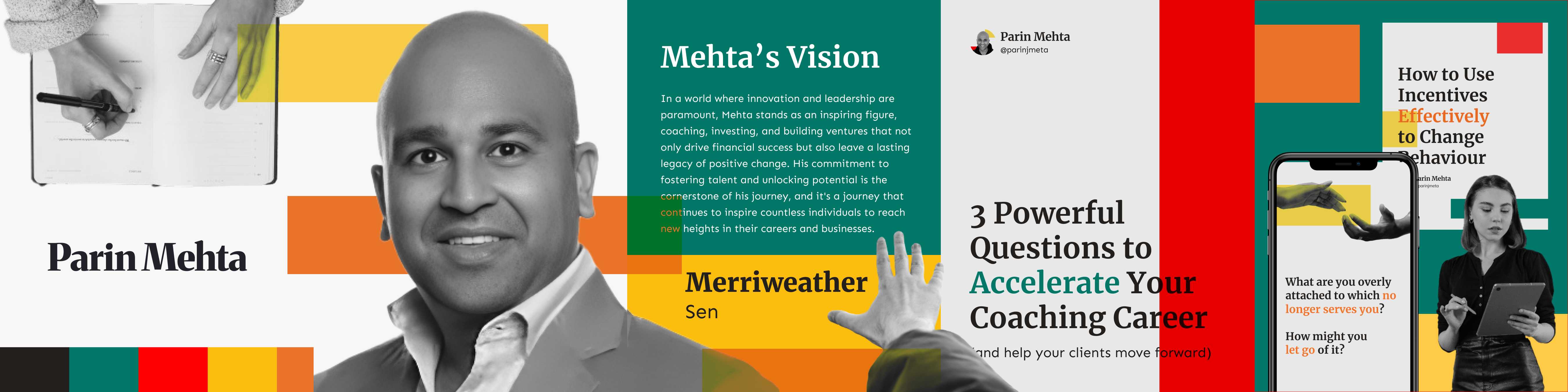
Building the System
Every element in the system is designed to reinforce structure — making content easier to read, follow, and remember.
Header font: Merriweather. Supporting text: Sen. Merriweather brings depth and credibility to headlines. Sen keeps body text readable and modern. Structured content needs clear hierarchy — without it, all text competes equally.
Color is used to support structure, not decorate it. A limited palette reduces distraction. Accent color highlights key information selectively. Too many colors can disrupt logical flow — this keeps focus on the ideas.
Grid alignment, section containers, and consistent spacing applied throughout. Without structure, complex ideas feel overwhelming — these elements make every layout predictable and intuitive to follow.
LinkedIn Profile & Cover
The profile is where users first interact with the brand. It sets the expectation before a single post is read.
Design applied:
- Clear hierarchy between name, title, and supporting detail
- Structured and clean layout
- Consistent visual system from cover to content
- Immediate understanding of the brand at a glance
- Strong and professional first impression
Carousel Design
Complex ideas are difficult to understand in a single frame. The carousel breaks content into step-by-step slides that guide the reader through the thinking.
Design decision:
- Break content into step-by-step slides
- Use strong headline hierarchy per slide
- Maintain consistent layout throughout
- Easier to follow ideas from slide to slide
- Better engagement with structured content
- Improved clarity per idea
Structured for Retention
Dense information is hard to retain when it isn't organized. Infographics solve this by giving information a clear visual structure.
Design decision:
- Section-based layout to group related ideas
- Clear grouping of information
- Visual hierarchy to guide reading order
- Faster understanding of complex topics
- Better retention of key information
- Higher value content that users save and revisit
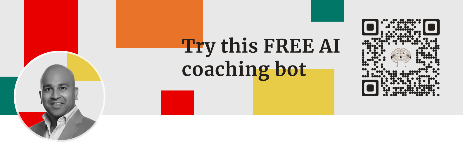
Banner System
The banner is the visual frame that surrounds all content. Without a consistent system, it creates a disconnect between the profile and the posts.
The same design system applied here ensures the brand identity is present at every touchpoint — not just in the content itself.
- Cleaner and more cohesive profile layout
- Better browsing experience across contexts
The Impact
The result is a cohesive and structured personal brand system.
Not just visually improved — but aligned with how the content is meant to be processed.