StarSeekr
A recruitment service website designed to help companies understand StarSeekr’s hiring support, recruitment process, pricing, resources, and consultation flow.
StarSeekr is a recruitment service that helps companies find pre-vetted candidates that fit their hiring process, saving time, effort, and resources. Unlike a typical UI/UX-only engagement, I was also involved in supporting the brand direction stage for StarSeekr — joining the discovery, contributing brand name suggestions, moodboarding, and visual direction exploration that later guided the website design.
This case study focuses on the UI/UX side of that process: how the brand direction, moodboarding, and website design were aligned so the final landing page and supporting pages felt consistent.
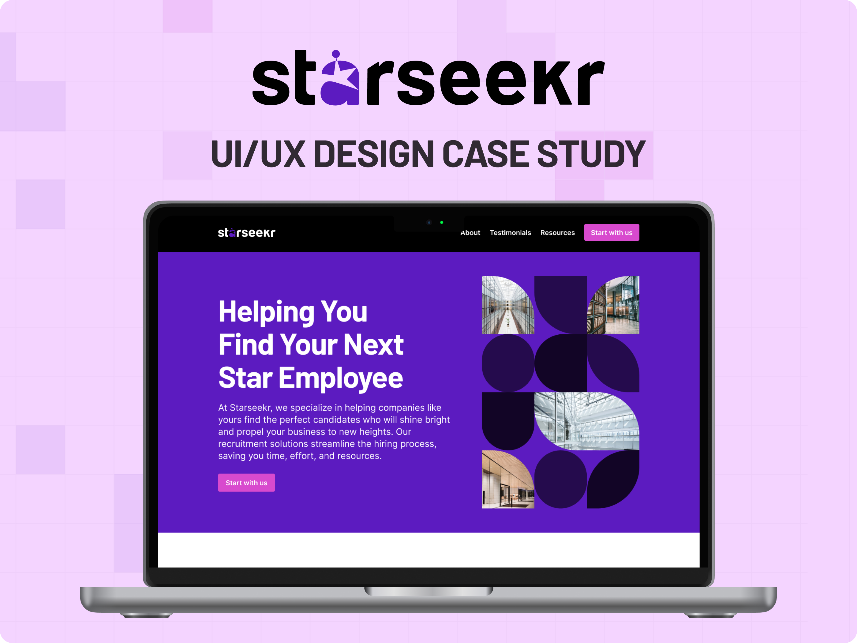
A recruitment service built to help companies find the right candidates faster.
StarSeekr helps companies find pre-vetted candidates through recruitment support, sourcing, screening, interview coordination, candidate endorsement, and onboarding support. The website needed to communicate this value clearly while making the service feel reliable, approachable, and easy to understand.
Understanding the business goals before designing the website.
The project started with a pre-discovery session to understand StarSeekr’s business model, recruitment offer, target clients, and goals. This helped define what the website needed to communicate and what actions visitors should take.
- StarSeekr focuses on recruitment support
- The goal was to help companies find qualified candidates
- The business wanted stronger testimonials and successful hire stories
- The website needed to support lead generation and business growth
- Ideal clients included remote companies, tech companies, small companies, and startups
Supporting the brand direction before moving into UI design.
Since the brand direction was still being shaped, I was also involved in the early brand support process. This included reviewing brand name options, moodboarding, visual style directions, and helping connect the selected brand direction to the website experience.
Designing for companies that need hiring support.
The target users were defined early so the website could speak to the right decision-makers and prioritize the right content. From there, clear website goals were set to guide the structure and content of the homepage and supporting pages.
- Explain StarSeekr's recruitment service clearly
- Build trust through proof, testimonials, and client logos
- Show the recruitment process in a simple way
- Present pricing and guarantee clearly
- Encourage visitors to start with StarSeekr
- Collect leads through forms, consultation booking, and downloadable guides
A 2-week process from discovery to developer handoff.
The StarSeekr project was completed through a focused 2-week process. The early days covered the pre-discovery session, brand name activity, and brand moodboarding, since I was also supporting the brand direction stage. The following days moved into conversion planning, sitemap, structure planning, UI mock-up design, responsive design review, and developer handoff.
Turning the landing page into a lead-generation flow.
The landing page was planned around lead generation. The goal was to guide visitors from understanding the service to taking action, such as starting with StarSeekr, booking a consultation, or downloading a guide.
Mapping the website around service clarity and conversion paths.
The sitemap helped organize how visitors move through the homepage and supporting pages. The structure focused on explaining the service, showing proof, presenting the recruitment process, collecting leads, and guiding users toward consultation booking.
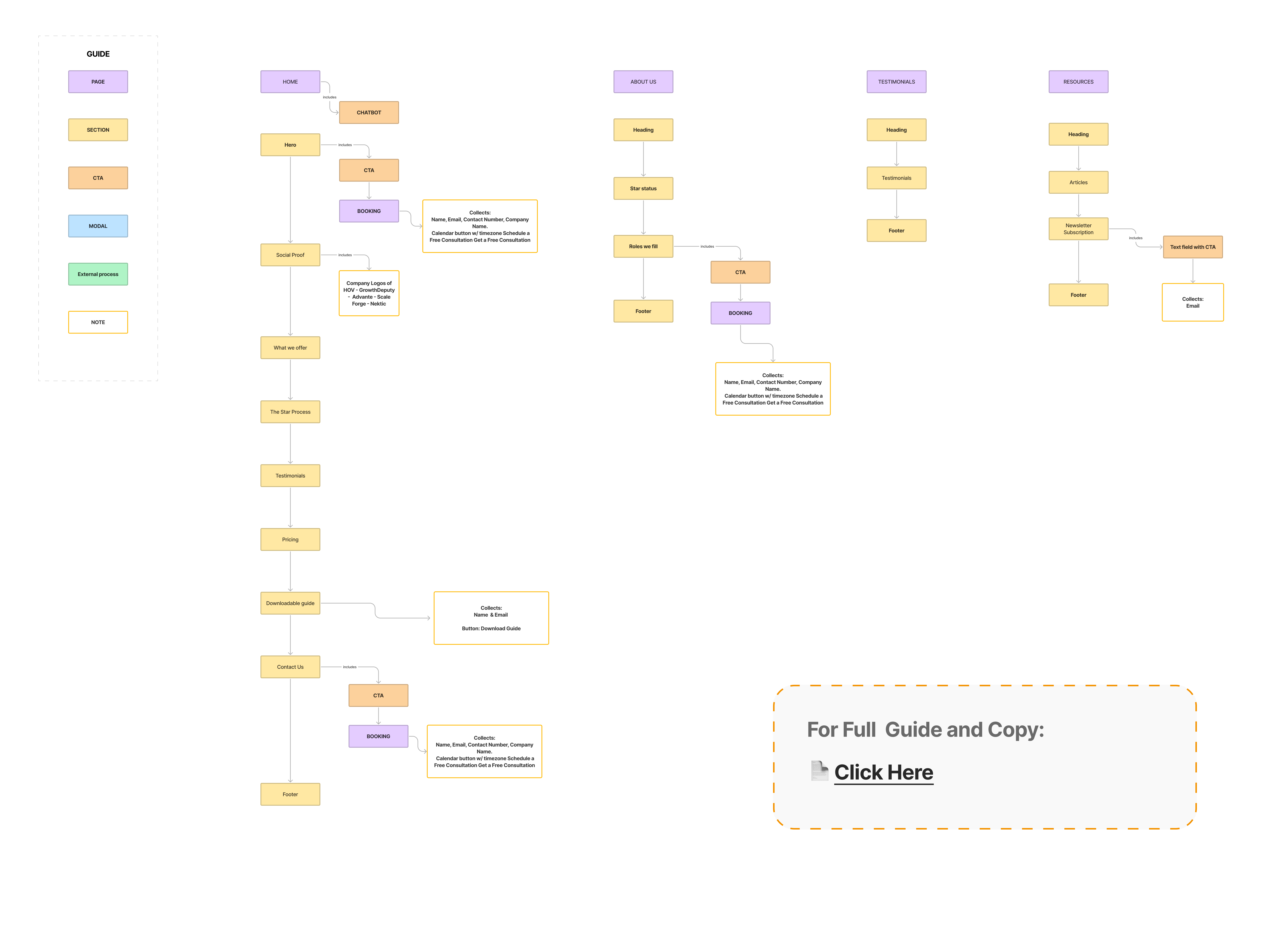
- CTA buttons lead to consultation or booking actions
- Booking flow collects name, email, contact number, and company name
- Resources section collects email / contact details for guide downloads
- The About Us page supports trust and includes CTA paths
- The Testimonials page supports proof and credibility
- The Resources page supports lead capture and helpful content
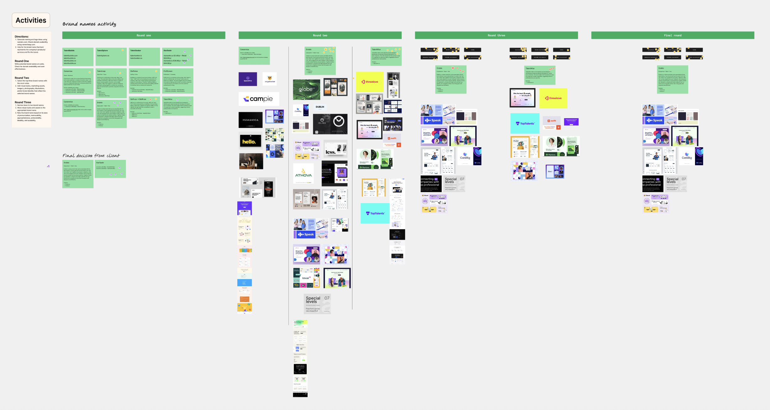
Exploring the brand direction before shaping the website experience.
Before moving into the website UI design, I was involved in the early brand direction exploration for StarSeekr. This included reviewing brand name options, exploring visual tone, checking possible brand archetypes, and helping identify a direction that would fit a recruitment service focused on trust, expertise, and successful hiring support.
This stage helped clarify how StarSeekr should feel as a brand before applying that direction into the website experience.
Showcasing the final brand colors, typography, and illustration style used for StarSeekr.
After the exploration and decision-making process, the final brand direction was defined through a clear visual system. This included the selected color pairings, primary typeface, and illustration style that were consistently applied across the landing page and supporting pages. These final brand elements helped create a visual identity that feels modern, approachable, and memorable while supporting StarSeekr’s recruitment-focused positioning.
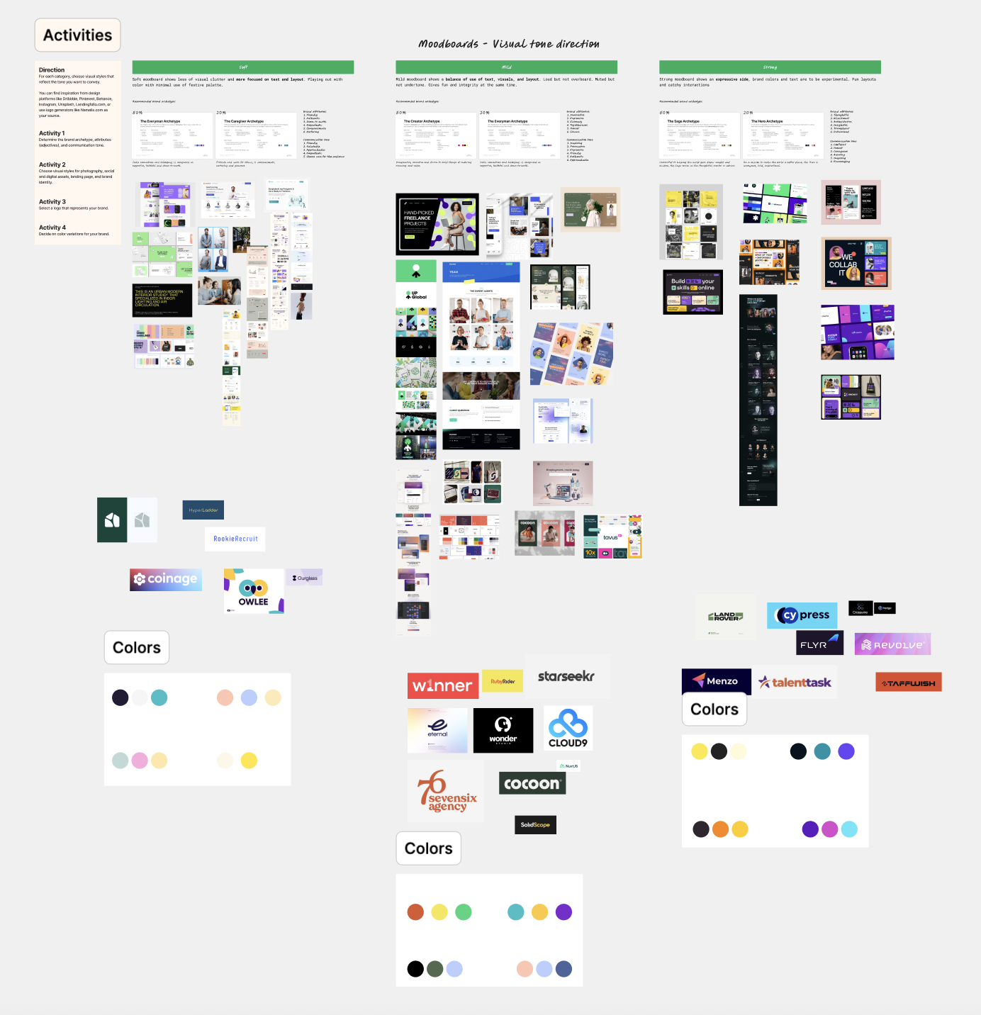
The final color system combined Rich Magenta, True White, and Fuchsia to create a bold yet clean visual direction. These colors helped the brand feel confident, modern, and noticeable while still staying easy to use across landing page sections and supporting materials.
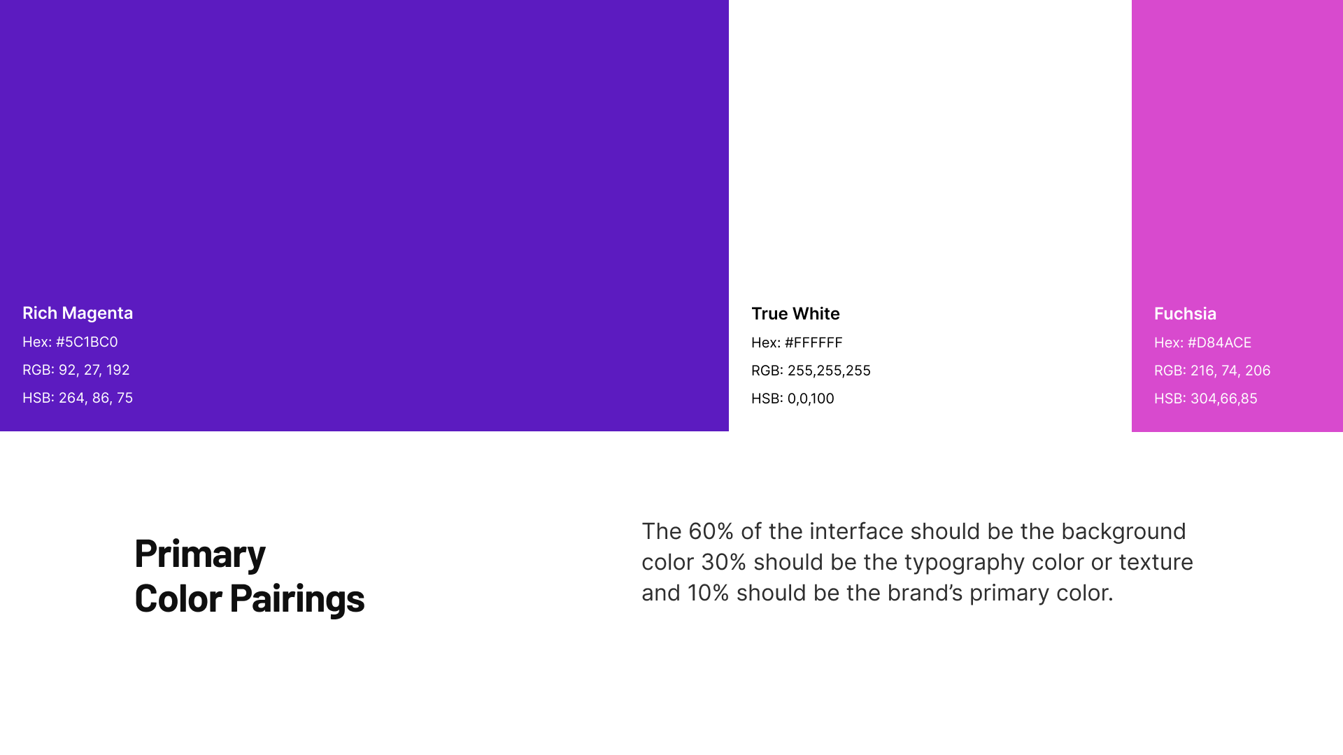
Barlow was chosen as the primary typeface for the brand. Its clean structure and strong readability made it effective for headings, body text, and digital layouts, helping maintain consistency across the website experience.
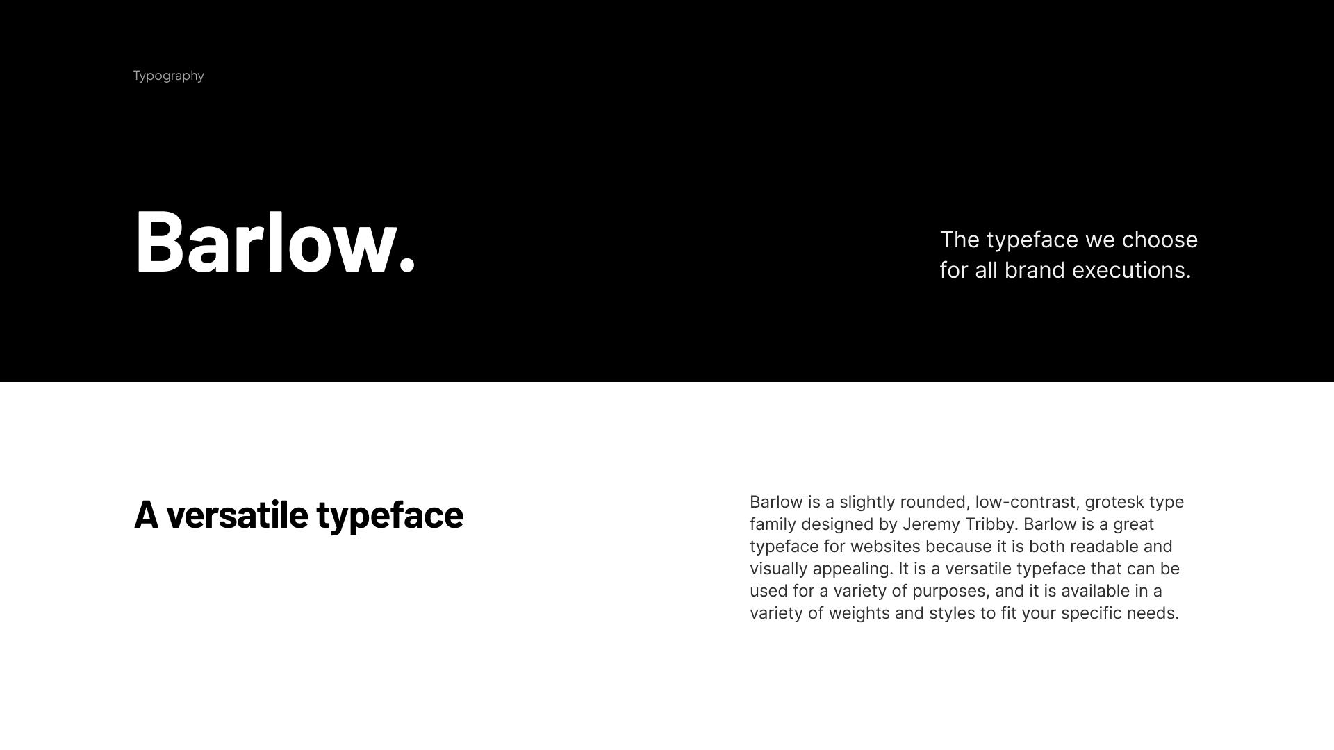
The final illustration direction used geometric shapes as a defining visual element. This approach gave the brand a flexible and recognizable design language that could be applied across web sections, supporting assets, and marketing visuals.
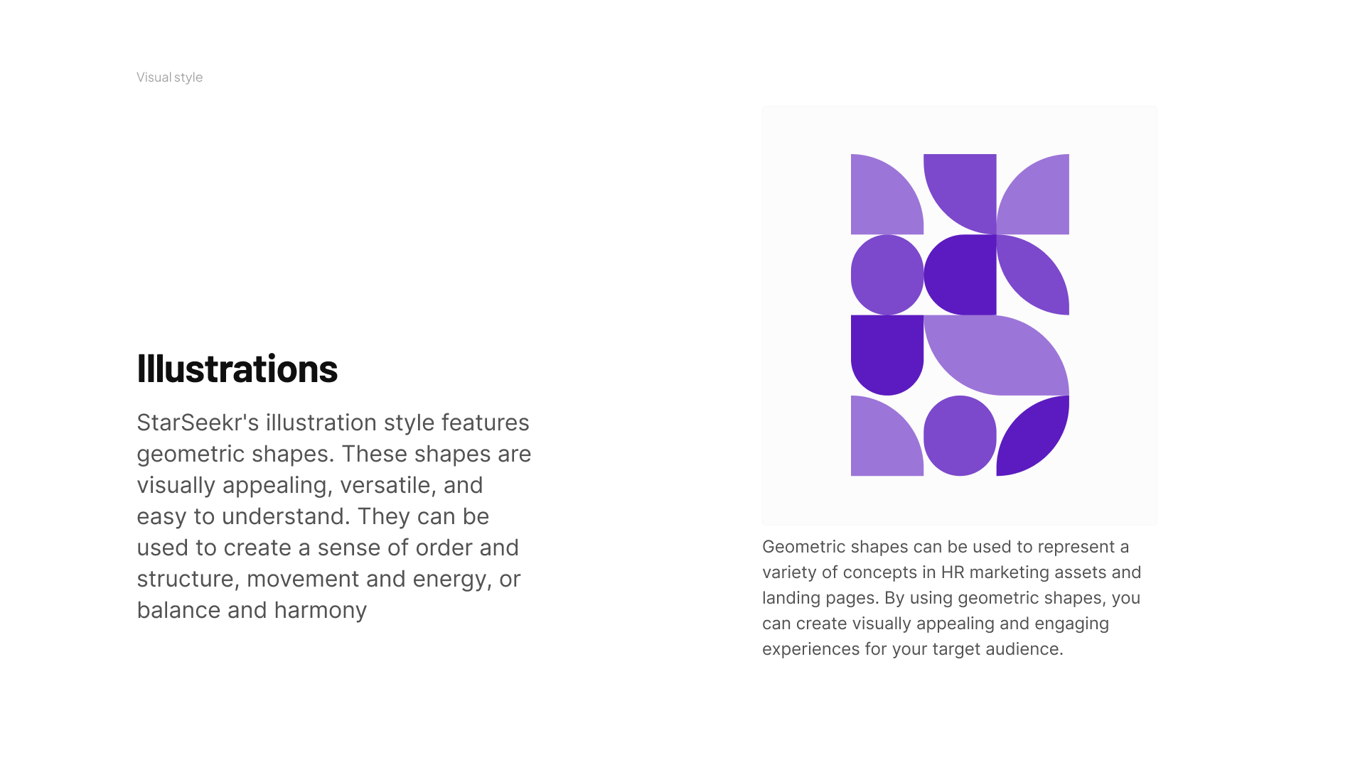
Exploring layout directions for the landing page and supporting pages.
After the brand direction was clearer, I explored UI/UX moodboards and layout directions for the website. This stage focused on how the brand direction could be translated into page structure, content hierarchy, CTA placement, service cards, testimonial sections, pricing blocks, resource forms, and responsive website layouts.
The UI/UX moodboarding stage explored three possible directions for the StarSeekr landing page: Soft, Mild, and Strong. Each direction tested a different balance of typography, layout, visuals, color usage, and interaction style. After review, the client chose the Strong direction because it felt more expressive, memorable, and aligned with the bold recruitment brand direction.
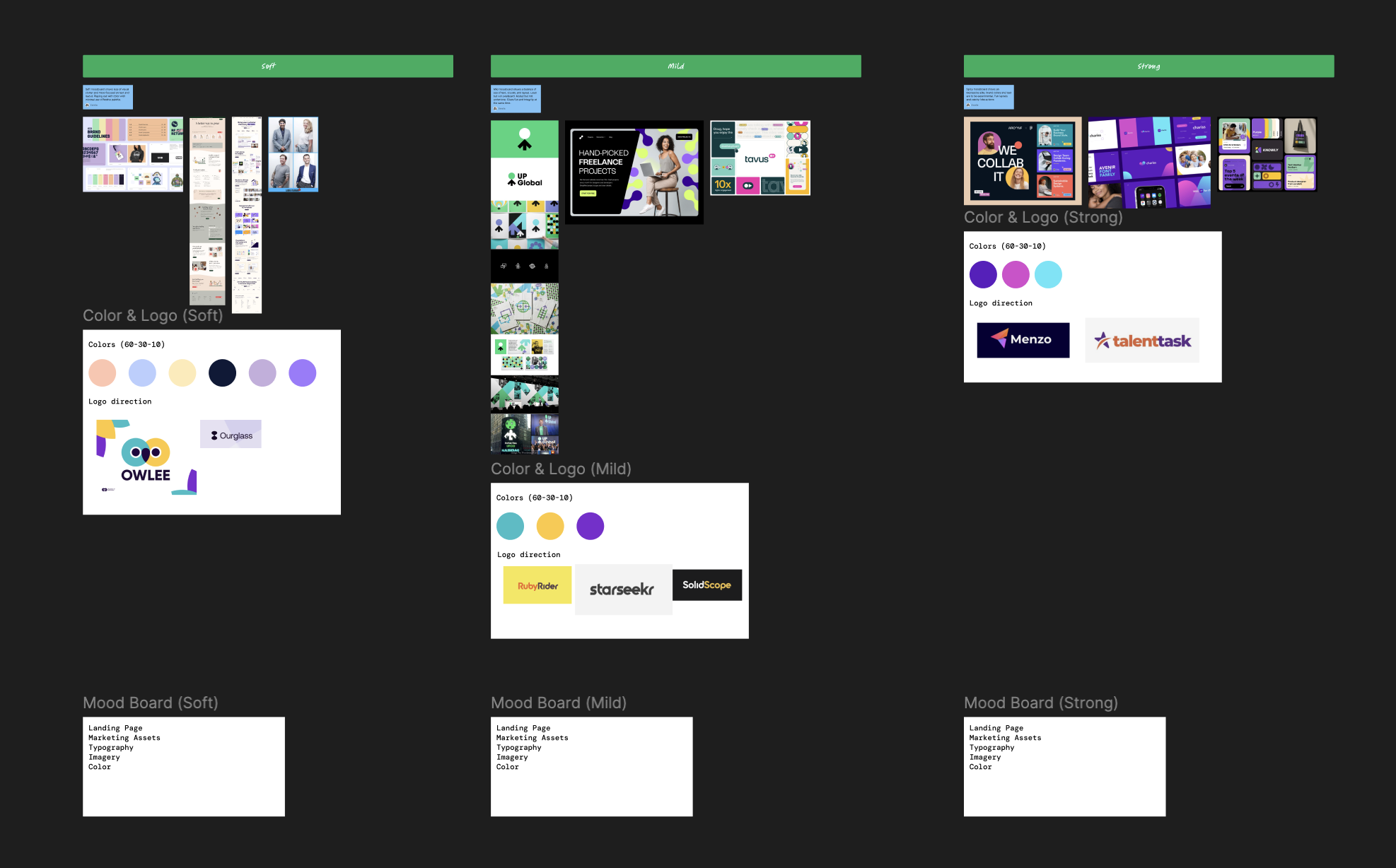
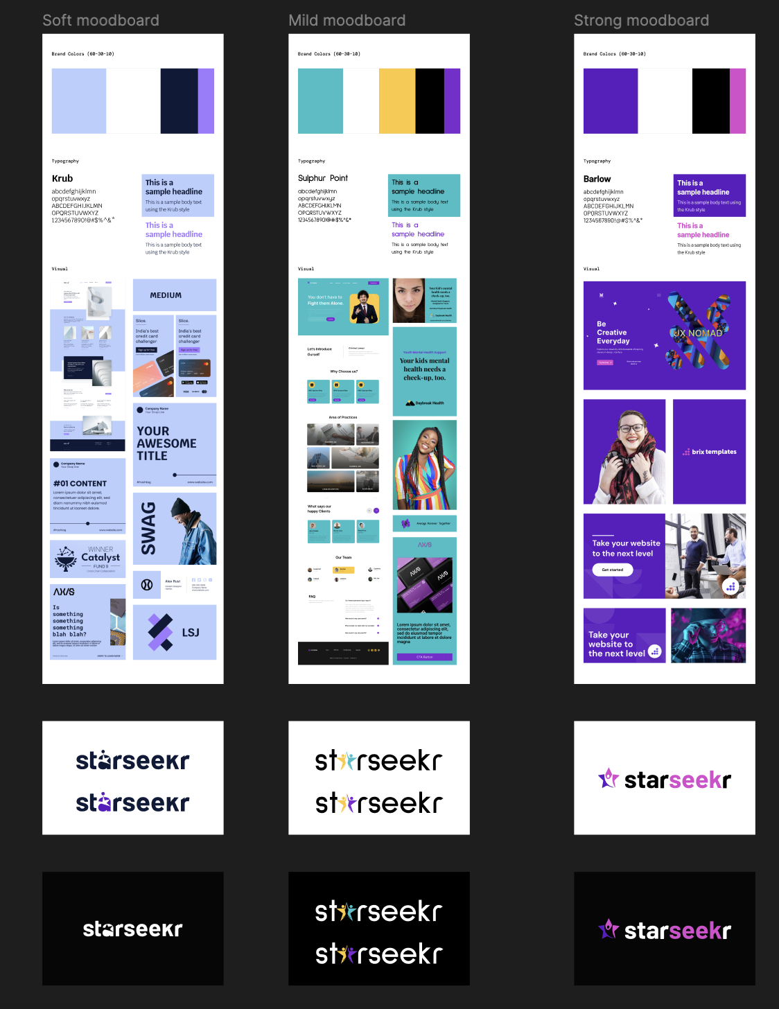
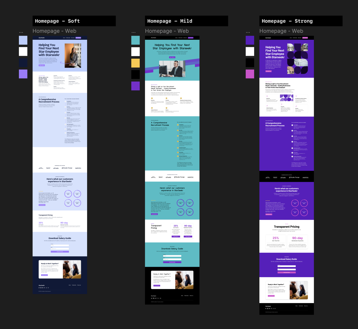
Soft moodboard shows less visual clutter and is more focused on text and layout. It explores color with minimal use of a festive palette.
Mild moodboard shows a balance of text, visuals, and layout. It feels loud but not overboard, muted but not undertone, giving a sense of fun and integrity at the same time.
Strong moodboard shows a more expressive side where brand colors and text can be more experimental. It supports fun layouts, stronger visual impact, and catchy interactions.
The client chose the Strong direction for the final UI design direction.
Planning the content hierarchy before high-fidelity design.
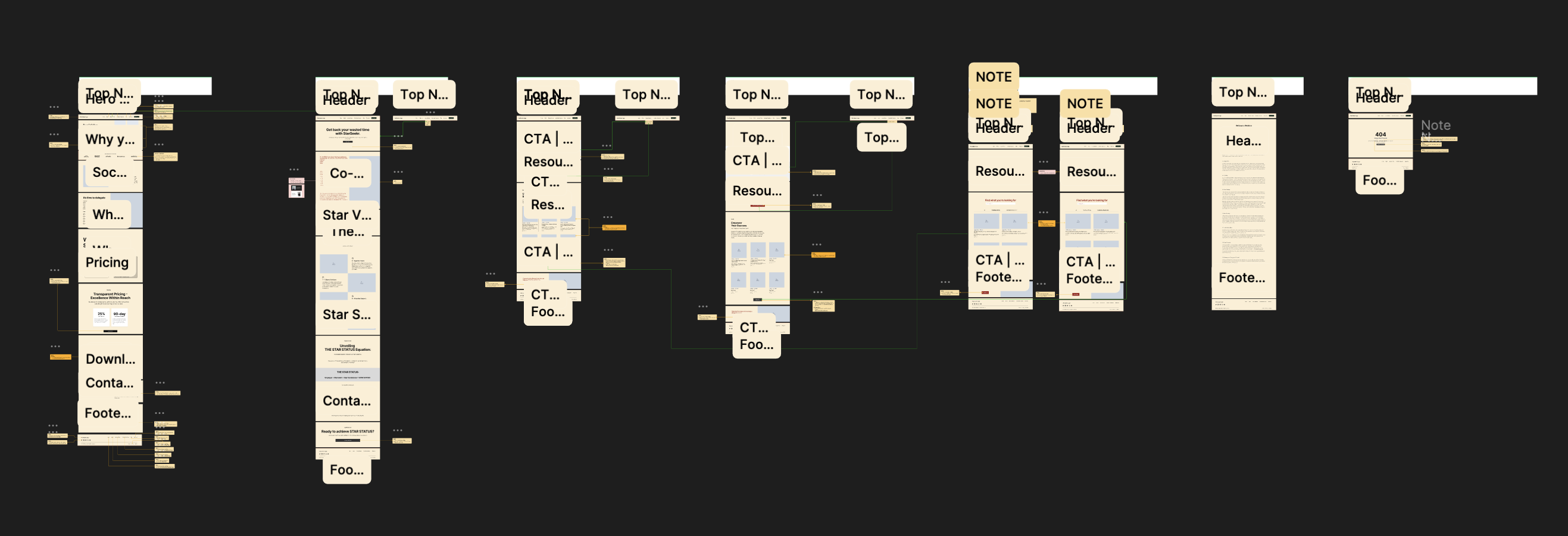
The wireframe and structure planning stage helped organize the website content before visual design. This made sure the homepage and supporting pages had a clear flow for explaining the service, process, pricing, testimonials, resources, and consultation actions.
Designing the final recruitment website experience.
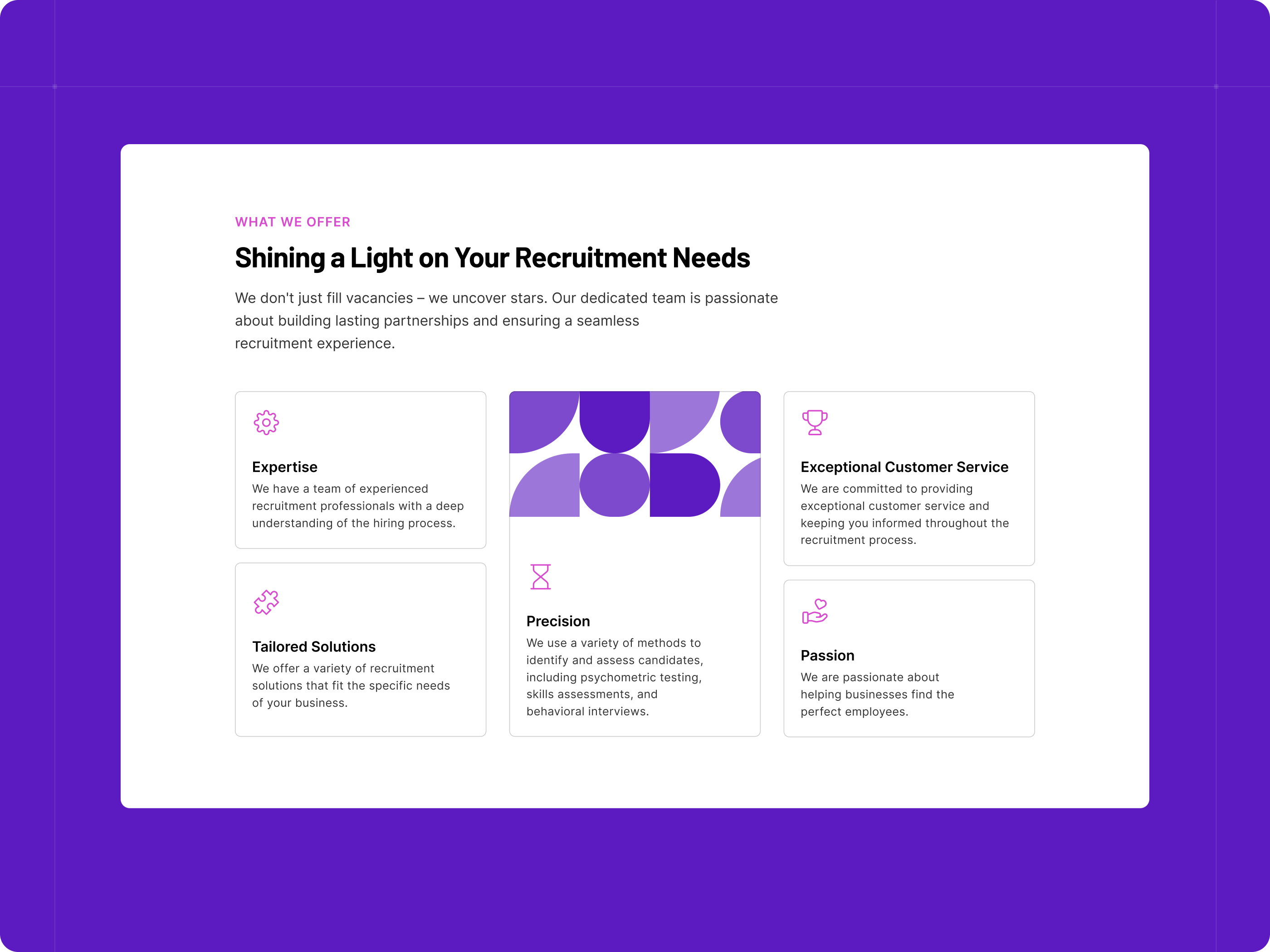
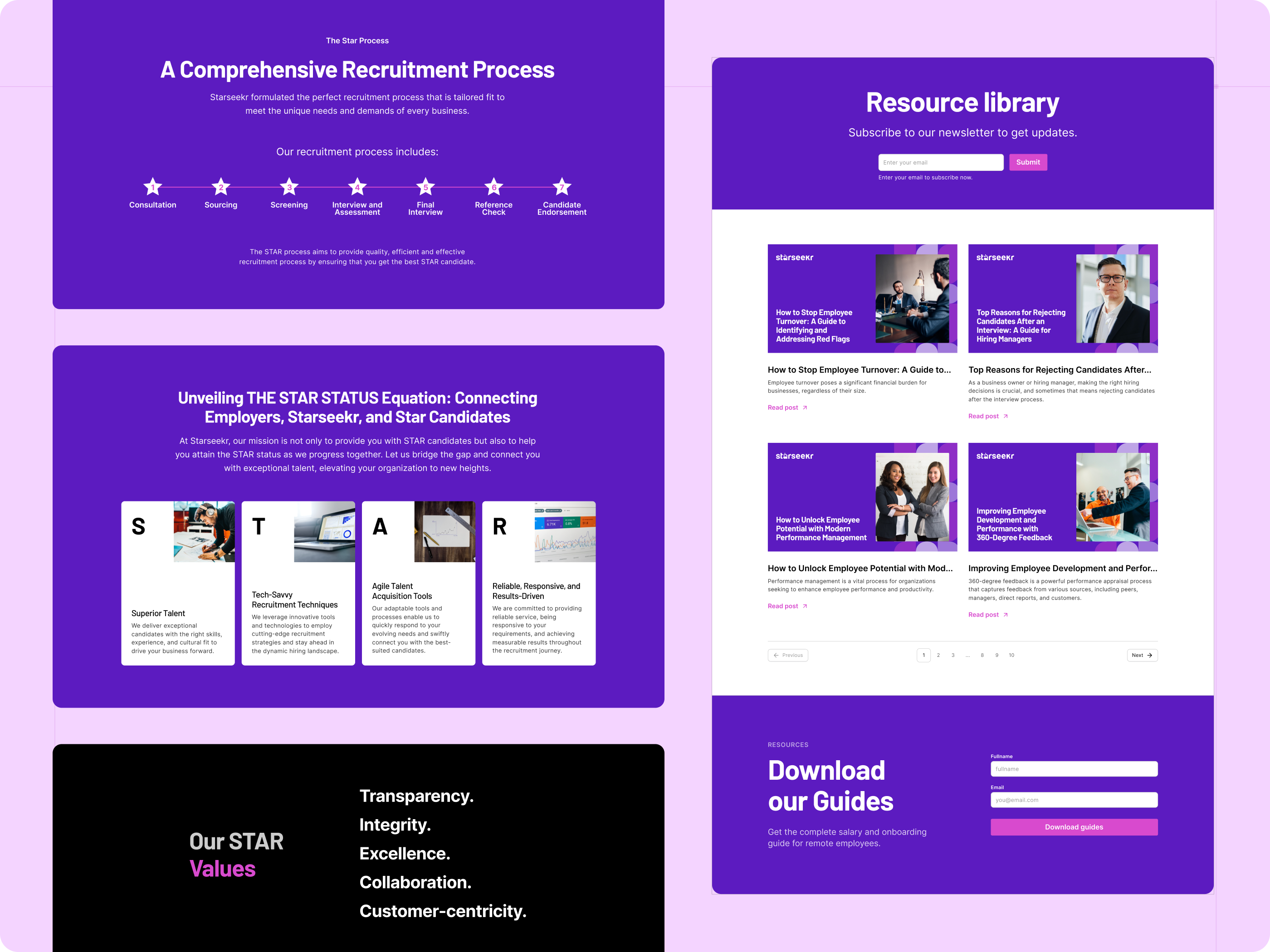
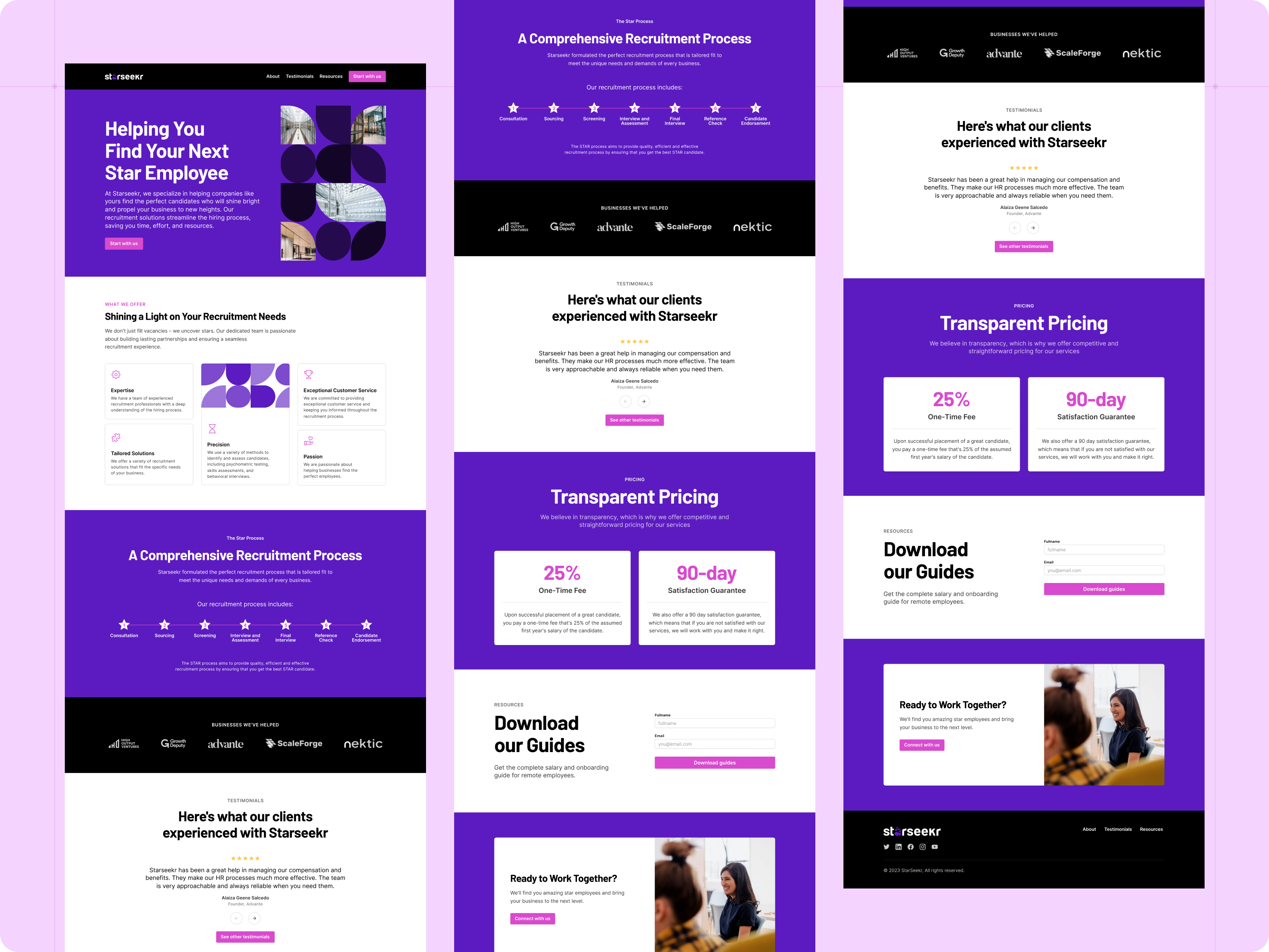
The final UI translated the brand direction and recruitment positioning into a responsive website experience. The pages were designed to clearly explain what StarSeekr offers, how the recruitment process works, why visitors can trust the service, and what action they should take next.
Preparing the design for clearer implementation.
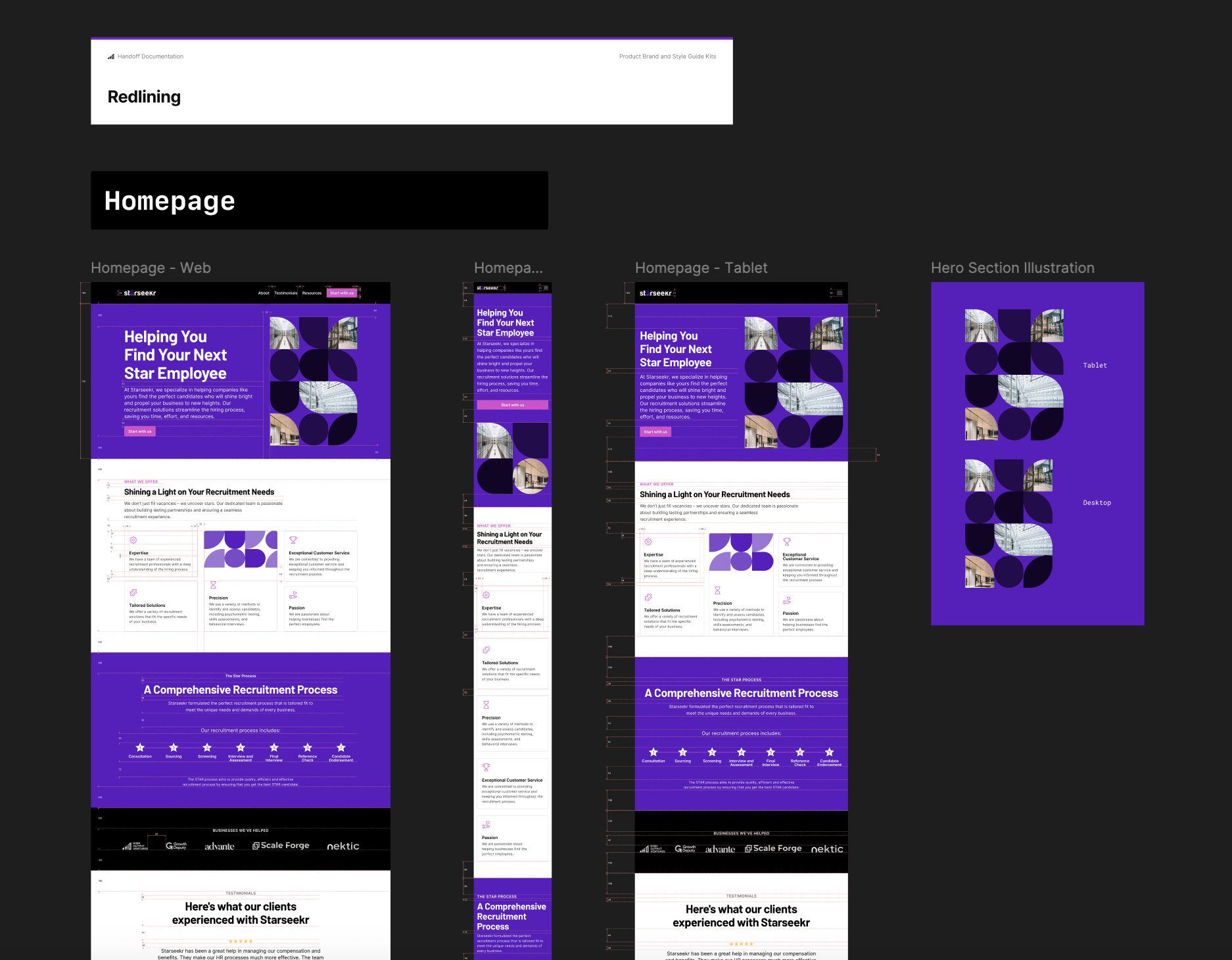
After the UI design was reviewed, final refinements were made to improve clarity, spacing, responsive behavior, and interaction details. Handoff documentation and redlining were prepared so the developer could understand layout spacing, responsive rules, CTA behavior, forms, navigation, and page structure.
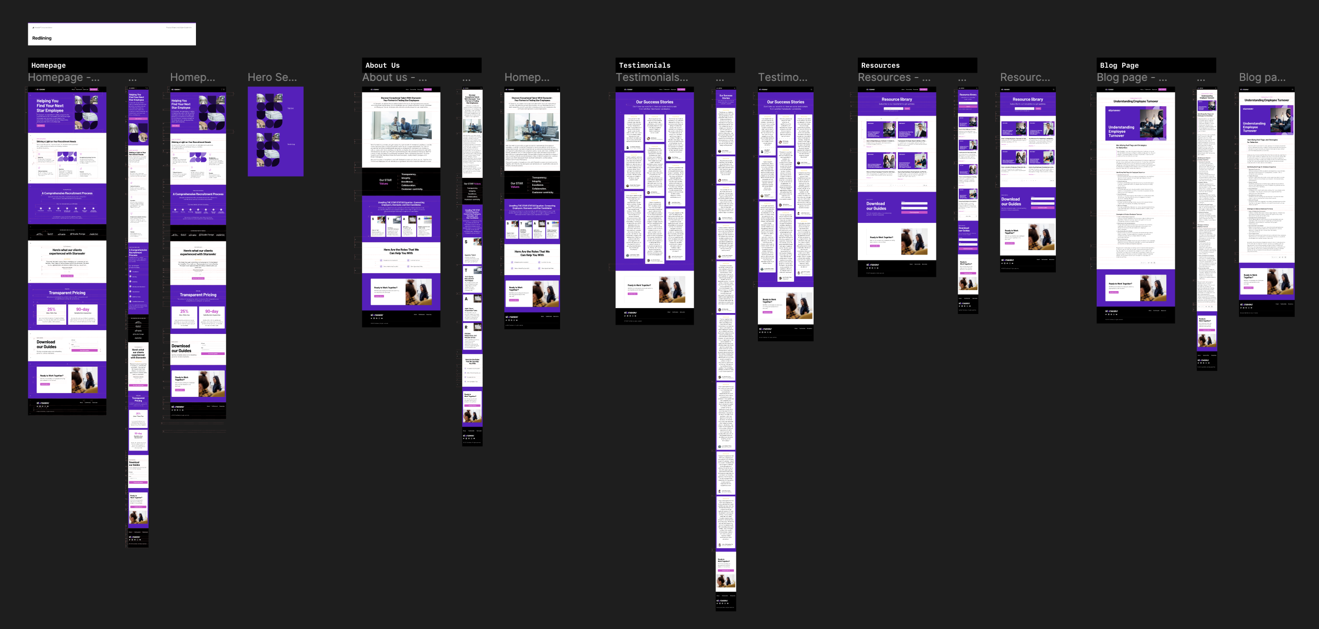
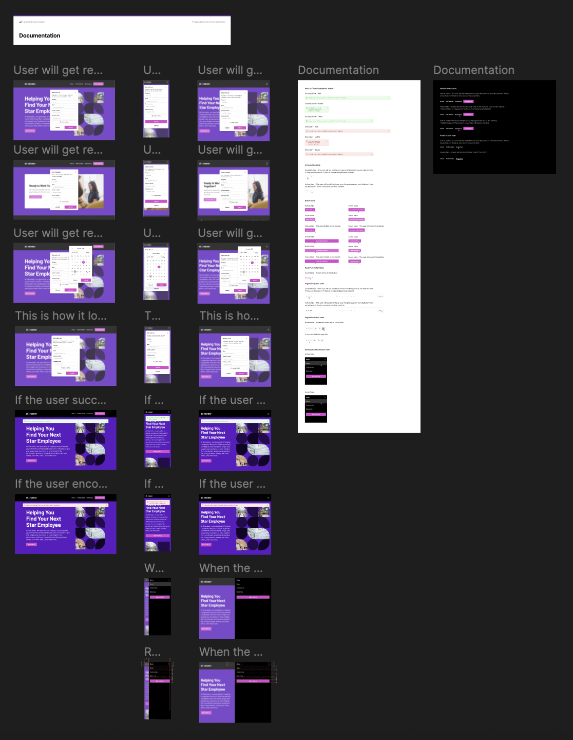
- Redlining
- Responsive references
- Navigation behavior
- CTA behavior
- Booking flow notes
- Download guide form behavior
- Layout spacing and implementation notes
A clearer website foundation for StarSeekr’s recruitment service.
The final StarSeekr website direction connected the brand discovery work with a structured UI/UX experience. The website gave StarSeekr a clearer way to explain its recruitment service, build trust with potential clients, present its process and pricing, and guide visitors toward consultation or resource download actions.
Organized the recruitment service into a clearer website structure
Connected early brand direction support with the final UI design
Planned conversion paths for consultation booking and guide downloads
Designed the homepage and supporting pages for a consistent website experience
Created a responsive UI direction for the recruitment service website
Prepared documentation and handoff materials for development